The ten tools worth evaluating in 2026 are Luca AI, Lifetimely, Peel Insights, Polar Analytics, Triple Whale, Shopify's native cohort report, Saras iQ, Glew.io, Mixpanel, and GA4.
Seven of those ten report repeat rate, not repeat profit. Two cohorts at an identical 28% repeat rate can differ by roughly $1,000 in kept contribution.
Shopify's free cohort report filters by channel, product, subscription, and geography, but stops at revenue and never names the discount or flow that caused decay.
Category crossover beats purchase frequency. Operators tracking raw order data find buyers who enter a second product category step up 50% to 100% in lifetime value.
Benchmarks disagree badly: 18.8% across 156,000 DTC customers, 28.2% from Rivo, 16.5% from Bluecore. Score yourself against your own trailing twelve cohorts instead.
Graduate off the free report when paid acquisition passes roughly 30% of revenue, or when you sell across more than two product categories.
Q1. What are the 10 best customer cohort analysis tools for e-commerce in 2026? [toc=1. The 10 Best Tools]
The 10 best customer cohort analysis tools for e-commerce in 2026 are Luca AI, Lifetimely, Peel Insights, Polar Analytics, Triple Whale, Shopify's native cohort report, Saras iQ, Glew.io, Mixpanel, and GA4. Most of them render a retention grid and stop there, which leaves you stitching Shopify, ad platform, and accounting exports together to learn whether a returning cohort was profitable. Luca AI sits first because it is an AI reasoning layer over a unified data warehouse: it normalizes those sources on ingestion, then answers cohort questions in plain English, including root cause and simulated outcomes.
Here is the honest framing before the list. Seven of these ten tools report repeat rate, not repeat profit. A store owner told me last quarter that his 90 day retention was climbing while his bank balance was flat. Both facts were true. His cohort tool only tracked one of them, and nobody had told him the difference mattered. That gap is what this list is organized around.
The 10 tools at a glance
Luca AI , Best for cohort questions answered in plain English across commerce, ads, and accounting data
Lifetimely , Best for Shopify LTV and profit cohorts in one app
Peel Insights , Best for deep retention and RFM cohort segmentation
Polar Analytics , Best for blended cohort reporting with custom metrics
Triple Whale , Best for marketing attribution teams who also want cohorts
LTV cohorts, daily P&L, predictive LTV, CAC targets by channel, and product level profit
Shopify DTC brands spending on paid ads
$0 / Month , $999 / Month
Peel Insights ⭐⭐⭐⭐
Retention cohorts, RFM segments, product affinity, and automated insights
Retention led brands with a defined repeat cycle
Quote based
Polar Analytics ⭐⭐⭐⭐
Blended cohort reporting, custom metrics, multi source dashboards, and alerts
Growth teams building their own metric definitions
Quote based
Triple Whale ⭐⭐⭐⭐
First party pixel, attribution, Moby agents, and cohort and LTV views
Paid media teams where attribution is the first job
Quote based, order volume tiers
Shopify native report ⭐⭐⭐
Cohort heatmap and curve, with filters by channel, product, subscription, and geography
Stores validating whether they need a paid tool
Included with your Shopify plan
Saras iQ ⭐⭐⭐
Managed warehouse, cohort software, multi channel ingestion, and BI reporting
Brands selling across Shopify, Amazon, and retail
From $300 / Month , Custom
Glew.io ⭐⭐⭐
Multi store cohorts, segmentation, and product and channel profit
Groups running several stores or regions
Quote based
Mixpanel ⭐⭐⭐
Event based cohorts, retention curves, funnels, and behavioural segments
App, subscription, and marketplace products
Free , Custom
GA4 ⭐⭐
Time and event based cohorts, acquisition reports, and exploration builder
Stores needing a free acquisition cohort view
Free; GA4 360 from roughly $50,000 / Year
⚠️ Who each family of tools is wrong for [toc=1.0c Who They Suit]
Mixpanel and GA4 are wrong if your cohorts are defined by orders. They think in events, so COGS and returns windows are foreign concepts to them. Operators buy them, then discover the gap. If you are weighing the free option specifically, our breakdown of Google Analytics alternatives for ecommerce covers where that path breaks.
Shopify's native report is wrong once paid acquisition passes roughly 30% of revenue. It stops at revenue. The r/shopify thread below is the exact request it cannot serve.
I'm looking for a tool to help with cohort analysis. Specifically, I want to see how many newly acquired users are retained each month after joining. Ideally, this tool also helps me identify what lead to the retention. — u/Interesting_Rock5343, r/shopify, September 2023 Reddit Thread
1.1 Luca AI [toc=1.1 Luca AI]
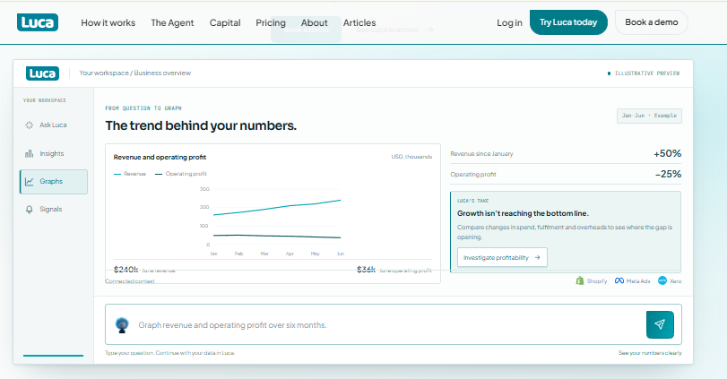
Luca AI connects revenue, profit, and cross-functional signals into one business overview.
⭐ Why did we choose this tool?
I run Luca AI, so read this with that in mind. It leads because of one architectural fact: Luca AI reasons across commerce, ad, and accounting data in the same query, so a cohort answer arrives with its cause attached. Ask why the March cohort decayed and Luca AI ranks the influencing components, including discount depth, entry SKU, and channel. It normalizes data on ingestion, which removes the cleanup year. Then its agents push the finding to Slack or email on a schedule. Cohort level vigilance, without the cohort level dashboard.
📊 Core evaluation metrics
Cohort dimensions: time, channel, entry product, behavioural, plus any custom field
Margin aware cohorts: yes, with COGS, shipping, fees, returns, and ad spend included
Data sources connected: 200+ native connectors across commerce, ads, accounting, and ops
Time to first cohort answer: minutes after connection, no SQL or modelling step
Proactive alerts: yes, anomaly detection and scheduled reports to Slack, email, or app
✅ Solutions offered
Plain English cohort and retention questions with reasoned answers, through conversational analytics
Root cause analysis on retention and margin decay
Predictive cohorts and scenario simulation on your own history
Automated weekly and monthly reports with graphs and recommendations
Single source of truth across Shopify, Meta, Google, Klaviyo, and Xero
💰 Pricing
[ Starter , €299 / Month | Growth , €499 / Month | Scale , Custom Pricing ]. Current plan details sit on the Luca AI pricing page.
💸 Case study: a supplements brand at roughly €4M
What was the problem? A European supplements brand running Shopify, Meta, and Xero tracked retention monthly in a spreadsheet. Repeat rate looked healthy. Contribution margin kept sliding, and nobody could say which cohort was responsible.
How did Luca helped? Luca AI connected the three sources and rebuilt cohorts by entry product, netting each to contribution after COGS, shipping, discounts, returns, and acquisition cost. The team asked the question in plain English. Luca AI named the discount driven entry SKU behind the decay and flagged two cohorts worth reordering against.
What was the outcome? They retired one entry bundle, moved spend to a higher crossover SKU, and set a weekly Slack alert on cohort contribution. The margin line stopped sliding inside two months. Company unnamed under NDA.
❤️ Best for
Shopify and Shopify plus Amazon brands between $1M and $40M in revenue
Teams with data in eight or more tools and no in house analyst
Operators who want the answer pushed to them, not a dashboard to open
Luca AI is not the right fit below roughly $1M in revenue, where there is not enough history to reason against, or for enterprises that already staff a data team. The use case library shows where the fit holds.
1.2 Lifetimely [toc=1.2 Lifetimely]
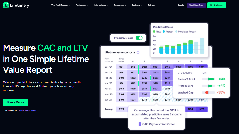
Lifetimely combines predicted sales, CAC payback, and lifetime value cohorts for Shopify brands.
⭐ Why did we choose this tool?
Lifetimely earns its place because it does the one thing most cohort tools skip. It nets cohorts to actual profit. The P&L pulls revenue from Shopify, syncs ad spend from Meta, Google, and TikTok, then factors in product costs, shipping, transaction fees, and operating expenses. Its cohort views segment by acquisition date, first product, channel, and geography. For a Shopify brand buying media, that combination replaces a spreadsheet and a Sunday night. It holds a 4.9 rating from 534 merchant reviews on the Shopify App Store listing.
📊 Core evaluation metrics
Cohort dimensions: acquisition date, first product, channel, and geography
Margin aware cohorts: yes, with net profit after COGS, ad spend, shipping, and fees
Data sources connected: Shopify, Meta, Google, TikTok, and an optional Amazon add on at $75 / month per the Lifetimely pricing page
Time to first cohort answer: same day, once product costs are entered
Proactive alerts: yes, AI insights and anomaly flags, marketing and profit scope
✅ Solutions offered
Real time daily, weekly, and monthly net profit P&L
LTV cohorts with 30, 60, 90 day and 12 month projections, the core of any Shopify LTV workflow
Predictive LTV modelling from historical purchase patterns
CAC target setting by channel using MER dashboards
Product level profit and customer behaviour reports
💰 Pricing
Free up to 50 orders per month, then paid tiers from $79 / month at 500 orders to $999 / month above 25,000 orders, billed on order volume rather than revenue, as published on the Lifetimely pricing page.
❤️ Best for
Shopify DTC brands spending meaningfully on Meta and Google
Order volumes between 500 and 25,000 per month, where the tiers stay sane
Founders who want profit and LTV in one app, not a warehouse project
😊 Reviews
We've been using Lifetimely for our DTC supplement brand and it's become part of our weekly routine. The daily P&L gives us true profit after ad spend and costs, and the LTV cohorts have helped us set realistic CAC targets by channel. Easy to set up and far better than our old spreadsheet. Would recommend to any Shopify brand spending on ads. — Verified Merchant, DTC Supplement Brand, 2026 Lifetimely , Shopify App Store Verified Review
Lifetimely lives inside the Shopify and Amazon world. It does not connect to Xero or QuickBooks, so operating expense and cash context stay outside the cohort view. Independent reviewers also note that some users report the tool running slow, and a minority have moved to Triple Whale. My read is that it remains the strongest single app pick for a Shopify brand that only needs commerce and ad data in the picture. If that scope is the constraint you are hitting, compare the Lifetimely alternatives side by side.
Luca AI and Lifetimely overlap on margin aware cohorts. They part ways on scope. Lifetimely computes profit cohorts inside Shopify and ads, while Luca AI reasons across accounting and operations data in the same question through ecommerce business intelligence, then pushes the finding without being asked.
1.3 Peel Insights [toc=1.3 Peel Insights]
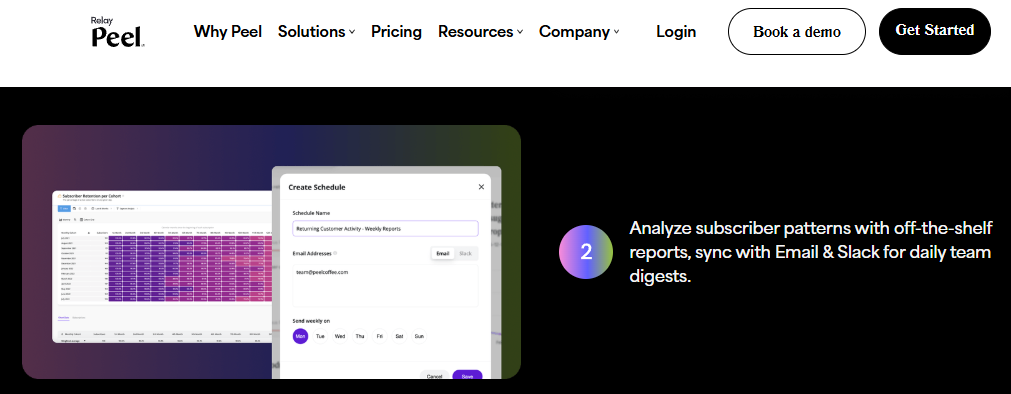
Peel schedules subscriber cohort reports for recurring email and Slack retention updates.
⭐ Why did we choose this tool?
Peel is the specialist. Where other tools bolt cohorts onto a marketing dashboard, Peel treats retention as the main event. It carries 40+ subscriber metrics plus cohort, LTV, and RFM analysis, and it backfills your history with no setup work. RFM means recency, frequency, and monetary value, the three behaviours that predict a repeat buyer. Peel holds a perfect 5.0 rating from 34 reviews on its Shopify App Store listing, and 4.5 on G2 from 32 reviews. Subscription brands on Recharge get the most out of it.
📊 Core evaluation metrics
Cohort dimensions: acquisition date, product, channel, RFM segment, and subscriber status
Margin aware cohorts: partial, revenue and LTV led rather than full contribution margin
Data sources connected: Shopify, Recharge, Skio, Klaviyo, and ad platforms
Time to first cohort answer: same day, history is backfilled automatically
Proactive alerts: yes, AI daily insights delivered to Slack or email
✅ Solutions offered
Cohort and retention reporting with 40+ customer metrics
Subscription retention reporting through native Recharge and Skio links
Daily automated insights pushed to Slack or email
💰 Pricing
Quote based, scaled to order volume. There is no published flat rate.
❤️ Best for
Subscription and consumable brands with a defined repeat cycle
Retention leads who want RFM segments they can export and action
Shopify stores that need cohort depth more than attribution
😊 Reviews
Great app for all things retention and cohort analysis! Easy to use but also excellent service (hi, Jordan!) which has enabled me to have custom reports built out to explore problems unique to the business. — Verified Merchant, Shopify Store Owner, 2026 Peel Insights , Shopify App Store Verified Review
I have loved working in Peel for our customer retention and insights projects. Their reporting capabilities are so robust that the ability to customize your search seems unlimited. My favorite features are the custom dashboards and audience building. — Verified Merchant, Retention Lead, 2026 Peel Insights , Shopify App Store Verified Review
❌ Where it stops
Peel does not reach into accounting data, so operating expenses stay outside the cohort. Several of its strongest workflows also depend on the Peel team building custom reports for you. Luca AI answers that same class of question without a services layer, because cohort logic is generated on request rather than pre-built, which is the core idea behind self service analytics tools.
1.4 Polar Analytics [toc=1.4 Polar Analytics]
Polar Analytics monitors ad spend anomalies and highlights creative performance through automated alerts.
⭐ Why did we choose this tool?
Polar is the pick when your team wants to define its own metrics. It centralizes Shopify, Meta, Google, and Klaviyo data into one place, then lets you build custom metrics and dashboards on top. Merchants describe it as a single source of truth, especially when running several stores or brands. It holds 4.9 across 116 reviews on its Shopify App Store listing, and 4.7 on G2. Every plan includes a success manager, which explains the support scores.
📊 Core evaluation metrics
Cohort dimensions: acquisition date, channel, product, market, and custom fields
Margin aware cohorts: yes, profit tracking with CAC, ROAS, and LTV in the same view
Data sources connected: Shopify, Meta, Google, TikTok, Klaviyo, and more
Time to first cohort answer: minutes to install, hours for data to populate
Proactive alerts: yes, automated reports and anomaly notifications
✅ Solutions offered
Unified dashboards across commerce and marketing sources
Custom metric builder for team specific definitions
Quote based, tied to order volume and connector count. No public flat rate.
❤️ Best for
Growth teams running several stores, brands, or geographies
Operators who want to define custom metrics rather than accept defaults
Small marketing teams that need low implementation effort
😊 Reviews
Great tool to centralise your dispersed data! Brings everything from Shopify to Meta ads into one place. It has revolutionised how we report and helps uncover hidden trends in campaign performance and product performance. Would recommend for small marketing teams due to the low cost and easy implementation — Verified Merchant, Marketing Lead, 2026 Polar Analytics , Shopify App Store Verified Review
Polar Analytics' dashboard and team have been nothing but excellent. It was a great start using a must needed BI and tools. I was able to realize benefits immediately. The team has been very supportive and available through out the onboarding process, and beyond. — Verified Merchant, Shopify Store Owner, 2026 Polar Analytics , Shopify App Store Verified Review
❌ Where it stops
Polar is still a dashboard product at heart. You build the view, then you read it. Luca AI and Polar overlap on unified data, and they differ on the interface: Luca AI returns a reasoned answer with its cause attached, so nobody has to build the chart first. If that distinction is the one you are weighing, compare the Polar Analytics alternatives directly.
1.5 Triple Whale [toc=1.5 Triple Whale]
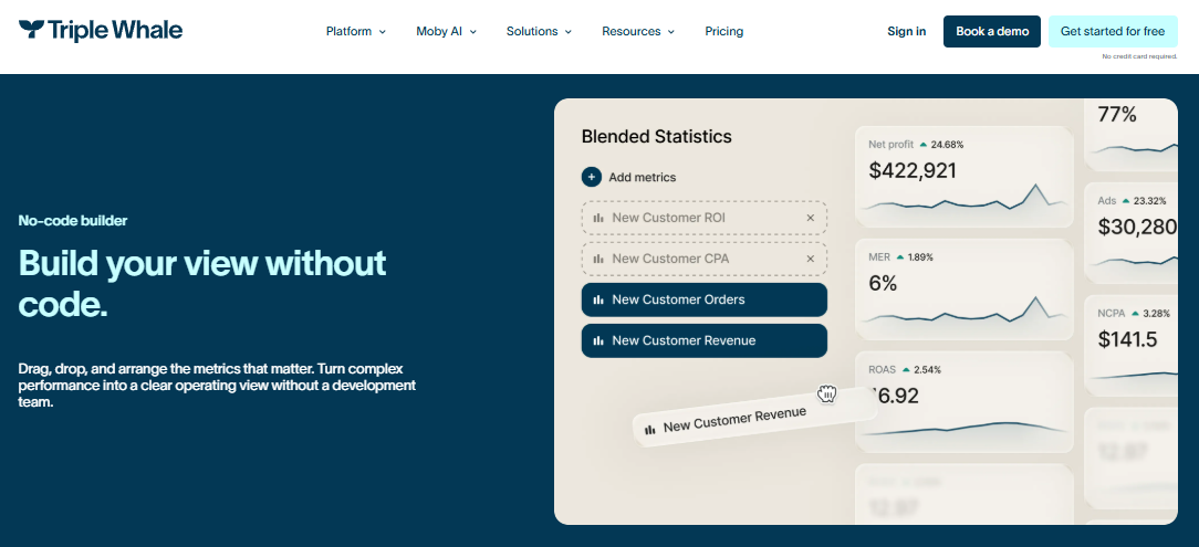
Triple Whale lets growth teams build custom views for blended ecommerce performance metrics.
⭐ Why did we choose this tool?
Triple Whale earns a place because paid media teams already live in it. Its first party pixel and Moby agents make it the default for attribution, and cohort analysis sits inside the Advanced tier alongside creative and product analytics. Attribution means assigning each sale to the ad that caused it. It averages 4.5 out of 5 from 482 reviews on G2. Cohorts here are a feature of a marketing platform, not the centre of gravity.
📊 Core evaluation metrics
Cohort dimensions: acquisition date, channel, campaign, product, and creative
Margin aware cohorts: partial, marketing and commerce costs only, no accounting layer
Data sources connected: Shopify, Meta, Google, TikTok, Klaviyo, and its own pixel
Time to first cohort answer: days, pixel and attribution setup comes first
Proactive alerts: yes, Moby agents run scheduled marketing analysis
✅ Solutions offered
First party pixel tracking and multi touch attribution
Marketing mix modelling for budget allocation
Cohort, product, and creative analytics on the Advanced tier
Moby AI agents for automated marketing analysis, one flavour of the agents for ecommerce now shipping across this category
Custom dashboards for blended performance
💰 Pricing
Quote based by order volume. G2 lists the Advanced tier, which contains cohort analysis, at $2,190 / Year on its Triple Whale pricing overview.
❤️ Best for
Brands spending heavily across Meta, Google, and TikTok
Teams whose first problem is attribution, not retention
Operators who want creative performance and cohorts in one place
😊 Reviews
I like that Triple Whale brings key ecommerce and marketing metrics into a single dashboard, making it much easier to understand performance across channels. — Verified User, Ecommerce Manager, 2026 Triple Whale , G2 Verified Review
The biggest challenge is that it can take some time to get comfortable with all the features and customize dashboards to match specific needs. The pricing can also feel high, especially for smaller teams. Additionally, like any analytics platform, there can sometimes be differences between Triple Whale data and the numbers shown in other platforms, which requires some extra validation. — Verified User, Growth Lead, 2026 Triple Whale , G2 Verified Review
⚠️ Where it stops
Triple Whale does not connect to Xero or QuickBooks, so cash and operating expense context stay out of the cohort. Reviewers also flag support quality and data discrepancies at points. Luca AI is not an attribution pixel and does not replace one. It reasons across commerce, ads, and accounting, which is a different job, and the trade offs are laid out in our list of Triple Whale alternatives.
Start here before you buy anything. Shopify's Customer cohort analysis report groups customers by first order date, then shows repeat purchase behaviour over time. Click any cell and you get total sales, average order value, orders per customer, top marketing channels, top locations, and a predicted spend tier for that cohort. Those predictions use 24 months of your store's own data, per Shopify's customer reports documentation. It costs nothing extra, and it answers the first three questions most operators have.
📊 Core evaluation metrics
Cohort dimensions: first order date, channel, product, subscription, and geography
Margin aware cohorts: no, revenue only, with no COGS, shipping, returns, or ad spend
Data sources connected: Shopify only
Time to first cohort answer: immediate, the report is already built
Proactive alerts: no, you open the report yourself
✅ Solutions offered
Prebuilt cohort table by first purchase period
Cohort drill down with AOV, orders per customer, and spend per customer
Predicted spend tier per cohort from 24 months of store data
Top marketing and sales channel attribution per cohort
Filters for subscription versus one time orders, with deeper options covered in our Shopify analytics guide
💰 Pricing
Included with your Shopify plan. Some cohort features require Shopify Plus.
❤️ Best for
Stores validating whether a paid cohort tool is justified
Operators with light paid spend and a single sales channel
Teams that want a reference point before importing data anywhere
😊 Reviews
For my needs, it's more beneficial to analyze contribution margin by cohort rather than just looking at revenue. I prefer having revenue, cost of goods sold, shipping, fees, refunds, and ad expenses displayed in a single row. — Shopify store owner, r/shopify, September 2026 Reddit Thread
We mainly use: Shopify's customer and order data, basic exports into spreadsheets, grouping customers by first purchase month, tracking repeat purchase rate and revenue over 30, 60, and 90 days. — Shopify operator, r/shopify_growth, April 2026 Reddit Thread
❌ Where it stops
The report is revenue only, and Sidekick cannot answer questions about cohort projections. That is the exact wall the Reddit quotes above describe. Luca AI reads the same Shopify data, then joins it to ad spend and accounting data, so contribution margin sits in the cohort row rather than in a spreadsheet, which is the point of proper Shopify business intelligence.
1.7 Saras iQ [toc=1.7 Saras iQ]
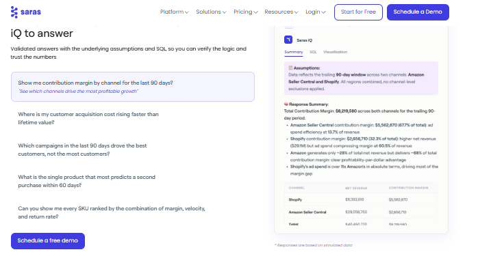
Saras iQ answers contribution margin and customer acquisition questions using channel-level ecommerce data.
⭐ Why did we choose this tool?
Saras belongs on the list for multichannel brands. Its Daton pipeline centralizes advertising, marketplace, storefront, subscription, and engagement data into a warehouse, and iQ reports on top. If you sell on Shopify and Amazon and retail, this is built for that shape. Saras Daton averages 4.7 out of 5 from 37 reviews on G2. Note the trade off: this is a warehouse first approach, so someone still interprets the output.
📊 Core evaluation metrics
Cohort dimensions: acquisition date, channel, marketplace, product, and region
Margin aware cohorts: yes, once cost data is modelled into the warehouse
Data sources connected: marketplaces, ad platforms, storefronts, and subscription tools
Time to first cohort answer: weeks, pipelines and models come first
Proactive alerts: yes, scheduled reporting through the BI layer
Marketplace and storefront performance consolidation
Product level reporting across channels
Analytics ready datasets for your own BI tool
💰 Pricing
From $300 / Month to Custom, depending on connectors and data volume.
❤️ Best for
Brands selling across Shopify, Amazon, and retail at the same time
Teams with an analyst, or budget for one
High data volume operations that want warehouse control
😊 Reviews
Daton has brought our data together from multiple sources and presents it visually in an easy-to-use way. One of the biggest benefits is being able to report on specific products across multiple channels, which gives us a much clearer view of performance and helps us make faster, more informed decisions. — Verified User, Ecommerce Analyst, 2026 Saras Daton , G2 Verified Review
The only drawback is that some team members find there are too many dashboards. Introducing more streamlined views through user permissions and roles would make the experience even stronger. — Verified User, Operations Manager, 2026 Saras Daton , G2 Verified Review
⚠️ Where it stops
G2 reviewers flag limited connectors and occasional data inaccuracies, which slows multi brand setups. Luca AI normalizes and standardizes data on ingestion across 200+ connectors, which removes the modelling phase this approach requires, and that is what ecommerce data integration should feel like. Different bet, same underlying problem.
1.8 Glew.io [toc=1.8 Glew.io]
⭐ Why did we choose this tool?
Glew handles the messy multi store reality that Shopify only tools ignore. It provides multichannel business intelligence for merchants, agencies, retailers, and B2B sellers. One agency has used it for over eight years, mainly for LTV and Facebook KPIs, including LTV by source. That last metric matters, because it tells you which channel buys customers who stay. Glew averages 4.0 out of 5 from 57 reviews on G2, the lowest of the paid tools here.
📊 Core evaluation metrics
Cohort dimensions: acquisition date, channel, source, product, and store
Margin aware cohorts: yes, product and channel profit reporting included
Data sources connected: Shopify, BigCommerce, Magento, ad platforms, and ESPs
Time to first cohort answer: days, connector setup then report configuration
Cross platform revenue attribution by channel and campaign
Scheduled reports for agencies and clients
💰 Pricing
Quote based, scaled by stores and data sources.
❤️ Best for
Groups and agencies reporting across several stores
Merchants on BigCommerce or Magento rather than Shopify alone
Teams that need LTV split by acquisition source
😊 Reviews
We have been using glew for over 8 years. As a vertically integrated DTC agency, the core metrics we use it for are: LTV, and FB advertising KPIs. In addition, the LTV by source allows us to see which channels are delivering us better, long-term clients for each dollar spent. — Verified User, DTC Agency Lead, 2026 Glew , G2 Verified Review
Glew.io is an amazing analytics aggregation service that allows you to view your data in one location. It has way better searching and filtering abilities than BigCommerce or the other services we have connected to it. — Verified User, Ecommerce Manager, 2026 Glew , G2 Verified Review
❌ Where it stops
Glew reports well and reasons little. You still decide what the cohort decay means. Luca AI ranks the influencing components behind that decay, which is the step Glew leaves to you, and our list of Glew alternatives shows who else closes it.
1.9 Mixpanel [toc=1.9 Mixpanel]
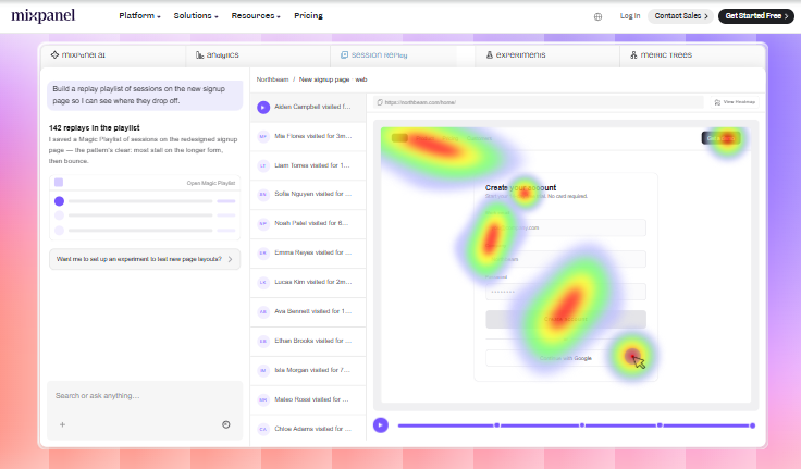
Mixpanel combines session replay and heatmaps to analyze product behavior beyond ecommerce orders.
⭐ Why did we choose this tool?
Mixpanel is on this list for one specific reader. If your cohorts are defined by in app events rather than orders, it is the right tool. It supports multi criteria cohorts, "did not do" logic for churn, identity resolution across web and mobile, and long lookback windows, all without SQL, per Mixpanel's own cohort analysis documentation. It averages 4.5 out of 5 on G2. For a pure Shopify store, though, it is the wrong shape.
📊 Core evaluation metrics
Cohort dimensions: any tracked event, behaviour, demographic, device, or geography
Margin aware cohorts: no, event based, with no COGS or returns concept
Data sources connected: SDKs, apps, warehouses, CDPs, and CRMs
Time to first cohort answer: weeks, event taxonomy and instrumentation first
Proactive alerts: yes, anomaly and threshold alerts on tracked events
Free tier available, then usage based paid plans up to Custom.
❤️ Best for
App, subscription, and marketplace products with event streams
Product teams measuring activation and feature adoption
Companies with engineering support for instrumentation
😊 Reviews
One thing I've found especially useful about Mixpanel is the funnel and retention analysis capabilities. It gave our product team much better visibility into how users move through onboarding workflows, adopt new features, and interact with campaign management tools over time. — Verified User, Product Manager, 2026 Mixpanel , G2 Verified Review
One challenge with Mixpanel is that the platform can become difficult to manage at scale if event tracking and naming conventions are not standardized early on. As more teams begin creating events, dashboards, and reports, it's easy for data to become inconsistent or duplicated, which can make analysis less reliable over time. — Verified User, Data Lead, 2026 Mixpanel , G2 Verified Review
❌ Where it stops
Reviewers repeatedly name the setup tax: each new event needs a developer, and messy naming ruins reports later. Luca AI carries no instrumentation step for commerce cohorts, because it reads the order, ad, and accounting records that already exist, which is how ecommerce data collection should work for a store.
1.10 GA4 [toc=1.10 GA4]
⭐ Why did we choose this tool?
GA4 makes the list because it is already installed and it is free. Its cohort exploration is genuinely capable once you know the settings, and acquisition cohorts by channel are useful for top of funnel work. The honest caveat comes from the practitioners: the interface is the weak point, and the default reports are not where the value sits. Treat GA4 as a session and acquisition tool, not a customer profit tool, and see our Google Analytics for ecommerce breakdown for the setup detail.
📊 Core evaluation metrics
Cohort dimensions: acquisition date, channel, event based cohorts, and audiences
Margin aware cohorts: no, session and revenue data only
Data sources connected: your site, Google Ads, and BigQuery export
Time to first cohort answer: hours in Explorations, if tagging is correct
Proactive alerts: limited, basic anomaly detection and custom alerts
✅ Solutions offered
Cohort exploration for retention by acquisition period
Acquisition and channel reporting
Funnel and path exploration
Audience building for Google Ads
BigQuery export for custom analysis
💰 Pricing
Free. GA4 360 starts near $50,000 / Year for high volume properties.
❤️ Best for
Stores needing a free acquisition cohort baseline
Teams already comfortable in Explorations or BigQuery
Marketers measuring traffic quality by channel over time
😊 Reviews
GA4 is massively more powerful. Things like the cohort exploration are incredibly useful if you know what to do with all the settings and data points. The problem with GA4 is just that it's a lot harder to get access to the data. — GA4 practitioner, r/GoogleAnalytics, December 2022 Reddit Thread
It fails as a reporting tool due to its complexity, and it fails as an exploratory data analysis tool due to its shortcomings. — GA4 practitioner, r/GoogleAnalytics, September 2023 Reddit Thread
❌ Where it stops
GA4 counts sessions, so it cannot tell you what a cohort cost to acquire or keep. Practitioners on r/GoogleAnalytics also note that cohort data via UTM capture is often matched by your ecommerce platform anyway. My read is that GA4 is a supplement here, never the system of record.
Luca AI sits at the top of this list for a reason the table makes plain. Eight of these nine alternatives stop at reporting, and the one that reasons across accounting data does it through a warehouse project. Luca AI normalizes commerce, ad, and accounting data on ingestion, answers cohort questions in plain English, names the drivers, and pushes the finding to Slack or email on a schedule.
Q2. How were these cohort analysis tools scored and selected? [toc=2. Scoring Methodology]
Each tool was scored out of 100 across five weighted criteria: Cross-Functional Data Coverage 25%, Cohort Depth and Margin Visibility 25%, Setup and Usability 20%, Verified User Reviews 15%, and Pricing Transparency 15%. Scores convert to stars in 20 point bands, so 0 to 20 earns one star and 81 to 100 earns five. Data coverage and margin visibility carry the most weight, because a cohort table blind to COGS, shipping, returns, and acquisition cost will report a healthy cohort that is quietly underwater.
⚠️ Why weights, and not vibes
Most cohort tool lists are published by cohort tool vendors. Saras Analytics ranks its own product first on its 2026 list, at a $300 per month entry price, without publishing a rubric. That is not dishonest. It is just unauditable.
So here is the disclosure up front. Luca AI publishes this article, and I founded Luca AI. The only fix I know is to show the weights, so you can disagree with them and re-score the list yourself.
⭐ The five criteria, and what fails each one
Each criterion has a disqualifying failure. If a tool hits that failure, it cannot recover through polish elsewhere.
Cross-Functional Data Coverage (25%). Fails if cohorts cannot see accounting and ad data together. Order data alone is not coverage, which is the whole argument behind cross channel analytics tools for ecommerce.
Cohort Depth and Margin Visibility (25%). Fails if the tool reports repeat rate only. Contribution margin is the deciding number.
Setup and Usability (20%). Fails if a first useful cohort needs an analyst, a pipeline build, or an event taxonomy.
Verified User Reviews (15%). Fails if ratings are thin, undated, or unverifiable on G2 or the Shopify App Store.
Pricing Transparency (15%). Fails if the price cannot be found, or spikes with order volume at peak season.
📊 Star bands
Score Bands and Star Ratings Used in This List
Score band
Stars awarded
0 to 20
⭐
21 to 40
⭐⭐
41 to 60
⭐⭐⭐
61 to 80
⭐⭐⭐⭐
81 to 100
⭐⭐⭐⭐⭐
The review criterion is not decoration. It caught real trade offs in this list, including the two below. Both came from paying users, not vendor pages.
Polar Analytics' dashboard and team have been nothing but excellent. It was a great start using a must needed BI and tools. I was able to realize benefits immediately. — Verified Merchant, Shopify Store Owner, 2026 Polar Analytics , Shopify App Store Verified Review
The biggest challenge is that it can take some time to get comfortable with all the features and customize dashboards to match specific needs. The pricing can also feel high, especially for smaller teams. — Verified User, Growth Lead, 2026 Triple Whale , G2 Verified Review
✅ Where the industry is heading, and my read
The whole category is drifting from monitoring toward recommending. Germán Loewe, CEO of Shalion, puts it plainly: no more descriptive analytics, give me prescriptive analytics, because the job is telling a brand to go right rather than left. I agree with him, and my rubric reflects that bias, which is why decision intelligence tools now score above passive dashboards.
I could be wrong on one weight. Pricing Transparency at 15% may be too low for a store under $2M, where a bad tier is a real cash event. Re-score it at 25% if that is you, and check our published plan pricing against the same standard.
Luca AI scores five stars on this rubric, and here is the audit trail. It clears Cross-Functional Data Coverage because cohorts compute against commerce, ad, and accounting data together. It clears Cohort Depth because one query returns the retention curve, the root cause, and the improvement areas. Judge those two claims directly.
Q3. What is customer cohort analysis, and how do you read a retention curve? [toc=3. Cohort Analysis Explained]
Customer cohort analysis groups buyers by a shared starting event, usually first purchase month, then tracks what each group does over time. Cohorts sit on the vertical axis, and elapsed periods sit on the horizontal. Read down a column to see whether newer cohorts retain better than older ones. Read across a row to see how fast a single cohort decays. Four types matter for e-commerce: time based, acquisition channel, entry product, and behavioural.
⏰ The table, in plain English
A cohort is just a group of customers who started at the same time. January buyers are one cohort. February buyers are another.
Shopify's own report builds this for you. It groups customers by first order date, then shows repeat purchase behaviour across the months that follow, as set out in Shopify's customer reports documentation. Our ecommerce customer analytics guide covers what to do with it next.
📊 A worked three cohort example
Say you pull three months and look only at Month 1 repeat rate.
Three Monthly Cohorts, Repeat Rate by Month
Cohort
Month 1
Month 2
Month 3
January
22%
11%
7%
February
28%
14%
9%
March
31%
16%
-
Reading down the Month 1 column, retention improved from 22% to 31%. Something you changed is working. Reading across the January row, that cohort decays fast after the first repeat.
Here is the trap, and it sets up the rest of this article. That same table can improve while contribution margin falls. If the March lift came from a 25% welcome discount, you bought repeat orders at a loss. The grid says win. The bank says otherwise. Our note on contribution margin versus gross margin shows the arithmetic.
✅ The four cohort types worth building
Each type answers one question, and only one.
Time based. Are newer cohorts retaining better than older ones?
Acquisition channel. Which channel buys customers who stay, not just customers who convert?
Entry product. Which first purchase leads to a second one?
Behavioural. What did retained customers do that churned customers did not? This is the terrain of customer behavior analytics.
Most operators build the first and skip the other three. Channel and entry product are where the money hides.
⚠️ What healthy decay actually looks like
Decay is normal. The question is the slope. One UK retailer tracking multi year cohorts sees roughly 30% of last year's buyers return this year, about 10% of two year old buyers, and around 5% of three year old buyers.
At larger scale, the early window tightens. A £50M beauty retailer reports about 20% of new customers making a second purchase inside 30 days. Those two numbers give you a rough sanity range for a repeat purchase business, and our customer churn analysis guide explains how to read the slope.
❌ The mistake almost everyone makes
Operators celebrate rows. A row going 22%, 11%, 7% feels like failure, so they panic about the January cohort.
Rows always fall. That is what decay means. The column is the scoreboard, because it compares cohorts at the same age. If your Month 1 column is flat across six months, nothing you shipped changed customer behaviour.
One more reading habit. Always pull cohorts by count and by revenue. A cohort can retain fewer customers while each spends more, which reads as a loss in one view and a win in the other.
Ask for both. Then ask what each retained order actually cost you to earn. That question is the one the next section is about.
Q4. Is Shopify's built-in cohort report enough, or do you need a dedicated tool? [toc=4. Shopify Native vs Tools]
Yes, Shopify's Customer cohort analysis report is genuinely useful and free. It groups customers by first order month, shows retention as a heatmap or curve, and filters by acquisition channel, product, subscription status, and geography. It stops at revenue. It cannot net out COGS, shipping, discounts, returns, or paid acquisition, and it will not tell you which discount or email touched the cohort. So it reports repeat rate, not repeat profit.
✅ What the native report does well
Find it under Analytics, then Reports, then Customer cohort analysis. Click any cell and Shopify shows total sales, average order value, orders per customer, and spend per customer for that cohort. The full field list sits in Shopify's own customers reports documentation.
It also gives you a predicted spend tier per cohort, built from 24 months of your own store data, plus the top marketing channels and locations behind it. For a store with light paid spend, that is enough to run on, and our Shopify analytics dashboard explainer walks the rest of the surface.
❌ The four hard limits
Each limit is structural, not a missing button.
No cost layer. Revenue only. No COGS, shipping, fees, returns, or ad spend.
No driver attribution. It shows that a cohort decayed, never which discount or flow caused it.
Shopify only. Meta, Google, Klaviyo, and Xero stay outside the view, which is why ecommerce data integration becomes the next project.
Access limits. The report is restricted to returning customers who accept marketing, and Sidekick cannot answer cohort projection questions.
⚠️ The driver gap, in operators' own words
This is the request the native report cannot serve. Both quotes below are from store owners, not vendors.
I'm looking for a tool to help with cohort analysis. Specifically, I want to see how many newly acquired users are retained each month after joining. Ideally, this tool also helps me identify what lead to the retention. — u/Interesting_Rock5343, Shopify store owner, r/shopify, September 2023 Reddit Thread
For my needs, it's more beneficial to analyze contribution margin by cohort rather than just looking at revenue. I prefer having revenue, cost of goods sold, shipping, fees, refunds, and ad expenses displayed in a single row. — Shopify store owner, r/shopify, September 2026 Reddit Thread
💰 Where free stops paying for itself
I will give you a threshold instead of a hedge. Graduate off the native report when paid acquisition passes roughly 30% of revenue, or when you sell across more than two product categories.
Below that line, buying a tool mostly buys you a nicer chart. Above it, the missing cost layer starts hiding real losses, which is the case our best Shopify analytics apps comparison works through.
💸 What that hiding costs
A supply chain consultant described a founder pushing a 72% gross margin bestseller. They rebuilt it line by line, adding shipping, returns, and service costs. Actual contribution margin was 8%.
She had scaled that product for two years. The data was sitting in her own systems the whole time. Gross margin only tells you what it costs to make the thing, never what it costs to sell it. That gap is exactly what customer profitability analysis is for.
Luca AI answers the driver question the native report cannot. Because it reasons over Shopify, ad platform, and accounting data together, you can ask why the March cohort decayed. Luca AI ranks the influencing components, including discount depth, entry SKU, and acquisition channel, instead of handing you a grid to interpret alone.
Q5. Which cohort metrics actually change decisions, repeat rate, margin, or category crossover? [toc=5. Metrics That Matter]
Repeat rate is the default metric because revenue data is easy to reach and cost data is not. Order streams sit in one API, while COGS, freight, returns, fees, and ad spend sit in four others with conflicting schemas, so vendors ship the metric they can compute cleanly. Two cohorts with identical repeat rates can differ by roughly $1,000 in kept contribution. The dimension that moves lifetime value hardest is not frequency but category crossover.
⚠️ The belief almost every dashboard encodes
Ask a founder if retention is healthy and they quote repeat purchase rate. It is one number, it moves, and every tool shows it. Fair enough.
The problem is architectural, not lazy. Orders live in Shopify. Landed cost lives in a spreadsheet or an ERP. Ad spend lives in Meta and Google. Returns and fees live in a payments export. Nobody ships a metric they cannot compute cleanly, so the industry standardized on the easiest one, which is why ecommerce data management decides what your cohort table can say.
💸 Two cohorts, same repeat rate, different business
Run the math on a $50 repeat order. Subtract product cost, pick and pack, shipping, payment fees, a welcome discount, and a return allowance. You keep somewhere near $15.
Now take two cohorts, both at 28% repeat rate, 500 customers each. Cohort A came in on full price and reorders at full price. Cohort B came in on a 25% discount and keeps using it.
Two Cohorts With Identical Repeat Rates and Different Kept Contribution
Cohort
Repeat rate
Net per repeat order
Kept contribution
A (full price entry)
28%
$15
$2,100
B (discount entry)
28%
$7.50
$1,050
Same grid cell. Roughly a thousand dollars apart. Your cohort tool called them identical. Our guide to tracking e-commerce unit economics shows how to build that second column properly.
❌ Gross margin is the wrong lens here
Gross margin only tells you what it costs to make the thing. It says nothing about what it costs to sell the thing.
One supply chain consultant works this out line by line with founders, and her rule is blunt. If you spend money to acquire a customer to sell a unit, that spend is a variable cost of the sale. Argue about where it lands on the P&L. Do not leave it out of product level math, because that is where ecommerce profit margins actually get decided.
✅ The twist: crossover beats frequency
Here is the part that surprised me. Standard advice says email more and discount more to lift frequency. The bigger lever is getting a customer into a second product category.
Anthony Mink at Live Bearded ran several cohort analyses against his raw data. Product category diversity turned out to be the leading driver of lifetime value, not order frequency. Anyone who bought body care stepped up 50% to 100% in LTV, and layering apparel and accessories produced the jump again. That reframes how you read ecommerce customer lifetime value.
That reframes your catalogue. Secondary SKUs stop being filler and become the post purchase engine. Mink's better performing flow did not hard sell the cross category product. It asked whether the customer wanted to learn about it, then educated the ones who opted in, which is the quiet core of most customer retention strategies for ecommerce.
⏰ What to measure on Monday
Three cohort views, in this order. Entry product cohorts netted to contribution. Channel cohorts netted to contribution. Crossover rate, meaning the share of each cohort that buys a second category within 90 days.
If you only build one, build the entry product view. It tells you which front door brings customers worth keeping.
Luca AI standardizes data definitions at the ingestion layer rather than reconciling them inside a report builder. That is the only reason margin aware and crossover cohorts compute without a data engineer. Plug in, ask, act, then ask Luca AI to simulate the cohort if crossover rises five points.
Q6. What repeat-purchase benchmarks tell you your cohort retention is actually bad? [toc=6. Retention Benchmarks]
Average e-commerce repeat purchase rate sits near 28.2%, with anything above 30% considered strong. A study of more than 156,000 DTC customers found 18.8%, meaning roughly 81% of customers never place a second order. Category matters more than the average: consumables and supplements run 22% to 44%, beauty 30% to 35%, apparel 20% to 26%, home goods 15% to 22%, and luxury 10% to 18%. Benchmark against your category and your own prior cohorts, never against a blended figure.
📊 The numbers, with their sources
Rivo's 2026 benchmark puts the e-commerce average repeat purchase rate at 28.2%. Shopify Enterprise cites a Beauchamp Sullivan analysis of over 156,000 DTC customers that found 18.8%.
Bluecore's 2025 Customer Growth Benchmarks, drawn from more than 100 major retailers, reported 16.5%. Decile's benchmarking guide reported 30%. That is a spread of nearly two to one on the same metric, and our list of top ecommerce KPIs explains which of them belongs on your weekly sheet.
⏰ Category baselines
Twelve Month Repeat Purchase Rate by Category
Category
12 month repeat purchase rate
Supplements and consumables
22% to 44%
Beauty and skincare
30% to 35%
Apparel and accessories
20% to 26%
Home goods
15% to 22%
Luxury and high AOV
10% to 18%
Consumables sit highest for a structural reason. The product runs out, which creates the occasion to buy again. Luxury sits lowest because the purchase cycle is measured in years, not weeks.
⚠️ Why the published averages disagree
Sample composition, mostly. Bluecore's 16.5% comes from large retailers with enormous one time buyer bases. Rivo's 28.2% skews toward Shopify brands. Decile's 30% reflects a different client mix again.
None of them are wrong. They are measuring different populations and calling the result "average." Using any single figure as your target is a mistake, and I have watched founders set strategy off one screenshot.
✅ A credible ceiling, from a real operator
Luke Bean runs data at Valente, a beauty retailer at roughly £50M. His cohorts show 70% to 80% of transactions coming from returning customers, and at 12 months about 65% to 70% of customers have made multiple purchases.
That is what a mature multi category retention engine looks like. It took years of catalogue depth and CRM work, not a clever email. Treat it as a ceiling, not a Q1 target, and use proper ecommerce customer segmentation to see who is actually carrying it.
💰 The three line self scoring test
Skip the industry average. Score yourself against yourself instead.
Pull your trailing 12 monthly cohorts and record Month 1 repeat rate for each.
Compare the newest six to the oldest six. If the column is flat, nothing you shipped changed behaviour.
Check your category band above. If you sit more than five points below it, the problem is product or onboarding, not email frequency.
Run that once a quarter. It takes twenty minutes and beats any benchmark report, and it pairs well with regular ecommerce performance analytics reviews.
❌ One number to stop quoting
Stop quoting blended repeat rate to your team. It averages your best entry product with your worst, then hides both.
Split it by entry product and channel. My read is that most brands discover one front door doing all the retention work, and two others quietly free riding on the average.
Luca AI computes these cohorts against your own trailing history rather than an industry table, which is what makes the self scoring test repeatable without a spreadsheet rebuild each quarter.
Q7. How do you choose the right tool for your stage, and what does it cost to run? [toc=7. Choosing and Deploying]
Choose by the unit your cohorts are defined in. If cohorts come from orders, you need an e-commerce retention tool. If they come from in app events, you need product analytics like Mixpanel. On price, Shopify's native report and GA4 are free, while GA4 360 starts near $50,000 a year. Dedicated tools run roughly $79 a month to $999 a month and up, often billed by order volume, which spikes your bill during BFCM exactly when margins are thinnest.
⚠️ The two families, and the buying mistake
There are two tool families here, and generic lists blend them. Event based tools like Mixpanel think in user actions. Order based tools like Lifetimely, Peel, and Polar think in purchases.
Buy the wrong family and you get a platform with no concept of COGS or a returns window. Mixpanel reviewers describe the real cost of that path: event tracking and naming conventions must be standardized early, or reports become unreliable as teams add events. Our overview of ecommerce analytics platforms separates the two families cleanly.
Volume tiers. Order based pricing jumps at peak season, when cash is tightest.
Connector limits. Extra sources often cost extra, or sit on a higher plan, so check your ecommerce API integrations list before signing.
Seats. Finance and ops users get added later, and the bill moves.
Implementation. Warehouse first tools need modelling work before the first useful cohort.
❌ Setup debt is the real bill
Reviewers name this repeatedly. Triple Whale users report weeks getting comfortable with features and customizing dashboards, plus data that needs validating against other platforms.
The biggest challenge is that it can take some time to get comfortable with all the features and customize dashboards to match specific needs. The pricing can also feel high, especially for smaller teams. — Verified User, Growth Lead, 2026 Triple Whale , G2 Verified Review
The only drawback is that some team members find there are too many dashboards. Introducing more streamlined views through user permissions and roles would make the experience even stronger. — Verified User, Operations Manager, 2026 Saras Daton , G2 Verified Review
Migration is worse. Luke Bean's team moved from Klaviyo to Bloomreach purely to get one customer record, and he calls it both expensive and difficult. Price that risk before you switch stacks for cohort data.
⏰ Verdict by revenue stage
Under $1M. Shopify native plus a spreadsheet. You do not have enough history to justify a subscription.
$1M to $5M. One margin aware tool. Lifetimely if you only need commerce and ads, Luca AI if accounting data belongs in the answer.
$5M and up. Unified data with reasoning on top, because the questions now span finance and ops, which is the case for an AI data analyst for ecommerce.
Skip free tiers for customer data. Deb Farnworth Wood banned her marketing team from free tools, because analyzing customer activity there means uploading customer data you do not want uploaded.
✅ The 14 day deployment loop
Connect Shopify, your ad platforms, and your accounting tool.
Load landed cost, shipping, fees, and a return allowance.
Pull 12 monthly cohorts by entry product, netted to contribution.
Ship one fix against the worst cohort and one against the best crossover path.
Re-pull the same table at day 30 and check the column, not the row.
Two proven fixes to borrow. Digital Darts found a day 27 subscriber giveaway cut Brez churn from 24% to 17%, and one plain text founder email produced $40K.
⚠️ Keep a human on the output
Do not let the AI be the quality check. Anthony Mink printed executive summaries for five days before realizing the hard part was translating them into an action. Our note on evaluating AI data agents covers what to test before you trust one.
Luca AI is priced against the decisions it changes rather than the rows it scans, and it is onboarded with your commercial rules the way you would brief a senior hire. Its agents re-run the cohort check on a cadence and push the delta to Slack or email. Cohort level vigilance, without the cohort level dashboard.
Which cohort in your store is quietly losing money? Tell me the entry product and I will tell you where I would look first, or tell us what you are building.
FAQ's
What are the best customer cohort analysis tools for e-commerce in 2026?
We rank ten tools for e-commerce cohort work in 2026: Luca AI, Lifetimely, Peel Insights, Polar Analytics, Triple Whale, Shopify's native cohort report, Saras iQ, Glew.io, Mixpanel, and GA4.
They split cleanly by job:
Margin-aware retention tools: Lifetimely, Polar Analytics, and Glew.io net cohorts to profit after COGS, shipping, fees, and ad spend.
Retention specialists: Peel Insights goes deepest on RFM and subscriber cohorts.
Attribution-first platforms: Triple Whale carries cohorts as a feature of a paid media stack.
Free baselines: Shopify's native report and GA4.
Event-based product analytics: Mixpanel, which is the wrong shape for an order-driven store.
Luca AI sits first because it reasons across commerce, ad, and accounting data in one query, so the retention curve arrives with its cause ranked beside it. Ask why the March cohort decayed and Luca AI names discount depth, entry SKU, and channel rather than handing back a grid.
The distinction that matters most is margin visibility. Seven of the ten report repeat rate only. If you want the reasoning behind our scoring, the rubric and star bands sit in the article, and our wider ecommerce analytics platforms breakdown separates the two tool families in more detail.
Does Shopify's built-in cohort analysis report replace a paid tool?
For some stores, yes. Shopify's Customer cohort analysis report is free and genuinely capable. Find it under Analytics, then Reports, then Customer cohort analysis.
It groups customers by first order date and gives you per-cohort detail when you click a cell:
Total sales, average order value, orders per customer, and spend per customer
A predicted spend tier built from 24 months of your own store data
Top marketing channels and top locations behind each cohort
Filters for acquisition channel, product, subscription status, and geography
Where it stops is cost. The report is revenue only, so COGS, shipping, discounts, returns, and paid acquisition never enter the calculation. It also never tells you which discount or email touched a cohort, and it is limited to returning customers who accept marketing.
Our threshold is specific rather than hedged: graduate off the native report once paid acquisition passes roughly 30% of revenue, or once you sell across more than two product categories. Below that line, a paid tool mostly buys a nicer chart.
Luca AI reads the same Shopify data, then joins it to ad spend and accounting records so contribution sits inside the cohort row. Our Shopify analytics guide walks the native surface first.
How much do customer cohort analysis tools cost per month?
Pricing spans free to enterprise, and the billing model matters more than the sticker price.
Shopify native report: included with your plan, with some cohort features tied to Shopify Plus.
GA4: free, with GA4 360 starting near $50,000 a year for high-volume properties.
Lifetimely: free up to 50 orders a month, then $79 a month at 500 orders, rising to $999 a month above 25,000 orders, plus a $75 Amazon add-on.
Saras iQ: from $300 a month to custom.
Triple Whale: quote based, with G2 listing the Advanced tier that contains cohort analysis at $2,190 a year.
Peel Insights, Polar Analytics, and Glew.io: quote based, scaled to order volume and connectors.
Four costs stay hidden in that table: volume tiers that spike during BFCM when cash is thinnest, connector limits that push you up a plan, extra seats once finance and ops join, and implementation time on warehouse-first tools.
Luca AI publishes flat tiers, starting at €299 a month for Starter, €499 for Growth, and custom pricing for Scale, so the bill does not move with your peak season. Convert any price into break-even terms, as our guide to tracking e-commerce unit economics sets out.
What is a good repeat purchase rate, and how do I know if my cohorts are bad?
Published averages disagree by nearly two to one, so treat all of them as context rather than targets.
Rivo's 2026 benchmark puts the e-commerce average at 28.2%, with above 30% considered strong.
A Beauchamp Sullivan analysis of more than 156,000 DTC customers found 18.8%, meaning roughly 81% of customers never place a second order.
Bluecore's 2025 benchmarks, drawn from 100-plus large retailers, reported 16.5%. Decile reported 30%.
Category matters far more than the blended figure. Supplements and consumables run 22% to 44%, beauty 30% to 35%, apparel 20% to 26%, home goods 15% to 22%, and luxury 10% to 18%. Consumables lead because the product runs out, which manufactures the next occasion to buy.
Our three-line self test beats any benchmark report. Pull your trailing twelve monthly cohorts and record Month 1 repeat rate for each. Compare the newest six to the oldest six, because a flat column means nothing you shipped changed behaviour. Then check your category band, and if you sit more than five points below it, the problem is product or onboarding rather than email frequency.
Stop quoting blended repeat rate internally. Split it by entry product and channel, using proper ecommerce customer segmentation.
Which cohort metric actually moves lifetime value, repeat rate or category crossover?
Category crossover, and by a wide margin. The standard playbook says email more and discount more to lift purchase frequency. The evidence from operators running cohort analysis against raw order data points elsewhere.
Anthony Mink at Live Bearded found product category diversity, not frequency, was the leading driver of lifetime value. Customers who crossed from their entry category into body care stepped up 50% to 100% in LTV, and layering apparel and accessories produced the jump again.
That reframes the catalogue. Secondary SKUs stop being filler and become the post-purchase engine. The flow that worked did not hard sell the second category either. It asked whether the customer wanted to learn about it, then educated the ones who opted in.
Three cohort views are worth building, in this order:
Entry product cohorts netted to contribution, which tells you which front door brings customers worth keeping.
Channel cohorts netted to contribution, not to conversion rate.
Crossover rate, the share of each cohort buying a second category within 90 days.
Luca AI standardizes data definitions at ingestion rather than inside a report builder, which is why crossover and margin-aware cohorts compute without a data engineer. Our note on ecommerce customer lifetime value covers the modelling detail.
Enjoyed the read? Join our team for a quick 15-minute chat — no pitch, just a real conversation on how we’re rethinking Ecommerce with AI - Luca
Loading Schedule...
Your AI Co-Founder is here.
Here’s why:
Shopify, Meta, Xero - one brain.
"Should I scale?" Answered with real data.
Growth capital. No applications. One click.
Thank you! Your submission has been received! Please book a time slot for the Meeting
Oops! Something went wrong while submitting the form.