Adding dashboards adds interpretation work. Automated ecommerce reporting delivers the finding, the cause, and the recommended move without anyone opening a tool.
Three tiers exist: scheduled export, scheduled dashboard, and reasoned report. Only the third removes analysis labor from your Monday.
Shopify has no native recurring report delivery on any plan. Your routes are Shopify Flow with ShopifyQL, a reporting app, or a workflow tool.
Automate a report only when you pull it weekly, it spans three or more sources, and a decision depends on it. Start with five reports.
Gross margin hides eight costs between supplier invoice and profit. Report contribution margin per SKU, annotated against a cross-brand median.
Exception reporting beats more tiles. Audit your metrics, then alert on stockouts, CAC drift above 30 percent, and delivery misses.
Q1. Why does another dashboard not fix your Monday reporting problem? [toc=1. The Dashboard Problem]
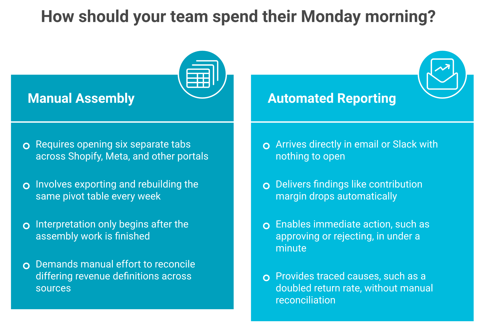
It is 8:40 on a Monday. An operations lead I will call Anita, running a skincare brand on Shopify, has six tabs open: Shopify reports, Meta Ads Manager, the returns portal, Klaviyo, Xero, and last week's spreadsheet. She is not analyzing anything yet. She is assembling.
More dashboards slow you down because they move interpretation onto you. A dashboard shows state. A decision needs synthesis across ads, margin, inventory, and cash. Operators routinely process a tiny fraction of the data their store generates, and brands that replace tile-scrolling with one scheduled digest report a sharp drop in dashboard logins within a week. The tiles were never the bottleneck.
The work does not disappear when you add a dashboard. It moves onto your Monday. Automated reporting removes the assembly step entirely.
⚠️ You are the integration layer, and that is the problem
Every ecommerce analytics dashboard you add creates one more surface that needs a human to read it. Most operators tell me they are barely processing five percent of what their business generates. The other ninety-five percent sits in tabs.
That is not a discipline failure. It is an architecture failure. Forty metrics displayed with equal weight means no metric carries weight.
❌ Dashboards were built to extract decisions, not to display capability
Somewhere along the way, reporting tools started competing on how much they could show. The original job was narrower. Take raw data, and pull out the decision a normal person cannot see in a spreadsheet.
Operators feel this gap immediately. The shallow layer works. The layer where money hides does not.
"The dashboard can feel cumbersome. Basic metrics like sales and visitors are fine, but when I need deeper insights (for example, which product/channel combination drives repeat purchases)..." - Store owner, r/ShopifyWebsites Reddit Thread
"Almost all of the super popular, easy-to-use, out-of-the-box reports now have to be manually created." - Verified User in Computer Software, Mid-Market, Google Analytics 4 - G2 Verified Review, 2/5
✅ What actually changes when the conclusion arrives instead
Here is the shift worth making. Stop asking what the dashboard should display. Start asking what decision needs to arrive, to whom, on what day.
A weekly report that says "contribution margin on your hero SKU fell to nine percent because return rate doubled" ends the Monday assembly ritual. A tile showing revenue up four percent does not.
💰 The honest hedge on this position
I could be reading the login-drop pattern too strongly. Some of that decline is novelty, and some teams genuinely need live views during a Black Friday hour.
My read right now is that the exceptions are narrower than the tooling market implies. Most sub-$10M brands need three delivered reports and two alerts, not another workspace to check.
Luca AI was built on one premise: operators do not need more dashboards, they need a layer that reads the connected data and returns the conclusion, with the reasoning attached.
Q2. What is automated ecommerce reporting, and how does it differ from a scheduled dashboard? [toc=2. Definition and Tiers]
A founder told me he had automated his reporting. What he had automated was the emailing of a CSV. He was still the analyst, just with a calendar invite attached.
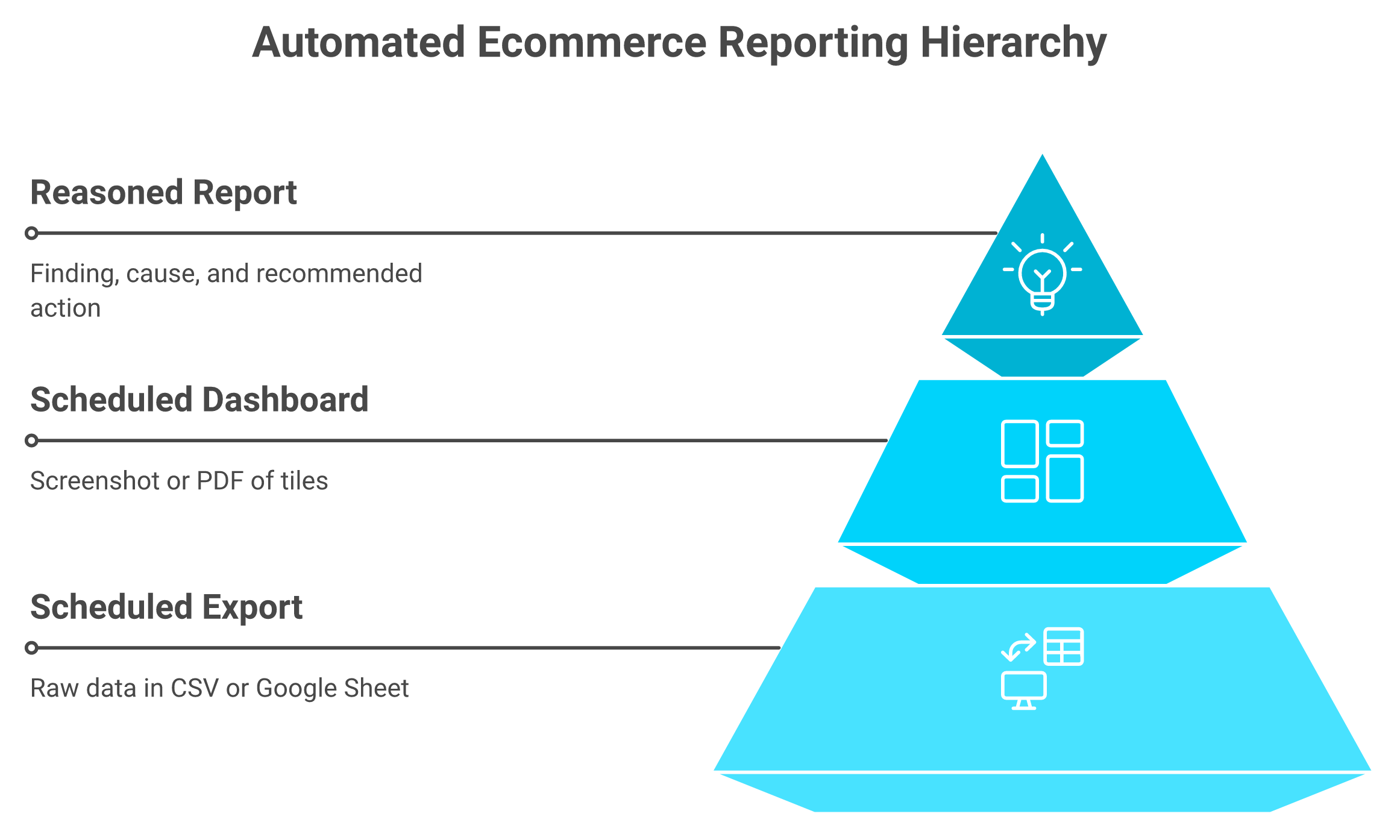
Automated ecommerce reporting generates and delivers store reports on a set schedule without anyone opening a tool. Queries run hourly, daily, weekly, or monthly, and results land in email, Slack, Google Sheets, or PDF. A scheduled export mails rows. A scheduled dashboard mails a picture. A reasoned report mails the finding, the cause, and the recommended move.
Most tools sell tier one or tier two and call it automation. Only the reasoned report takes the analysis off your desk.
⭐ The three tiers, and where each one leaves you
Three Tiers of Automated Ecommerce Reporting
Tier
What arrives
Who still does the analysis
Scheduled export
Raw rows in a CSV or Sheet
You, in a pivot table
Scheduled dashboard
A screenshot or PDF of tiles
You, comparing to last week
Reasoned report
Finding, cause, recommended action
Nobody, you approve or reject
Tier one is a delivery mechanism. Tier two is a delivery mechanism with charts. Only tier three removes analysis labor.
⏰ The five-minute test that exposes the difference
One operator described calculating net profit on a single delivery lane. It used to mean emailing an expert and waiting two days, by which point the customer had lost interest. With reasoning applied on top of connected data, that answer took five minutes.
That is the real measure. Not report count. Time from question to defensible answer.
❌ Where scheduling tools stop
Data-movement tools are good at moving data. They are not built to interpret it, and their alerting layer often disappoints.
"Supermetrics offers functionality such as error handling and email alerts, however I have yet to see either of these features work." - Verified reviewer, Supermetrics - G2 Verified Review, 2.5/5
"Sometimes the database pulls incorrect data and I have to keep updating it so that it pulls correctly." - Verified reviewer, Supermetrics - G2 Verified Review, 2.5/5
Merchant reviews of Shopify reporting apps cluster around the same value: scheduling and email delivery of the report, not prettier visualization. Delivery is what people pay for. Interpretation is what they still lack.
✅ The definition test to apply before you buy
Ask one question of any tool. After this arrives, does a human still have to work out what it means?
If yes, you bought delivery. If no, you bought reporting. The word automated only applies to the second.
Luca AI normalizes and standardizes data on ingestion, so a scheduled report does not inherit conflicting definitions of revenue from Shopify, Stripe, and your accounting tool.
Q3. Can Shopify schedule and deliver reports natively, and what are the real workarounds? [toc=3. Shopify Limits and Setup Paths]
Every few months this question lands in the Shopify community forums, and the answer has not changed. Someone is downloading the same reports by hand each month and cannot find the setting.
No. Shopify offers no native recurring report generation or email delivery on any plan, including Plus. Three routes exist: Shopify Flow's ShopifyQL analytics action, a reporting app from the App Store, or a workflow tool such as Zapier or Make. Destinations worth wiring: email, Slack, Google Sheets, Drive, SFTP, and BigQuery. Pick the route by how many non-Shopify sources the report needs.
❌ What native Shopify reports actually do
Native Shopify reports let you build, filter, and export. They will not run themselves on Tuesday at 6am and land in your inbox.
Operators discover this the slow way, usually after a quarter of manual downloads.
"My organization is constantly downloading Shopify reports on a monthly basis and I've been having the hardest time trying to find a native or third-party solution like Zapier, PowerAutomate..." - Merchant, Shopify Community: Automating Shopify Reports
✅ Choose your route by source count, not by feature list
Shopify Report Automation Routes and Delivery Destinations
Route
Best when
Delivers to
Real limit
Shopify Flow plus ShopifyQL
Shopify-only data, simple triggers
Email, Slack
Thin logic, no cross-source joins
Reporting app
Shopify plus a few app integrations
Email, Sheets, Drive, SFTP
Interpretation still manual
Zapier or Make
Glue between three or more tools
Almost anything
Breaks quietly, needs an owner
AI layer over a warehouse
Commerce, ads, finance, and ops together
Slack, email, app
Overkill under roughly $1M revenue
One rule holds. If the report needs three or more sources, skip Flow and go straight to an ecommerce business intelligence layer that joins data before it schedules anything.
⏰ The cost nobody prices: weeks before you trust the numbers
Pixel-based platforms need a calibration window before practitioners trust the output, commonly two to three weeks of traffic. That window is real, and it is rarely in the sales deck.
Even after calibration, cross-platform disagreement persists.
"Some data we still notice discrepancies between platforms, for example, tracking ads, and differences in the reported metrics like revenue." - Verified reviewer, Triple Whale - G2 Verified Review, 4/5
💸 Standardize your lookups before you automate anything
The tactical move that saves the most rework is boring. Force product, channel, and vendor names into one template before the first scheduled report runs.
Skip that step, and you will schedule a report that quietly double-counts a brand for six months.
Luca AI is an AI layer over a data warehouse rather than an attribution pixel, so the first useful report does not wait on a tracking calibration window, and it does not replace a pixel you already run.
Q4. Which reports should you automate first, and at what cadence? [toc=4. What to Automate First]
Most teams automate whatever was easiest to build. Then they wonder why the inbox filled up and nothing changed.
Automate a report only when three things are true. You pull the same data at least weekly, it spans three or more sources, and a decision depends on it. Start with five: daily contribution margin and sales by channel, inventory and stockout risk, blended CAC and MER against target, refunds and returns, and weekly cohort repeat-purchase rate. Cadence follows decision frequency, never data freshness.
✅ The three-part test before you build anything
Repetition is the first signal. If you pulled it once out of curiosity, it does not earn a schedule.
Source count is the second. Single-source questions usually belong in the platform itself. Decision dependency is the third, and it is the one people skip.
⭐ The five to automate first
Contribution margin and sales by channel, daily. Triggers pause-or-scale calls on ad sets. Goes to whoever owns spend.
Blended CAC and MER against target, weekly. Triggers budget reallocation. Goes to the growth owner.
Refunds and returns by SKU, weekly. Triggers product or listing fixes. Goes to merchandising.
Cohort repeat-purchase rate, weekly. Triggers retention spend decisions. Goes to the founder.
Five is enough. A sixth report usually replaces a decision rather than adding one.
⏰ Match cadence to the decision, not to the data
Data refreshes hourly. Almost no decision does. Sending a daily report for a monthly decision trains people to ignore the sender.
Ask the recipient one question. How often do you actually change something because of this? That answer is the cadence.
💰 Build for the decisions, not for the tool
The highest-leverage prep step takes an afternoon. Sit with each report recipient and write down the ten to twenty questions they ask on repeat.
Build only those. Everything else is a dashboard wearing a schedule.
⚠️ The seasonal trap this fixes
One buyer described spending three weeks before each buying cycle analyzing which vendors performed and which did not. That work cannot stretch to six weeks when two seasons overlap.
Vendor performance is a recurring question with a hard deadline. It belongs on a schedule, computed before the cycle opens, not assembled during it. The point of automation here is to move team hours from data assembly to judgment.
Luca AI takes the instruction in plain English: ask it for a weekly CAC report with graphs, reasoning, and channel-level attribution modelling across Meta and Google spend, and it ships on that cadence without a build step.
Q5. Which numbers belong in the report, and why is gross margin not one of them? [toc=5. Metrics That Earn a Slot]
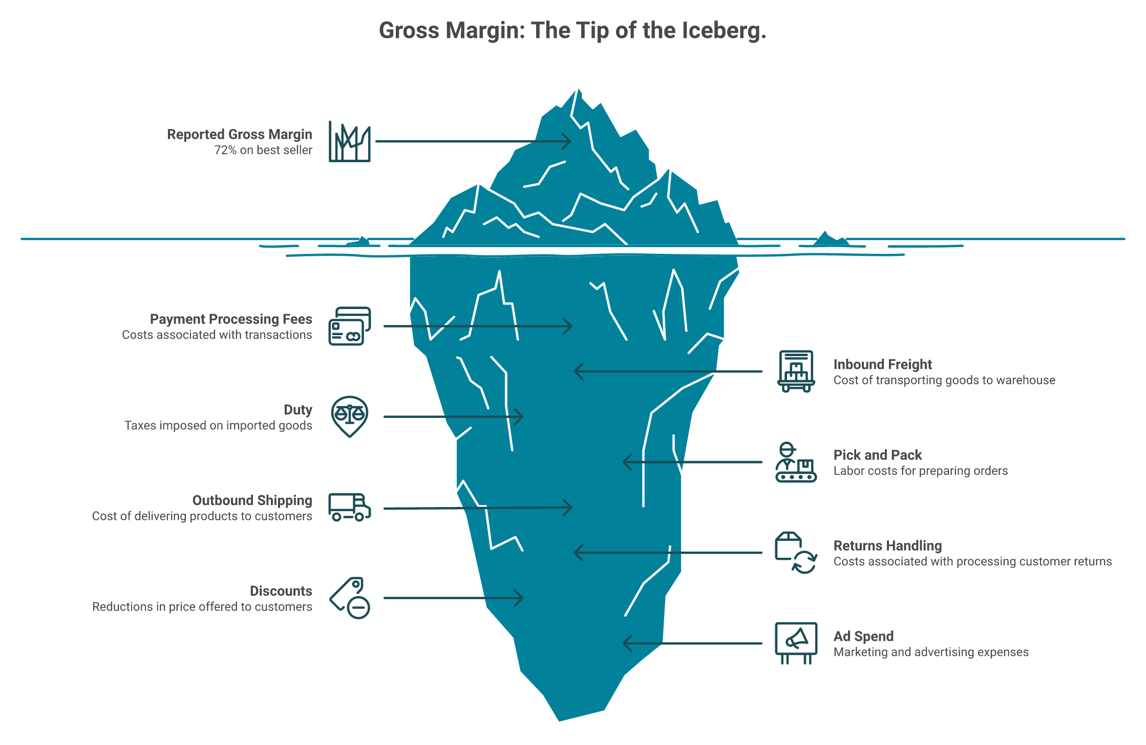
A founder slid a supplier invoice across the table and said her best seller ran a 72 percent gross margin. She could not make them fast enough. Twenty minutes into her P&L, line by line, actual contribution margin came out at 8 percent.
Gross margin only says what the product cost to make, not what it cost to sell. Automating it scales a false signal. Report contribution margin per SKU, blended CAC and MER, repeat-purchase rate, and cash runway, each annotated against a cross-brand median so the reader sees deviation rather than a raw number.
💸 The eight costs that sit between invoice and profit
Automating a gross margin report scales a false signal. The eight costs below the waterline are where stores actually bleed.
Between the supplier invoice and real profit sit payment fees, inbound freight, duty, pick and pack, shipping, returns handling, discounts, and ad spend. Gross margin ignores all eight.
That is where stores bleed. A SKU can look like your hero and quietly fund nothing.
⚠️ The blended-average trap
Her real error was not arithmetic. She used blended shipping costs across every product, instead of the actual cost for that one heavy SKU.
Blended anything hides the outlier you needed to find. Operators solve this by building per-SKU and per-destination rows by hand, which is exactly the labor worth automating with a real unit economics tracking process.
"It has pretty substantial limitations for ecommerce tracking and often isn't close to accurate for conversion rate, number of orders, or revenue." - Verified User in Information Technology and Services, Google Analytics - G2 Verified Review, 1.5/5
✅ The five lines worth a schedule, with medians attached
Metrics That Earn a Slot in an Automated Ecommerce Report
Line
Why it earns a slot
Reference point
Contribution margin per SKU
Only line that says if the product funds the business
Your own trailing 90 days
Blended CAC and MER
Catches efficiency drift before cash does
Median CPA $32.74 across 30,000+ brands, 2025
Conversion rate by channel
Separates traffic problems from offer problems
Median CVR 2.01%, CTR 1.77%, 2025
Channel mix share
Flags dangerous concentration
Meta 61 to 72 percent of DTC spend, Q1 2026
Repeat-purchase rate and cash runway
Ties retention to solvency
Your own cohort baseline
A number without a reference point is trivia. Pair every line with a median, and the report becomes a verdict.
⏰ What the automated report must compute
Pull unit cost, landed cost, and returns into the same row as ad spend. Then rank SKUs by contribution dollars, not by revenue.
I have watched that single ranking change reorder decisions in one meeting. Revenue rankings almost never do.
💰 My honest hedge on benchmarks
Medians are useful and also blunt. A supplement brand and a furniture brand share almost nothing on CPA.
My read is that you use medians to spot direction, then trust your own trailing data for the actual call.
Luca AI reads accounting, payments, and 3PL data alongside Shopify and Meta, which is why the margin line in its reports is contribution rather than gross.
Q6. How do you set alerts so you only hear from your data when it matters? [toc=6. Exception Reporting]
A Shopify seller posted that he had been paying for clicks to a sold-out product page since the weekend. Nothing was broken in his dashboard. He simply had no reason to look at that tile on a Saturday.
Exception reporting replaces tiles with thresholds. Run a metric audit first, which typically removes 40 to 60 percent of what you currently display, then alert on your three most expensive failure modes: stockouts, CAC spiking more than 30 percent above target, and carrier delivery misses. Everything else waits for the weekly report.
❌ Forty metrics with equal weight means none has weight
When every number is on screen, nothing on screen is urgent. Teams stop reading, then blame themselves for it.
"Found out today I've been paying for clicks to a sold out page since the weekend." - Store owner, r/shopify Reddit Thread
✅ Run the audit in one afternoon
List every metric anyone currently sees. Beside each, write the last decision it changed and the date.
Anything with a blank beside it goes. Most teams cut roughly half the list on the first pass.
⚠️ The three thresholds that pay for themselves
Three Exception Thresholds Worth Setting First
Failure mode
Trigger
Who gets pinged
Cost of missing it
Stockout risk
Units below restock lead time, not below zero
Ops and buying
Paid clicks to a dead page
CAC drift
30 percent above target, two days running
Growth owner
Spend burned before the weekly
Delivery or SLA miss
Carrier promise breached by 48 hours
CX lead
Refunds and a review hit
Set the stockout buffer by lead time, not by a round number, using your inventory management data. Alerting at zero units is alerting after the loss.
⏰ How to avoid alert fatigue
Use standard-deviation triggers for anything noisy. A ping when a metric moves two deviations from its own pattern beats a fixed threshold that fires weekly.
Plenty of tooling promises alerting and quietly never delivers it. Test yours by forcing a breach in a sandbox before you trust it with inventory.
"All of the data was unreliable and always showed different metrics than in our FB/IG accounts." - Verified reviewer, Supermetrics - G2 Verified Review, 0/5
⭐ The masking problem alerts catch and dashboards do not
One retailer found a category that had collapsed from 20,000 units to five, hidden because another category grew slightly and offset it. Nobody noticed the swap for a full year.
Totals hide reversals. Category-level thresholds catch them the week they start.
Luca AI scans connected data continuously and pings Slack or email when ROAS dips, inventory falls below a threshold, or CAC spikes, with the contributing cause traced rather than the number alone flagged.
Q7. How do you move from descriptive reports to prescriptive recommendations? [toc=7. Descriptive to Prescriptive]
The most useful thing an analytics leader said to me last year was blunt. Stop selling monitoring. Tell the brand to go right, and explain why right beats left.
A descriptive report says CAC rose 18 percent. A prescriptive report says CAC rose 18 percent because a creative cluster fatigued, the affected SKU carries 11 percent contribution margin, and the move is to cut that ad set and shift budget to the returning-customer campaign. Prescriptive means naming the turn, with the reasoning attached.
⭐ The same finding, two ways
Descriptive Reporting Versus Prescriptive Reporting
Descriptive version
Prescriptive version
CAC up 18 percent week over week
CAC up 18 percent, driven by one fatigued creative cluster
Meta spend up, ROAS down
Spend shifted to prospecting, returning-customer campaign underfunded
Hero SKU revenue flat
Hero SKU margin down to 11 percent after return rate doubled
No action stated
Cut ad set 4, move 20 percent of budget, recheck Thursday
The left column is a status update. The right column is a decision someone can approve in thirty seconds.
❌ Humans are the wrong consumer of raw metrics
We are bad at digesting rows of numbers, and worse at holding six sources in working memory. The data is better read by a machine first.
✅ What root-cause work looks like inside a scheduled report
Three steps, in order. Detect the outlier, test the influencing components across sources, then rank the candidate causes by contribution.
Ask Luca AI to run that sequence on a weekly cadence, so the report arrives with the cause ranked instead of the metric merely flagged.
⚠️ Where single-source tools stall
Attribution disagreements are the clearest example. Two platforms credit the same order differently, and neither can adjudicate, which is why operators keep hunting for Triple Whale alternatives.
"Triple Whale will attribute more revenue to the email that was sent out, but the platform will attribute more revenue to the SMS that was sent out." - Verified reviewer, Triple Whale - G2 Verified Review, 4/5
Both quotes are true at once. The tool is pleasant to use and still cannot settle a cross-channel dispute alone.
💰 My position, stated plainly
Descriptive analytics is finished as a purchase category for stores under $10M. Paying monthly to be told what already happened is a poor trade.
I could be early on this. Some teams still need the raw view for audits, and I would not take that away from a finance lead.
Luca AI is trained on the relationships between ecommerce metrics, so it surfaces the outlier, traces influencing components across sources, and states the recommended move inside the same report.
Q8. What architecture sits underneath, and should you build it or buy it? [toc=8. Architecture and Build vs Buy]
A leader I respect told me his company spent about ten million dollars building a system to turn data into meaning. Then general models arrived and did it better. He said the learning was interesting. I would call it expensive.
Four layers sit underneath any automated report: ingestion from Shopify, Meta, Google, Klaviyo, accounting, and 3PL; normalization so revenue and customer mean one thing everywhere; a reasoning layer that computes and explains; and delivery into email or Slack. Skip normalization and you spend a year cleaning data before any report is trustworthy.
⭐ The four layers, plainly
Ingestion. Move data in on a schedule. Connectors break silently, so somebody owns them.
Normalization. Force one definition of revenue, customer, and channel across sources.
Reasoning. Compute, compare, and explain the change.
Delivery. Push the result where the decision gets made.
Storage, ingestion, transformation, and visualization are separate jobs. Stitching them yourself means buying four tools and wiring them into your ecommerce tech stack.
❌ Normalization is the layer everyone skips
Skip it, and your reports disagree with each other forever. Feed messy exports into a model, and it answers confidently and wrongly.
That is usually laziness, not a model limitation. Define your metrics once, before anyone builds a chart, and treat ecommerce data management as the first task rather than the last.
One operator switched on his inventory system's native AI forecasting and shut it down after it hallucinated. Another brand shipped an AI-generated product image with the rear derailleur drawn onto the front wheel.
Sample ten outputs against a hand-built calculation before any report reaches a decision-maker. Luca AI normalizes and standardizes data on ingestion, which removes the definition drift that causes most of these errors, though it does not remove your review step.
💰 The build path is real engineering
A common build is Fivetran plus Snowflake plus dbt. Standing that up well takes roughly eight to twelve months and a dedicated engineer.
Operators say the same thing in plainer language.
"Unless you have a specific need to integrate your ERP data into a complex business intelligence setup, you likely won't require a full-fledged data warehouse." - Store operator, r/shopify Reddit Thread
✅ The call by stage
Build Versus Buy by Revenue Stage
Stage
Call
Why
Under $1M, two sources
Skip the stack
Native reports plus a weekly export is enough
$1M to $10M, five or more sources
Buy layers one and two
No engineer to spare, and definitions still need governing
Luca AI sits as a reasoning layer over a unified warehouse spanning commerce, marketing, finance, and operations, which is why it fits the $1M to $10M brand with no data hire and not the enterprise that already employs one.
Q9. Which tools actually automate reporting, and which just schedule a dashboard? [toc=9. Tool Comparison]
Every tool in this category claims automated reporting. Most automate the sending. Very few automate the thinking, and the difference shows up in month three, when your team quietly stops opening the email.
Score every tool on four questions. Does it reason or only display? Does it push without being opened? Does it trace root cause across sources? Does it need a calibration period before you trust it? Luca AI covers all four. Triple Whale reasons across commerce and marketing only. Supermetrics and Report Pundit move and schedule data well, but leave interpretation to you.
⭐ The scored comparison
Automated Reporting Tools Scored on Four Criteria
Tool
Reasons, not just displays
Pushes on a schedule
Cross-source root cause
Trust delay
Luca AI
Yes
Yes, Slack, email, app
Yes, commerce, ads, finance, ops
None, no pixel to calibrate
Triple Whale
Partly, marketing and commerce
Yes
Marketing only
2 to 3 weeks pixel calibration
Supermetrics
No, data movement
Yes
No
Connector setup and upkeep
Report Pundit
No, report builder
Yes, email and SFTP
No
Low, Shopify-centric
GA4 and Looker Studio
No
Partly
No
High, rebuild reports yourself
Power BI or Tableau
No, you model it
Yes
Only what you model
Months, needs an owner
✅ Luca AI, and where it does not fit
Luca AI is an AI layer over a unified warehouse, priced at $250 per month for Founder, $500 for Growth, and $750 for Scale. Ask it a question in plain English and it answers from your own connected data.
It is not an attribution pixel, and it does not replace one. It also does not suit enterprises that already employ a data team, or stores too early to have data worth reasoning against.
⚠️ The honest limits on the rest
Triple Whale is genuinely pleasant to use for multichannel marketing views. It cannot see your accounting layer, so it cannot tell you the cash consequence of its own recommendation, which is why buyers shortlist Triple Whale alternatives once finance joins the evaluation.
Data pipes are the other trap. They work until a connector changes, and then somebody owns the fix.
"We were hoping to automate our suite of 25+ clients reporting, but unfortunately, it has caused more of a headache than it has provided any substantial value." - Verified reviewer, Supermetrics - G2 Verified Review, 0/5
"The interface and reporting structure are not very intuitive at first, and finding specific metrics or building custom reports can take time." - Aman S., Performance Marketing Head, Google Analytics - G2 Verified Review, 2/5
💰 The BI tools are not wrong, just slow
One retail leader told me he pulls about 95 percent of what he needs from Power BI. Another said Power BI has fallen behind on pace and readiness for AI work, compared with Looker.
Both are right. Classic BI answers the questions you already modeled, and nothing else, which is the gap AI-powered BI tools for ecommerce were built to close.
⏰ Pick by stage, not by feature count
Under $1M with two sources, use native reports and a weekly export. Between $1M and $10M with five or more sources, buy a layer that joins and reasons.
Above $10M with a data engineer, build the warehouse and buy the reasoning. Ask Luca AI to run the recurring questions in that last setup, rather than rebuilding a semantic layer twice.
Luca AI sits first in this table for one reason: it reasons across commerce, marketing, finance, and operations in a single layer, then pushes the conclusion out on your cadence.
Q10. Your report says reorder but your cash says wait, so how do you compare funding options? [toc=10. Funding the Reorder]
A buyer once described the constraint perfectly. A store runs on two train tracks, inventory on one side and cash on the other, and both have to move in parallel. Your report can flag a winning SKU in March. If the money lands in June, the season already closed.
Compare capital on four numbers only: total cost of the advance, time from request to funds in account, minimum viable draw size, and repayment structure against your cash cycle. Luca AI prices each draw dynamically against current performance rather than one application snapshot, funds draws from roughly EUR 10K to 50K on request, and deploys in one click with no application.
💰 The four numbers, defined
Total cost. Most providers quote a flat fee, not an APR. A 10 percent fee repaid in three months is not 10 percent money.
Speed. Measure request to cleared funds, not approval. Draw size. The smallest useful amount matters more than the maximum. Repayment. A daily revenue sweep punishes your best month, so model it against your cash flow forecast before signing.
⭐ The market, on capital metrics only
Ecommerce Funding Providers Compared on Capital Metrics
Provider
Stated cost
Speed to fund
Draw structure
Repayment friction
Luca AI
Priced per draw, repriced as performance changes
One click, no application
Small draws, roughly EUR 10K to 50K
Sized to avoid idle capital
Wayflyer
One fixed fee, typically 5 to 10 percent
About 24 hours after onboarding
Lump sum advance
Daily or weekly revenue share, 3 to 9 months
Clearco
8 to 14 percent flat fee, 35 to 40 percent effective APR reported
If you are weighing the two structures side by side, the Luca AI versus Wayflyer breakdown runs the same four numbers in more depth.
❌ The sizing trap nobody prices
A large advance carries fee on every euro, including the euros that sit in your account doing nothing. Idle capital is still paid-for capital.
Providers earning on advance size have a reason to suggest a bigger number. I would rather take EUR 50K, prove the return, and draw again, which is the core argument against classic revenue-based financing structures.
⚠️ What operators actually complain about
The complaints cluster on timing and control, not on the headline fee.
"They delivered funding when we didn't need it and demanded remittances when we needed funding. Absolute disaster." - Seller on 8fig, r/AmazonTools Reddit Thread
"Fees are on the high side (especially ClearAngel at 0.7% of revenue). Loan/funds does not go into company account, but paid through invoice. Aggressive repayment schedule." - Reviewer, Clearco - Trustpilot Verified Review
"So far we connected amazon and shopify and got everything done in 5 days. We have no complaints for now." - Reviewer, 8fig - Trustpilot Verified Review
Ratings say the same thing in aggregate. Wayflyer holds 4.6 from 527 Trustpilot reviews, while 8fig sits at 3.8 from 268 with an F from the BBB.
⏰ Many small draws beat one large advance
Run the math on your own cash cycle. Four draws of EUR 50K, priced as performance improves, usually cost less than one EUR 200K advance held for nine months.
Luca AI earns on subscription rather than advance size, which is why its sizing guidance points down as often as up.
Q11. What should you ship this Monday? [toc=11. Monday Action Plan]
The reporting work most teams do on Monday is assembly, not analysis. One retail operator described tasks he assumed would take two weeks getting handled in about 90 seconds once the data was clean and the question was clear.
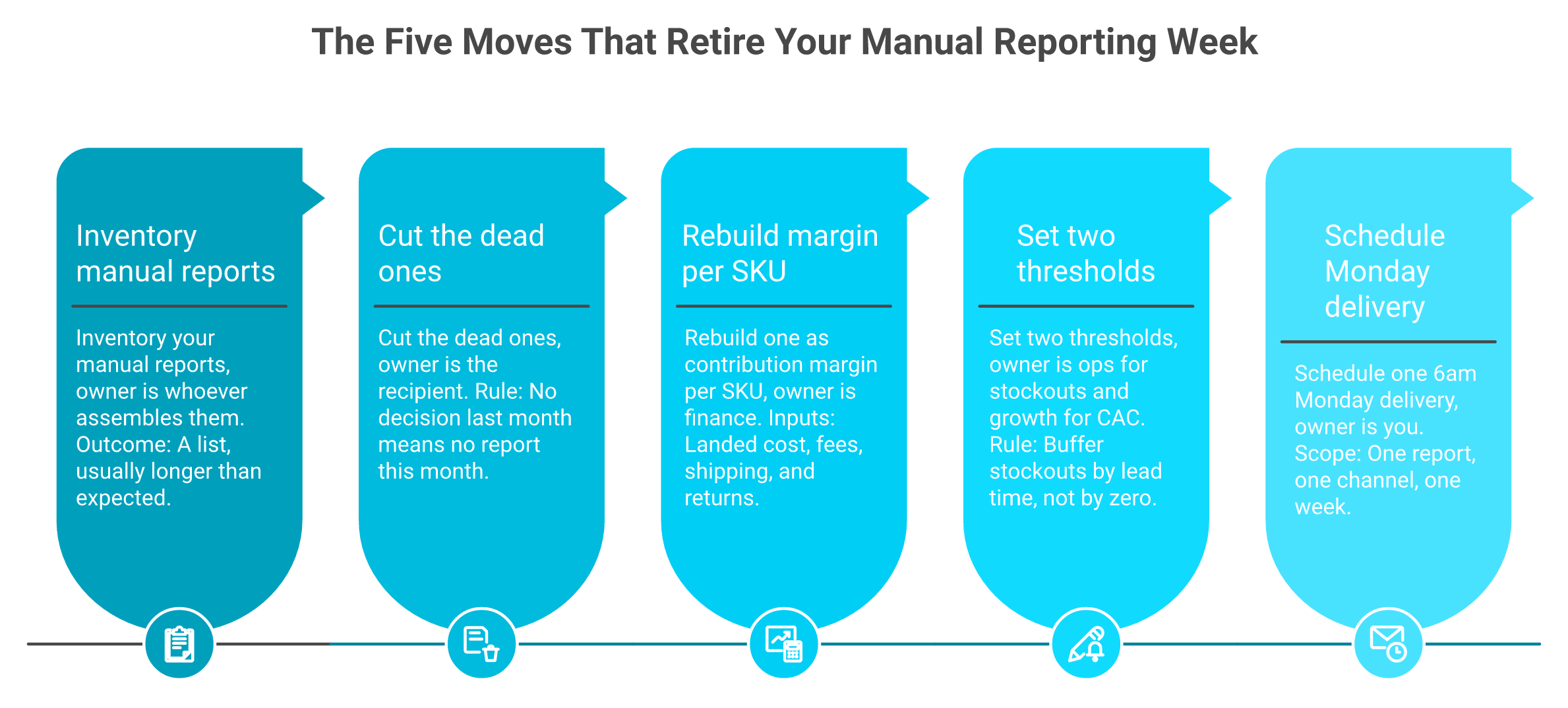
Five moves. List every report your team assembles by hand. Kill the ones nobody acted on last month. Rebuild one as contribution margin per SKU. Set two thresholds, on stockouts and on CAC. Schedule one Monday 6am delivery. Then log how often anyone opens a dashboard the following week.
✅ The five moves, with owners
One report and two alerts is the whole first week. Track dashboard opens afterwards to see whether the answer beat the search.
Inventory your manual reports. Owner: whoever assembles them. Output is a list, usually longer than expected.
Cut the dead ones. Owner: the recipient. Rule: no decision last month means no report this month.
Rebuild one as contribution margin per SKU. Owner: finance. Include landed cost, fees, shipping, and returns.
Set two thresholds. Owner: ops for stockouts, growth for CAC. Buffer stockouts by lead time, not by zero.
Schedule one 6am Monday delivery. Owner: you. One report, one channel, one week.
⏰ The measurement that tells you it worked
Count dashboard opens for the week before, then the week after. A sharp drop is not disengagement. It means the answer arrived before anyone had to go looking, which is the point of automated data reporting in ecommerce.
Ask Luca AI to run those five moves as standing instructions, so the Monday report arrives with the reasoning attached rather than assembled by hand.
⚠️ Where this goes wrong
Teams try to ship all five reports in week one. Then the thresholds fire constantly, and everyone mutes the channel.
Ship one report and two alerts. Add the third only after someone acts on the first.
💰 What I am still sitting with
My honest uncertainty is about autonomy. I am comfortable with a system that names the turn, and less comfortable with one that takes the turn on ad spend without a human nod.
Some operators I respect disagree, and say tight guardrails slow the learning. My read for 2027 is that approval-gated agentic action becomes the default for spend and inventory, while reporting itself goes fully hands-off much sooner.
⭐ The question worth arguing about
If a report only exists to trigger a decision, how many of your current reports would survive a month of scrutiny? Most teams land somewhere between two and four.
Tell me what your list looks like after the cut. I am collecting these, and the pattern across brands is more interesting than any single one.
Luca AI runs this checklist as a standing instruction: connect the sources, set the thresholds, and the Monday report arrives with the analysis already done.
FAQ's
What is automated ecommerce reporting, and how is it different from a scheduled dashboard?
Automated ecommerce reporting generates and delivers store reports on a set schedule without anyone opening a tool. Queries run hourly, daily, weekly, or monthly, and the output lands in email, Slack, Google Sheets, or a PDF.
The distinction that matters is what arrives:
Scheduled export: raw rows in a CSV. You still build the pivot table.
Scheduled dashboard: a picture of tiles. You still compare it to last week.
Reasoned report: the finding, the cause, and the recommended action. Nobody analyzes anything, you approve or reject.
Only the third tier removes analysis labor. The first two relocate it into your inbox.
Luca AI pushes weekly and monthly reports that carry the graphs, the reasoning behind the movement, and a recommendation, into Slack or email. We built it that way because the chart is a courtesy for the human reader, while the reasoning is the substance.
Apply one test before you buy anything. After the report arrives, does a person still have to work out what it means? If yes, you bought delivery, not reporting. If you want the fuller category breakdown, our guide to automated data reporting in ecommerce walks through each tier with examples.
Can Shopify schedule and email reports automatically?
No. Shopify offers no native recurring report generation or email delivery on any plan, including Plus. Native reports let you build, filter, and export, but they will not run themselves on Tuesday at 6am and land in your inbox.
Three workarounds exist, and the right one depends on how many non-Shopify sources the report needs:
Shopify Flow with the ShopifyQL analytics action: fine for Shopify-only data and simple triggers, thin on logic, no cross-source joins.
A reporting app from the App Store: good for Shopify plus a few app integrations, delivers to email, Sheets, Drive, or SFTP, but interpretation stays manual.
A workflow tool such as Zapier or Make: glue for three or more tools, and it breaks quietly, so somebody has to own it.
One rule holds across all three. If the report needs three or more sources, skip Flow and use a layer that joins the data before it schedules anything.
Luca AI is an AI layer over a data warehouse rather than a tracking pixel, so the first useful report does not wait on a calibration window. Our breakdown of Shopify reporting covers the native limits and each setup path in detail.
Which ecommerce reports should I automate first, and at what cadence?
Automate a report only when three things are true. You pull the same data at least weekly, it spans three or more sources, and a decision depends on it. If you pulled it once out of curiosity, it does not earn a schedule.
Start with five, each tied to the decision it triggers:
Contribution margin and sales by channel, daily. Triggers pause-or-scale calls. Goes to whoever owns spend.
Inventory and stockout risk, daily. Triggers reorder timing. Goes to ops and finance together.
Blended CAC and MER against target, weekly. Triggers budget reallocation.
Refunds and returns by SKU, weekly. Triggers product or listing fixes.
Cadence follows decision frequency, never data freshness. Data refreshes hourly, but almost no decision does, and a daily report for a monthly decision trains people to ignore the sender.
Luca AI takes the instruction in plain English, so you can ask for a weekly CAC report with graphs, reasoning, and channel-level attribution modelling, and it ships on that cadence with no build step. Before you build anything, interview each recipient and write down the ten to twenty questions they ask on repeat, then check them against the ecommerce KPIs that actually drive decisions.
Why should an automated report show contribution margin instead of gross margin?
Gross margin only says what the product cost to make. It says nothing about what it cost to sell, so automating it scales a false signal on a schedule.
Eight costs sit between the supplier invoice and real profit:
Payment processing fees and inbound freight
Duty, pick and pack, and outbound shipping
Returns handling, discounts, and ad spend
We watched a founder present a best seller at 72 percent gross margin. Twenty minutes through her P&L, line by line, actual contribution margin came out at 8 percent. Her error was not arithmetic. She used blended shipping costs across every product, instead of the actual cost for one heavy SKU, and blended anything hides the outlier you needed to find.
Luca AI reads accounting, payments, and 3PL data alongside Shopify and Meta, which is why the margin line in its reports is contribution rather than gross. That is the architectural point, not a feature preference: a tool that cannot see the finance layer cannot compute the number that matters.
Rank SKUs by contribution dollars, not revenue, and annotate each line against a cross-brand median so the reader sees deviation rather than trivia. Our explainer on contribution margin versus gross margin shows the full calculation.
Should we build our own reporting stack or buy an automated reporting layer?
Buy what you can, and build only what you cannot. Four layers sit underneath any automated report: ingestion, normalization, a reasoning layer, and delivery. Skip normalization and you spend a year cleaning data before any report is trustworthy.
The call by stage:
Under $1M with two sources: skip the stack. Native reports plus a weekly export is enough.
$1M to $10M with five or more sources: buy ingestion and normalization. You have no engineer to spare, and definitions still need governing.
$10M to $100M with no data engineer: buy a warehouse-native layer so you are live in days rather than quarters.
A real data team with bespoke modeling: build. You have problems only you have.
A common build path is Fivetran plus Snowflake plus dbt, which takes roughly eight to twelve months to stand up well, with a dedicated engineer owning it. One leader told us his company spent about ten million dollars building a meaning layer, then general models arrived and did it better.
Luca AI normalizes and standardizes data on ingestion, which is how a store skips the cleanup year. Compare the layers against your existing ecommerce tech stack before committing engineering time.
Enjoyed the read? Join our team for a quick 15-minute chat — no pitch, just a real conversation on how we’re rethinking Ecommerce with AI - Luca
Loading Schedule...
Your AI Co-Founder is here.
Here’s why:
Shopify, Meta, Xero - one brain.
"Should I scale?" Answered with real data.
Growth capital. No applications. One click.
Thank you! Your submission has been received! Please book a time slot for the Meeting
Oops! Something went wrong while submitting the form.