Customer Cohort Analysis for Ecommerce: How to Segment Buyers, Read Retention Curves, and Turn the Analysis Into Decisions
14
mins read
TL;DR
Customer cohort analysis groups buyers by first-order month, then tracks repeat purchases. Rows are cohorts, columns are customer age, cells are repurchase rates.
Read left to right for decay and top to bottom for acquisition quality. Four curve shapes matter: the cliff, the slow bleed, the flatline, and crossing curves.
Build cohorts on contribution margin, not revenue. One operator's 72% gross-margin best seller came in at 8% contribution margin once shipping and returns loaded in.
Category crossover beat purchase frequency as the biggest LTV lever, with one brand seeing a 50% to 100% LTV lift when buyers crossed into a second category.
Benchmarks for calibration: DTC median repeat rate near 28%, top quartile near 40%, subscription 65% plus, and 77% of customers buy only once.
Fund a cohort only when payback clears inside your cash cycle, and remember cohort grids cannot judge brand, creative, or human touchpoints.
Q1. What is customer cohort analysis, and which cohort types actually matter for a store? [toc=1. Cohort Analysis Basics]
Customer cohort analysis groups buyers by a shared starting point, usually their first-order month, then tracks how many buy again in each following month. Rows are cohorts. Columns are customer age. Cells are repurchase rates. Acquisition cohorts group by when customers arrived, behavioral by what they did, demographic by who they are, and predictive by what a model expects next.
A founder doing roughly $180K a month showed me her Shopify cohort report last quarter. She scrolled it for maybe forty seconds, then closed the tab. Her exact words: "I can see the numbers, I just don't know what they want from me."
That reaction is the normal one. The grid is not hard to open. It is hard to convert into a decision.
🧮 The grid, in plain English
Think of a table with three rows and three columns. Each row is one month's worth of first-time buyers. Each column is how old those buyers are, not what calendar month it is.
Say January brought you 500 new customers. In their second month, 60 bought again, so month one retention is 12%. By month three, 35 bought again, so retention is 7%.
Do that for February and March, and you have a cohort grid. That is genuinely all it is.
🔍 Four cohort types, and the two you will use
Stripe and Mixpanel both split cohorts into the same broad families, and the taxonomy is worth knowing before you pick one.
Acquisition cohorts group customers by when they first bought. This is the default and the one Shopify's native report uses.
Behavioral cohorts group by what customers did, for example everyone whose first order contained your starter kit.
Demographic cohorts group by who customers are, such as region or device.
Predictive cohorts group by what a model thinks they will do next.
For a store under $5M, only the first two earn their keep. Acquisition cohorts tell you whether customer quality is drifting. Behavioral cohorts tell you which entry product buys you a second order.
🚗 It is a gas gauge, not a windshield
One operator put the distinction better than I can. You need the dashboard to go faster, the speed limit and the gas gauge. You need a clean windshield to see further.
Cohort tables are the gas gauge. They report position, not direction.
🎯 The one question the grid exists to answer
Strip everything else away and the grid answers a single question. Is the quality of the customers you are buying getting better or worse over time?
Read top to bottom. If March's month-three retention beats January's, your acquisition is improving. If it is sliding, you are paying more for worse customers, which is the quiet version of a growth problem.
The same grid answers two questions. Left to right shows decay, top to bottom shows whether the customers you are buying are getting better.
Everything in the rest of this article ladders back to that comparison. The build steps, the curve shapes, the margin layer, all of it exists to make that answer trustworthy.
Luca AI reads the cohort grid continuously and surfaces the shift, so the answer to that question is not gated on someone remembering to open a report on a Monday. That is the difference between ecommerce customer analytics that sit still and analytics that keep watching.
Q2. What do you need to decide before you build a single cohort row? [toc=2. Pre-Analysis Setup]
Two decisions come first. Split your last twelve months into new-customer revenue and returning-customer revenue, because blended revenue hides cohort decay. Then pick your retained event. Repeat purchase is the only revenue-valid choice for ecommerce. Sessions and add-to-carts produce curves that look healthy while your cash position gets worse.
Almost every guide on this keyword sends you straight to a spreadsheet export. That is a mistake, and it is why so many cohort grids get built once and never trusted again.
💰 Split new from returning revenue first
Andrew Faris has argued for years that "revenue" is not a real metric. His position is that you should only ever look at two numbers: new customer revenue and returning customer revenue.
Run that split before you build anything. It takes about ninety minutes in Shopify's customer reports.
The split tells you which problem you actually have. Flat returning revenue with growing new revenue means retention is leaking. Flat new revenue with growing returning revenue means acquisition is stalling, and your cohort work will not fix it.
🎯 Pick the retained event, and get it right
The retained event is the action that counts as "still alive" in a cohort. Get this wrong, and every number downstream is decorative.
Repeat purchase. The correct default. It ties directly to cash.
Session or site visit. Produces flattering curves. People browse without buying.
Add to cart. Worse. It measures intent, not money.
Email open. Not a retention signal at all.
Commerce Catalyst makes the same point in its build guide, and it is the one methodological rule I would not bend. If you are still deciding which events belong in your reporting layer at all, our breakdown of top ecommerce KPIs covers the same triage.
⏰ Match granularity to your reorder cycle
Monthly cohorts are the standard, but standard is not always right for your catalog.
If your product gets reordered every three weeks, like coffee or supplements, monthly buckets blur the signal. Use weekly. If your average gap between orders is five months, like outerwear or furniture, monthly rows will look like a graveyard. Use quarterly.
The rule of thumb I use: your column width should be roughly half your median time between orders.
✅ The two numbers to write down before you open a spreadsheet
Write these on a sticky note. First, your returning-customer share of revenue for the trailing twelve months. Second, your median days between first and second order.
Those two numbers set your expectations for the grid. Without them, you will read normal decay as a crisis, or read a real crisis as normal. Both numbers also feed directly into ecommerce customer lifetime value work later on.
Ninety minutes of setup here saves you from rebuilding the whole analysis in three weeks. That is the entire pitch for this section.
Q3. How do you build a cohort retention table from Shopify data without a data team? [toc=3. Building The Matrix]
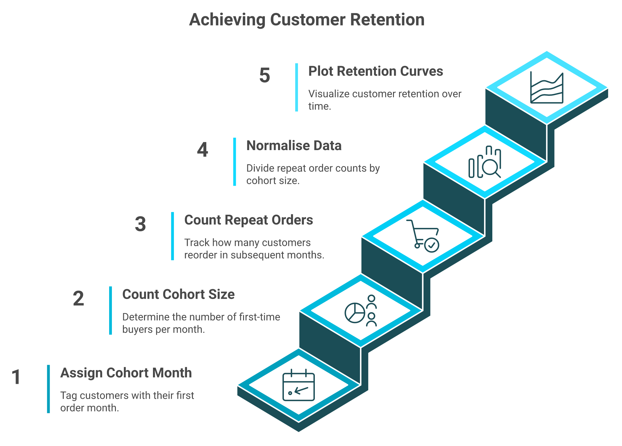
Export customer ID, first order date, order date, and order value. Assign each customer a cohort from their first order month. Count how many of that cohort ordered again in each later month, then divide by cohort size. Retention Rate (Month N) equals repeat purchasers in Month N, divided by cohort size, times one hundred.
📤 What to export
Pull one row per order from Shopify's customer or order export. You need four fields and nothing else.
Customer ID, order date, order value, and a derived first-order date per customer. In Sheets, that last one is a MINIFS across each customer's orders, which is how the Glencoyne DTC tutorial builds it.
Note that Shopify's own cohort report is gated by plan tier, so export the raw list regardless. Your analysis should survive a downgrade, which is also the argument for owning your ecommerce data integration layer rather than renting it from one plan tier.
🧾 The five steps
Assign each customer a cohort month from their first order date.
Count cohort size for each month.
For each cohort, count how many ordered in month one, month two, month three, and so on.
Divide each count by cohort size.
Plot as a heatmap, then as overlaid curves.
That is a single pivot table. The build is not the hard part.
The whole build is five steps and one pivot table. The difficulty sits in what you refuse to trust afterwards.
⚠️ Your last two rows are lying to you
This is the rule almost nobody publishes. Recent cohorts are right-censored, meaning they have not lived long enough to show their real curve.
Your newest two rows will always look worse than they are. Grey them out. Do not let them influence a decision.
🚩 Three things that quietly corrupt the grid
Small cohorts swing wildly. Below roughly 200 customers in a bucket, a handful of orders moves retention by several points. Widen the window instead of trusting the noise.
Discount-acquired cohorts behave differently from full-price cohorts, so a BFCM row is not comparable to a March row. Tag them and read them separately.
Market structure matters too. In COD-heavy and high-RTO markets, thirty-day repeat rates sit at the low end of the global bands, roughly 10% to 30% depending on category.
🕐 When the spreadsheet stops being defensible
Spreadsheet cohorts are correct at the start. They stop being correct when the export loop starts eating your Mondays, and the data pulled in is not even reliable.
"We are a startup company and mainly use Supermetrics for Shopify API. Data is inaccurate when it comes to Daily Total Sales and Returning Orders figures." — Verified reviewer, Startup Supermetrics - G2 Verified Review
"Almost all of the super popular, easy-to-use, out-of-the-box reports now have to be manually created." — Verified user in Computer Software Google Analytics - G2 Verified Review
"Some data we still notice discrepancies between platforms, for example, tracking ads, and differences in the reported metrics like revenue." — Verified reviewer, Marketing Triple Whale - G2 Verified Review
One founder described his early years as almost entirely Excel-based, with most of the business tied up in exports from Shopify and exports from the returns system. That is the cost nobody puts on the invoice, and it is why so many teams start hunting for Supermetrics alternatives in the first place.
Luca AI normalizes and standardizes data on ingestion, so the cohort answer arrives without the export, clean, and pivot loop that ate your last four Mondays.
Q4. How do you read a retention curve instead of just looking at it? [toc=4. Reading Retention Curves]
Read left to right for decay, and top to bottom for cohort quality. Four shapes matter: the cliff (offer or product mismatch), the slow bleed (weak post-purchase), the flatline above zero (a real base worth funding), and crossing curves (newer cohorts beating older ones). Each shape has one correct next move.
🧭 Two axes, two different questions
Left to right shows how one cohort decays as it ages. That is a retention question.
Top to bottom compares cohorts at the same age. That is an acquisition quality question, and it is the more valuable of the two.
Watch for the flattening point, the month where the curve stops falling and holds. Kissmetrics is right that this is different from your headline repeat purchase rate, which is a single blended number with no time dimension.
📊 Four shapes and the move each one demands
Retention Curve Shapes and the Decision Each One Demands
Shape
What it looks like
Likely cause
Your next move
The cliff
Steep drop by month one, near zero after
Offer or product mismatch, discount-acquired buyers
Audit the first-order product and the acquisition offer
The slow bleed
Steady decline, never flattens
No post-purchase system doing work
Build one asset per drop month
The flatline
Falls, then holds above zero
You have a genuine repeat base
Fund it, and protect the flatline percentage
Crossing curves
Newer cohorts above older ones
Acquisition or product quality improved
Find what changed, then spend into it
Niblin's Shopify guide is the only competing page I have found that attempts this mapping, and it is worth reading alongside this table. For the retention side of the same problem, our guide to customer retention strategies for ecommerce goes deeper on the fixes.
📉 The multi-year reality check
Before you panic at your own decay, here is what a healthy catalog business looks like across years, from an operator tracking it directly.
Roughly 30% of last year's buyers purchase again this year. Around 10% of buyers from two years ago come back. About 5% from three years ago.
If your numbers sit near that shape, you do not have a retention emergency. You have a normal business, and the work is compounding the base. A customer churn analysis across those same cohorts will tell you whether the decay is accelerating or holding steady.
🔬 Telling a real shape from noise
Three tests before you act on a shape. First, is the cohort above 200 customers? Second, does the shape appear in at least three consecutive cohorts? Third, does it survive when you exclude discount-acquired buyers?
If a shape fails any of those, it is noise. Acting on noise is how teams burn a quarter rebuilding flows that were fine.
I will hedge one thing here. Crossing curves are the most exciting pattern on this list, and also the easiest to misread, because a single strong launch month can fake them.
Luca AI watches for the shape change rather than the shape, flagging when a cohort's month-three retention breaks its own historical pattern instead of waiting for a quarterly review.
Q5. Why does a cohort with great retention still lose money? [toc=5. Margin-Layered Cohorts]
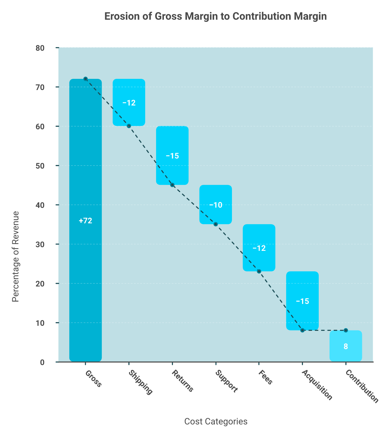
Because the grid was built on revenue. A cohort can repurchase beautifully and still destroy cash once shipping, returns, support tickets, and acquisition cost load in. One operator's 72% gross-margin best-seller came in at 8% actual contribution margin. Rebuild cohorts on contribution margin over a fixed horizon, not revenue.
💸 The invoice on the table
A founder slid an invoice across the table and said her best seller ran at 72% gross margin. She could not make them fast enough. Her cohort chart backed her up, because those buyers came back.
Then we opened her P&L, her shipping data, her return rates, and her support tickets. Twenty minutes later she was crying at her own conference table.
🧾 What the twenty-minute teardown found
The product was heavy and bulky, so shipping ate a large slice per order. Returns ran high because sizing was inconsistent. Every return triggered support tickets and a second shipping leg.
Line by line, cost by cost, that 72% became 8% contribution margin. She had spent two years scaling a product that barely broke even.
Every deduction between these two numbers is real cash. Cohorts built on revenue never show you this drop.
The worst part is that the data sat in her systems the whole time. She just had no way to see it in one place, which is the exact gap a real customer profitability analysis is supposed to close.
⚠️ Gross margin is a lie
Gross margin tells you what it costs to make the thing. It tells you nothing about what it costs to sell the thing.
Contribution margin is the honest number. It is revenue minus product cost, shipping, payment fees, returns, fulfillment, and the acquisition cost of that order. If that distinction is new to you, start with contribution margin vs gross margin.
Luca AI sits over commerce, marketing, finance, accounting, and operations data as one reasoning layer, which is the only way that full cost stack lands in a single cohort view.
✅ How to layer margin onto the grid
Lock three definitions before you build, the way Loiale publishes them in its retention methodology.
Repeat purchase rate. Share of a cohort with two or more orders by day N.
Cohort retention. Share of a cohort still purchasing at day N.
Cohorted LTV. Contribution margin per customer over a fixed horizon, usually 365 or 720 days.
That last definition is the one people skip. LTV measured in revenue makes every cohort look better than it is, which is why our guide to ecommerce customer lifetime value insists on a margin base.
⭐ What operators say about revenue-only data
"It has pretty substantial limitations for ecommerce tracking and often isn't close to accurate for conversion rate, number of orders, or revenue." — Verified user in Information Technology and Services Google Analytics - G2 Verified Review
"Much of my time spent within Supermetrics is spent manually finding and fixing errors from expired auth tokens or date formats changing randomly." — Verified reviewer, Analytics Supermetrics - G2 Verified Review
Both reviews describe the same trap from different angles. Operators are fighting for accurate revenue numbers, while margin data never enters the model at all.
⏰ Your move this week
Pick your single largest cohort by first-order month. Rebuild one column, month twelve, on contribution margin instead of revenue.
If the margin number lands under your blended CAC, you have found your leak. Do not scale that entry product again until the cost stack changes, and check the effect against your overall ecommerce profit margins before you reorder.
Luca AI extracts the relevant slice from your full data pool and traces root cause, so margin-per-cohort becomes a question you ask rather than a model you rebuild every quarter.
Q6. Which cohort cut actually moves LTV, and why is it not purchase frequency? [toc=6. LTV Levers]
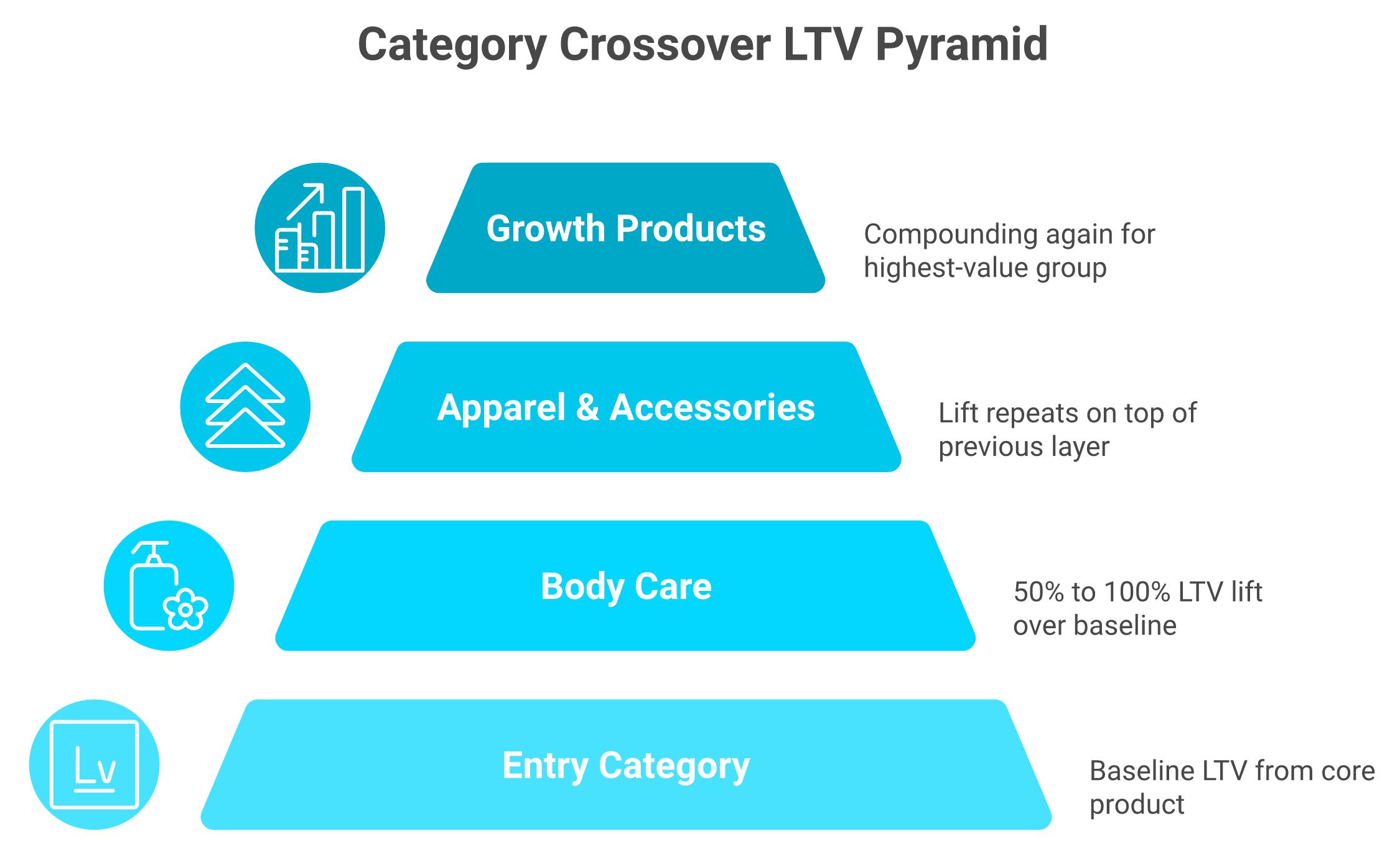
Cut cohorts by entry product and by category crossover, not just by month. One operator's cohort queries showed customers who crossed from their entry category into body care jumped 50% to 100% in LTV, and layering apparel did it again. Category diversity beat frequency and new product launches as the leading driver.
❌ The advice everyone gives first
Ask ten growth people how to raise LTV and you get the same three answers. Send more email. Launch more products. Push a subscription.
All three assume the lever is frequency. Buy more, buy more often, and lifetime value follows.
🔍 The operator who tested it properly
Anthony Mink, founder of Live Bearded, ran cohort queries directly against his raw Shopify database. He ran four or five different cuts, not one.
His finding surprised him. Product category diversity was the leading driver of lifetime value, not frequency and not new launches.
Anyone who bought body care jumped roughly 50% to 100% in LTV. Layer apparel and accessories on top, and it happened again.
Each crossover layer stacks on the one below it. This is the cohort cut almost nobody publishes, and it is where the money hides.
🔁 The twist: your secondary catalog is primary
This is the part that reframes a whole post-purchase strategy. Most brands aim 90% of their flows at the hero product.
Mink's read after the cohort work was blunt. His secondary products were actually his primary LTV drivers, so they needed to become the primary post-purchase focus.
Luca AI is trained on the relationships between ecommerce variables, which is how an entry SKU gets connected to a downstream LTV gap instead of sitting in a separate report.
✅ The exact cuts to run
Run these three cohort cuts against your last 24 months.
Entry-product cohorts. Group customers by the first SKU in their first order.
Crossover cohorts. Split each entry cohort into buyers who later purchased a second category, and buyers who did not.
Order-count cohorts. Group by lifetime order count to see where value concentrates.
The crossover cut is the one nobody publishes, and it is where the money usually hides. It also belongs in your standing ecommerce customer segmentation model, not in a one-off spreadsheet.
⭐ Why the tooling makes this hard
Slicing by entry SKU is not a feature most stacks expose cleanly. Operators say so in their own words.
"The downside of GA is its learning curve, especially with GA4. Finding specific metrics or building custom reports can take time." — Aman S., Performance Marketing Head Google Analytics - G2 Verified Review
That second review is honest and positive, and it also marks the boundary. Channel-level ease is not the same as SKU-level cohort reasoning, which is why some teams end up comparing Triple Whale alternatives once their questions get more specific.
💰 What to do with the finding
Once you know which crossover raises LTV, stop guessing at cross-sells. Build one educational sequence that moves buyers into that specific second category.
I will hedge here. One brand's category effect does not transfer to yours, so treat the 50% to 100% figure as a reason to test, not a forecast.
Luca AI finds the influencing components behind an LTV gap, so the entry-SKU driver surfaces from one plain-English question instead of a weekend of terminal access and database queries.
Q7. Is blended CAC quietly invalidating your cohort math? [toc=7. CAC Allocation]
Yes, if you average acquisition cost across the business. If you spend money to acquire a customer to sell a unit, that spend is a variable cost of the sale. Blended CAC hides structurally unprofitable entry-product cohorts. Allocate CAC by product or category, then rerun payback using current CAC, not 2023 CAC.
💸 The thesis, stated plainly
Blended CAC is an average across every product, channel, and offer you run. Averages hide the cohorts that are killing you.
A cohort can show 30% month-three retention and still lose money, because the ads that bought it cost double your store average.
🧾 The accountant's objection, stated fairly
Finance training says marketing is an operating expense. It sits below the gross profit line, not inside unit economics.
There is a real argument here. Brand spend, agency retainers, and creative production do not map cleanly to a single unit.
I do not think that objection survives contact with a paid-heavy DTC P&L. You can debate where it lands on the statement, but you cannot exclude it from product-level math and still make good decisions. Our view on tracking e-commerce unit economics lands on the same side.
⚠️ Why this got urgent
Acquisition costs moved sharply, and cohort payback models built on old numbers are now wrong. Triple Whale's 2025 benchmark work across more than 30,000 brands put CAC up roughly 40% to 60% since 2023.
Their Q1 2025 report, covering $2.9B in tracked ad spend, showed Meta CPMs up 26% and new-customer growth down 5.1%.
Run your payback model on 2023 CAC and every cohort looks fundable. Rerun it on today's CAC and some do not. That is also the gap between platform ROAS and true profitability.
✅ A worked entry-SKU payback
Say your starter kit acquires customers at $58, and contribution margin on the first order is $19.
Month 0: minus $39 per customer.
Month 6 cumulative margin: $44, so still under CAC.
Month 12 cumulative margin: $71, which finally clears it.
That is a twelve-month payback on a cohort your blended report calls profitable. If your cash cycle is 90 days, this cohort is a financing problem, not a marketing win.
Luca AI simulates the payback scenario before you commit spend, showing which entry-product cohort breaks even inside your cash cycle and which one does not.
⭐ What operators report about attribution data
"It is becoming very opaque, it doesn't have real-time, the sampling is increasingly wild, and now it applies a threshold. If you don't pay for BigQuery, you're really tied hand and foot." — Verified user in Retail Google Analytics - G2 Verified Review
"Some data we still notice discrepancies between platforms, for example, tracking ads, and differences in the reported metrics like revenue." — Verified reviewer, Marketing Triple Whale - G2 Verified Review
Perfect channel attribution is not available to you. Product-level allocation is, and it is the more decision-useful of the two.
💰 The flag to set today
Set one rule in whatever tracks your numbers. Flag any cohort where month-six cumulative contribution margin sits below its allocated CAC.
Luca AI predicts and simulates against your own history rather than reporting last week's CAC, which is what makes a forward payback flag possible at all.
Q8. What do good cohort numbers look like for a store your size? [toc=8. Retention Benchmarks]
DTC median repeat purchase rate sits near 28%, roughly 40% at the top quartile, and 65% or higher for subscription brands. Beauty runs near 35%, apparel near 25%. First-to-second order conversion averages about 27%. Around 77% of customers buy once, and the 23% who return drive close to half of revenue.
📏 Read the definition before the number
Every benchmark you see depends on two hidden choices. What counts as a repeat purchase, and over what window.
A 90-day repeat rate and a 365-day repeat rate can differ by more than double for the same store. Most benchmark posts never say which one they used.
The numbers below are 365-day repeat purchase rates unless noted. Match your own window before you compare, then hold that definition across every ecommerce reporting cycle.
📊 Benchmark bands by category
DTC Repeat Purchase and Retention Benchmark Bands
Metric
Benchmark
Source basis
DTC median repeat purchase rate
~28%
2026 aggregate DTC benchmark set
Top quartile repeat rate
~40%
Same set
Subscription brands
65%+
Same set
Beauty
~35%
Category split
Apparel
~25%
Category split
Food and beverage
~40%
Category split
First-to-second order conversion
~27%
2026 retention agency dataset
COD-heavy and high-RTO markets, 30-day repeat
10% to 30%
Regional band
Luca AI holds your history in memory, so the comparison that matters becomes your own last four quarters rather than a category median someone else published.
💰 The purchase-count multiplier
This is the number I would put on the wall. Across a 13-brand DTC dataset over a 720-day window, 77% of customers bought once.
The 23% who came back drove about 49% of revenue. A one-time buyer was worth roughly $93, while a five-plus buyer was worth roughly $1,200.
That is a 9.8x median multiplier, with a range from 4x to 37x across brands. Gorgias data across more than 12,000 merchants points the same way, with 21% of customers driving 44% of revenue.
⭐ What the top of the market looks like
Luke Bean, CEO of Valente, shared the baseline behind a bootstrapped business at £50M scale. Returning customers made up 70% to 80% of transactions.
About 20% of new customers placed a second order within 30 days. Between 65% and 70% of customers bought more than once within 12 months.
Those are not starting targets. They are what a decade of compounding a repeat base looks like, and they are built on Shopify LTV math rather than headline revenue.
⚠️ How to use these without wasting a quarter
Benchmarks are calibration, not goals. If your repeat rate sits at 22% in apparel, you are near normal, and chasing 40% is likely the wrong project.
The higher-leverage question is your own trend. Is month-three retention improving cohort over cohort, or drifting down?
My read right now is that most sub-$5M stores over-index on the category median and under-index on their own slope. The slope is the part you control, and it is worth tracking inside your ecommerce performance analytics cadence.
Luca AI studies performance across months and years, then pings you when a cohort breaks its own established pattern instead of waiting for a benchmark report to tell you.
Q9. How do you turn a retention curve into a live post-purchase sequence? [toc=9. Curve To Campaign]
Find the two or three months where your curve drops hardest, then build one asset per drop. A choose-your-own-adventure opt-in flow moves buyers across categories better than a hard cross-sell. Plain-text founder emails outperform designed templates at the first renewal moment. One brand's day-27 giveaway blunted its second-renewal churn spike.
📉 Step 1: Mark your danger zones
Take your retention curve and find the steepest month-over-month drops. Most stores have two or three, not ten.
Label each one with a date range in days, not months. Day 0 to 30, day 60 to 90, and so on.
Those ranges are your build list. One asset per zone, nothing more, because a five-flow rebuild never ships. Mapping them properly is the practical half of ecommerce customer journey analytics.
🔁 Step 2: Build the choose-your-own-adventure flow
Anthony Mink at Live Bearded tested this against a standard cross-sell. The standard version said "here is body care, you should buy this."
The version that worked asked a question instead. "Are you interested in learning more about body care?" A yes triggered a short educational sequence.
Opt-in beats push because it segments by behavior, not by guess. You learn who is curious before you spend a discount on them, which is a cheaper form of customer behavior analytics than most software sells.
✉️ Step 3: Send the ugly email at the renewal moment
The first renewal notice is when doubt shows up. Brez handles that window with plain-text founder emails, customer reviews, and simple "what to expect" guides.
One of those plain-text emails generated $40K. No template, no hero image, no design sprint.
I have watched teams spend three weeks on a designed flow that underperformed a founder writing 200 honest words. That is not a fluke; it is a pattern.
🎁 Step 4: Attack the second-renewal spike
The third danger zone is usually the post-second-renewal drop. Churn spikes again a few weeks after the second charge.
Brez ran a giveaway to cross that gap. Stay subscribed past day 27, and you could win five free cases.
Luca AI finds the root cause behind a drop and pushes the recommendation to Slack or email on whatever schedule you set, which is how a danger zone gets noticed before the quarter closes.
✅ Step 5: Segment with RFM, not with software you cannot afford
RFM means recency, frequency, and monetary value. It groups customers by when they last bought, how often they buy, and how much they spend.
That is three columns from your order export. It runs on the principle of paying attention to what people do, not what they say.
My position is direct. Do not buy a predictive personalization platform before your cohort list is mature, because RFM on transaction data will outperform it at this stage. Our comparison of customer segmentation in ecommerce gets to the same conclusion.
⭐ What operators say about acting on data
"There is a wealth of information in Google Analytics but it can be difficult for the average user to find it and extract it correctly." — Verified user in Marketing and Advertising Google Analytics - G2 Verified Review
"They're very slow to update their existing connectors. As a result, they're missing lots of features and updates within their connectors." — Verified reviewer, Analytics Supermetrics - G2 Verified Review
Both point at the same gap. The data exists, and the translation into a live flow is where teams stall.
Luca AI moves from monitoring to recommending, naming which cohort drop-off is costing the most margin right now, so the next flow you build is the one that pays.
Q10. Which tools run cohort analysis properly, and where does each one break? [toc=10. Cohort Analysis Tools]
Luca AI answers cohort questions in plain English over your unified data, finds the root cause behind a curve shift, and pushes scheduled reports to Slack or email. Shopify's native report is free but plan-gated and descriptive. Lifetimely and Peel go deep on LTV cohorts. Looker and Power BI need SQL support you probably do not have.
🧠 The real decision is descriptive versus prescriptive
Every option here can show you a cohort grid. That is not the differentiator.
The question is whether the tool explains why the grid moved, and what to do next. Most stop at display, which is the line between reporting and decision intelligence tools.
📊 Honest comparison
Cohort Analysis Tools Compared, Strengths and Failure Points
Tool
What it does well for cohorts
Breaks when
Luca AI
Plain-English cohort questions across commerce, marketing, finance, and ops data, with root-cause reasoning and scheduled push reports
You are below roughly $1M revenue, so there is not enough data to reason against
Shopify Analytics
Native acquisition cohorts, free, zero setup
Report access is plan-gated, and it is descriptive only
Lifetimely
Deep LTV and profit cohorts, strong merchant satisfaction
Stays inside commerce data, no finance or ops layer
Peel
Deepest subscription and cohort retention slicing
Thin public review sample, narrower use case
Looker or Power BI
Fully custom cohort models
Needs SQL and analyst time you likely do not have
Merchant sentiment on the app-store options is genuinely strong. Lifetimely holds roughly 4.8 to 4.9 stars across about 460 to 504 reviews, with around 97% five-star. Peel sits at 5.0, but across only 35 reviews. If you are weighing that route, our rundown of Lifetimely alternatives covers the trade-offs by stage.
⚠️ Where legacy BI runs out of road
One operator explained his stack move plainly. He shifted to Looker for flexibility and cost, and felt Power BI had fallen behind on how AI-ready it was.
Another founder, Ari Tulla of ELO Health, spent about $10 million building an internal system to turn data into meaning. His conclusion afterward was that reasoning models arrived and did it ten times better.
That is the architectural point. Building the pipeline is no longer the hard part, which is why the market keeps moving toward an AI-native data platform instead of another dashboard layer.
⭐ What reviews reveal about data trust
"Data is inaccurate when it comes to Daily Total Sales and Returning Orders figures. Tickets have been opened since the start of January 2021 with barely any response." — Verified reviewer, Startup Supermetrics - G2 Verified Review
"Triple Whale is very user-friendly and easy to navigate to find the data you need across multiple channels." — Verified reviewer, Marketing Triple Whale - G2 Verified Review
Returning-order accuracy is exactly the field cohort math depends on. Ease of navigation does not fix an inaccurate input.
✅ Two scenario calls, and one honest no
Under $1M revenue, stay in a spreadsheet. Your cohorts are too small to read reliably, and paid tooling will not fix that.
Between $1M and $5M with data in six or more systems, an intelligence layer earns its keep. That is the range where the export loop starts costing real hours, and where Shopify business intelligence stops being optional.
Luca AI is not the right answer for marketplace-only sellers, pure B2B, or anyone needing a tracking pixel, since it reasons over your warehouse rather than replacing attribution infrastructure.
Luca AI sits first in this list because it explains why a cohort moved, simulates what happens next, and delivers that without a dashboard build.
Q11. When does a cohort payback result justify taking capital? [toc=11. Funding Cohort Growth]
When a cohort shows stable, margin-positive payback inside your cash cycle, your constraint is working capital, not creative. Fund inventory or spend against that specific cohort. Compare offers on effective rate, disbursal speed, advance size, repayment structure, and whether pricing can improve between draws. If payback runs past your cash cycle, capital accelerates the loss.
💰 The test, with the arithmetic
Your cash cycle is the gap between paying a supplier and collecting from customers. Call it 90 days for a typical Shopify brand.
Now take your best cohort. If allocated CAC is $58 and cumulative contribution margin clears $58 by day 75, that cohort is fundable.
If it clears at day 300, borrowing does not help. You would be paying a fee to hold a loss for longer, which is why the test belongs inside your cash flow forecast, not beside it.
⚠️ Why the old model no longer applies
Payback math built on 2023 acquisition costs is now stale. Triple Whale's benchmark work across more than 30,000 brands put CAC up roughly 40% to 60% since 2023.
Their Q1 2025 data, covering $2.9B in tracked spend, showed Meta CPMs up 26% and new-customer growth down 5.1%.
Rerun the test at today's numbers before you sign anything. A cohort that was fundable last year may not be.
💸 Compare capital on capital terms
Ignore feature lists. These are the only five variables that decide what a draw costs you.
Effective cost per draw, expressed as total fee over the money actually used.
Time to disbursal, from request to funds in the account.
Draw size range, both minimum and maximum.
Repayment structure, fixed schedule versus revenue-responsive.
Repricing between draws, whether improved performance lowers your next fee.
Capital Terms Compared, Advance Model Versus Per-Draw Pricing
Capital variable
Revenue-based advance model
Luca AI
Typical draw pattern
Infrequent large advances
Frequent small draws
Pricing basis
Snapshot at application
Priced per draw against live performance
Application step
Required
None
Idle capital risk
Higher, since size is fixed upfront
Lower, since draws match the need
Published terms for the established providers show fast, data-driven underwriting, deployment inside roughly 24 to 48 hours, revenue-responsive repayment, and no equity or personal guarantees. Our primer on revenue-based financing breaks down how those terms actually price out.
⏰ The idle-capital cost nobody prices
Take $300K at a fixed fee when you only deploy $80K this quarter. You are paying full cost on money sitting in your bank account.
Four draws of $50K, priced separately as performance improves, usually costs less across twelve months. That is arithmetic, not marketing.
⚠️ My disclosure, stated openly
Luca AI provides capital, so treat this section as a conflicted view and check the numbers yourself.
Here is the incentive difference worth weighing. A lender that earns on advance size has a reason to push you higher. A provider earning subscription revenue at $250 to $750 a month does not. The side-by-side in Luca AI vs Wayflyer lays out both structures.
That is why the honest answer to "I want $300K" is often "take $50K, prove the cohort, then scale."
Luca AI prices each draw against live performance and funds in small increments, so nothing sits idle and the next draw gets cheaper when the cohort math improves.
Q12. What will cohort analysis never tell you? [toc=12. Where Cohorts Stop]
Cohort tables cannot tell you whether high retention is even the right target. Lower-retention cohorts can create more enterprise value at higher volume and better upfront margin. They also cannot tell you whether your product still feels desirable, whether a phone call saves a high-AOV customer, or whether your automated flows are embarrassing you.
❌ The case against maximizing retention
Andrew Faris published a reversal on this in 2026, and it deserves attention. His earlier position was that higher LTV always wins.
His revised read is that retention trades off against CAC, AOV, and volume. A lower-retention cohort acquired cheaply at scale can produce more enterprise value than a small, loyal one.
Subscription models complicate it further. Guaranteed rebuy looks like elite retention, while masking higher acquisition cost and converging revenue curves.
⚠️ The data-driven trap in creative work
One fashion operator described falling into it directly. The team got too data driven and lost touch with the emotional side of the business.
Their point was that people do not choose clothing on a one or a zero. Cohort matrices are excellent for inventory and logistics, and poor at curation.
I would extend that carefully. Cohort data can tell you a product line is dying, and it cannot tell you whether the new line should exist. That judgment sits with you, not with your ecommerce growth strategy deck.
📞 The human touchpoint your grid cannot see
A store owner serving older customers told me answering the phone kindly is part of her margin. There is relief on the other end when a human picks up.
Her upsell business runs through those calls. No automated sequence in her stack replicates it, and her cohort grid gives no credit for it.
If your average order value is high and your buyers are mature, weigh that before you automate the relationship away.
✅ Keep a human on the QA line
The rule I hold to is simple. Do not remove the quality check, and do not let the AI be the quality check.
Operators who ignore this ship flows with the wrong image, the wrong product, or the wrong tone at scale. Even excellent brands get this wrong, which is the honest caveat behind every claim made for agentic AI for ecommerce founders.
"Sampling, sampling, sampling. When we switched to an enterprise web analytics solution that does no sampling, we found that Google Analytics was telling us we had twice as much traffic as we actually do." — Gitai B., Marketing, Web Analytics, and Testing Lead Google Analytics - G2 Verified Review
"They're very slow to update their existing connectors, meaning there are regularly fields, metrics, and breakdowns that are totally absent from their integrations." — Verified reviewer, Analytics Supermetrics - G2 Verified Review
Both reviews describe a number that looked authoritative and was not. Cohort grids inherit that same risk from whatever feeds them.
⏰ What I think shifts by 2027
My hypothesis is that cohort analysis stops being a report anyone opens. It becomes a background check that flags a shape change and names the cause, closer to ecommerce monitoring tools than to reporting software.
The scarce skill then is not reading the grid. It is deciding which flagged cohort deserves your cash this month, and which one you let go.
I could be reading the timeline too aggressively. If you are running these cuts on your own store, I would genuinely like to hear which cohort dimension moved your numbers, and which one turned out to be noise.
FAQ's
What is customer cohort analysis, and how is it different from repeat purchase rate?
Customer cohort analysis groups buyers by a shared starting point, usually their first-order month, then tracks how many of them buy again in each following month. The output is a grid: rows are cohorts, columns are customer age, and cells are repurchase percentages.
Repeat purchase rate is a single blended number with no time dimension. It tells you what share of customers came back. It cannot tell you when they came back, or whether newer customers behave better than older ones.
The difference matters in practice:
Repeat purchase rate answers "how loyal is my base overall?"
Cohort retention answers "is the quality of the customers I am buying improving or sliding?"
Cohorted LTV answers "how much margin does one customer return over a fixed horizon?"
We treat the second question as the important one, because it is the only one that tells you whether your acquisition is getting better or worse. Luca AI reads the cohort grid continuously and flags the shift, rather than waiting for someone to open a report. If you want the wider metric picture first, start with our guide to top ecommerce KPIs and work down to cohorts from there.
How do I build a customer cohort retention table from Shopify data without a data team?
You need four fields from your Shopify export: customer ID, order date, order value, and a derived first-order date per customer. Everything else is a pivot table.
Assign each customer a cohort month from their first order date.
Count cohort size for each month.
For each cohort, count how many ordered again in month one, month two, month three, and onward.
Divide each count by cohort size to get the retention percentage.
Plot the result as a heatmap, then as overlaid curves.
The formula is straightforward: retention rate for month N equals repeat purchasers in month N, divided by cohort size, times one hundred.
Two hygiene rules protect the output. Grey out your two newest cohorts, because they have not lived long enough to show a real curve. Ignore any cohort under roughly 200 customers, because a handful of orders will swing it by several points.
Shopify's native cohort report is gated by plan tier, so we recommend exporting the raw customer list regardless, which keeps your analysis alive through a plan change. Luca AI normalizes and standardizes data on ingestion, which removes the export, clean, and pivot loop entirely. Our breakdown of the Shopify analytics dashboard covers what the native reports do and do not give you.
What is a good repeat purchase rate and retention benchmark for a DTC store?
Benchmarks only mean something once you state the window. The figures below are 365-day repeat purchase rates unless noted, and a 90-day rate for the same store can be less than half as high.
DTC median repeat purchase rate: roughly 28%.
Top quartile: roughly 40%.
Subscription brands: 65% or higher.
Beauty: near 35%. Apparel: near 25%. Food and beverage: near 40%.
First-to-second order conversion: roughly 27% on average.
COD-heavy and high-RTO markets: 10% to 30% at 30 days.
The concentration number matters more than the median. Across a 13-brand DTC dataset over 720 days, 77% of customers bought once, and the 23% who returned drove close to half of revenue. A one-time buyer was worth roughly $93 against roughly $1,200 for a five-plus buyer.
Our position is that most sub-$5M stores over-index on the category median and under-index on their own slope. Luca AI holds your historical performance in memory, so the comparison becomes your cohort against your own last four quarters. For the margin side of the same question, see ecommerce profit margins.
Why does a cohort with strong retention still lose money?
Because the grid was almost certainly built on revenue. A cohort can repurchase beautifully and still drain cash once shipping, returns, support tickets, payment fees, and acquisition cost are loaded in.
We watched one founder present a best seller at 72% gross margin. After a line-by-line teardown across her P&L, shipping data, return rates, and support tickets, actual contribution margin came in at 8%. She had spent two years scaling a product that barely broke even, and the data had been sitting in her systems the whole time.
Two fixes change the picture:
Rebuild the grid on contribution margin, defined as revenue minus product cost, shipping, fees, returns, fulfillment, and the acquisition cost of that order.
Allocate CAC by product or category, not blended across the business, because averages hide the entry products that are structurally unprofitable.
Luca AI reasons across commerce, marketing, finance, accounting, and operations data as one layer, which is what lets that full cost stack land inside a single cohort view. If the underlying distinction is new, read contribution margin vs gross margin before you rebuild anything.
Which tool should we use to run customer cohort analysis?
The real decision is descriptive versus prescriptive. Every option here can display a cohort grid. Very few explain why the grid moved.
Luca AI answers cohort questions in plain English across commerce, marketing, finance, and operations data, traces the root cause behind a curve shift, and pushes scheduled reports to Slack or email. It needs enough data to reason against, so it fits stores from roughly $1M upward.
Shopify Analytics is free and zero-setup, but the cohort report is plan-gated and descriptive only.
Lifetimely and Peel go deep on LTV and subscription cohorts, and stay inside commerce data.
Looker or Power BI will model anything, and need SQL plus analyst time most small teams do not have.
Two honest limits. Under $1M revenue, stay in a spreadsheet, because your cohorts are too small to read reliably. Luca AI is also not a tracking pixel and does not replace attribution infrastructure, so marketplace-only sellers and pure B2B stores are a poor fit. For a wider field comparison, see our list of ecommerce analytics platforms.
Enjoyed the read? Join our team for a quick 15-minute chat — no pitch, just a real conversation on how we’re rethinking Ecommerce with AI - Luca
Loading Schedule...
Your AI Co-Founder is here.
Here’s why:
Shopify, Meta, Xero - one brain.
"Should I scale?" Answered with real data.
Growth capital. No applications. One click.
Thank you! Your submission has been received! Please book a time slot for the Meeting
Oops! Something went wrong while submitting the form.