.svg)
.svg)


Q1. What is customer churn analysis, really, once you get past the definition? [toc=What Churn Analysis Really Is]
A founder I talked to last quarter had just crossed $400K a month and looked exhausted, not thrilled. She told me every new cohort felt like pouring water into a bucket with a hole she could not find. That is the real shape of churn analysis. Not a definition, a search for the hole.
Customer churn analysis is the process of measuring who leaves, when they leave, and why, then tracing each loss to a specific, fixable cause in your customer journey. It is not one number on a dashboard. It is a diagnosis. Done right, it tells you which cohort bleeds cash at which lifecycle stage, so you can stop the leak before it compounds against your runway.
🪣 The leaky bucket nobody warns you about
Here is what scaling actually does. It does not solve your problems, it multiplies them. More revenue means more orders, more support tickets, more refunds, and more places for money to quietly leak out.
Most operators feel this as a vague anxiety. Revenue is up, but the bank account does not feel proportionally better. That gap is usually churn doing its work in the background, one silent cancellation at a time. If you have ever felt this, you are not alone, and it is exactly why e-commerce founders are drowning in data while still missing the leak.
A blended churn rate hides all of it. Saying "we churn at 6% a month" is like a doctor saying "you are 6% sick." It is true and useless. It does not tell you which part of the body is failing.
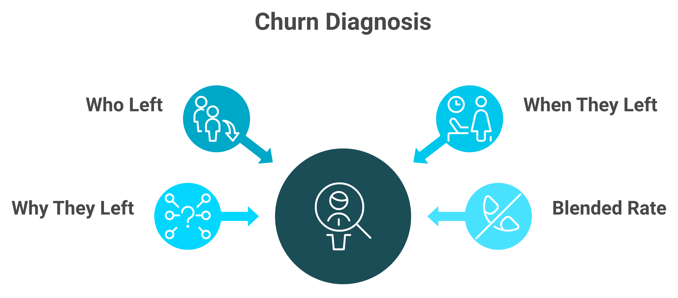
🔍 Why a diagnosis beats a number
The shift that matters is treating churn as a diagnostic, not a metric. A real diagnosis answers three questions in order: who left, exactly when in their lifecycle, and what specific thing pushed them.
For example, "subscribers who joined on a discount, cancelling right after their third billing cycle, because the second full-price charge surprised them." That sentence is worth more than any dashboard tile, because you can act on it Monday morning. Pairing it with the right way to track e-commerce unit economics turns the observation into a cash decision.
The IBM definition frames churn simply as customers lost over a period. Stripe's churn guide pushes further, into segmenting and modeling the causes. The reader past the definition wants the causes, not the vocabulary.
The honest goal here is finding the unknown-unknowns, the leaks you do not even know to look for. That is also where this gets hard for a human staring at spreadsheet exports, and where I think AI changes the work, which is exactly what we built Luca to do later in this piece.
Q2. Which churn actually matters, customer churn or revenue churn? [toc=Customer vs Revenue Churn]
Most operators report logo churn because it is the easiest number to pull. I think that instinct quietly costs them money, and I will defend that position.
Track both, but anchor your decisions to revenue churn and net revenue retention, not logo churn. Losing ten $20 customers and losing one $2,000 customer look identical on a logo-churn chart and are wildly different in your bank account. Customer churn tells you how many leave. Revenue churn tells you how much cash leaves. NRR above 100% means your retained base grows before any new acquisition.
💸 The logo-churn trap
Logo churn (the percentage of customers who leave) treats every customer as equal. They are not. Your top 10% of customers often carry a third of your revenue.
So a "good" month on logo churn can hide a brutal month on cash. You lost few customers, but you lost the wrong ones. This is the same lie gross margin tells; it reports the surface and stays silent on what actually hits your account.
🧮 The two formulas, side by side
Run both on the same period and the gap becomes obvious.
In that example, logo churn looks worse than revenue churn, which tells you the customers leaving are below-average value. Appcues lays out these retention formulas clearly if you want the full set. Custify makes the same case for separating revenue churn from headcount churn.
🎯 Which number goes on the wall
For subscription and replenishment brands, put net revenue retention on the wall. It is the one number that captures churn, downgrades, and expansion in a single read.
For one-time-purchase stores, anchor on revenue churn by cohort and repeat-purchase rate instead, since "subscribers" is not your model. My read, after looking at a lot of these, is that the brands tracking NRR catch problems a full quarter earlier. Inside Luca's financial management, we surface logo churn and revenue churn side by side on ingestion, so the operator never confuses a quiet month for a healthy one.
Q3. How do you calculate churn rate and the metrics around it? [toc=Churn Metrics and Formulas]
There is a specific kind of dread I have watched too many operators live with, the Monday morning shudder. It is the moment you open five exports, Shopify on one tab, returns on another, payments on a third, and start triangulating numbers by hand. Richie Jones, who managed £200M in GMV at VAST, described running the early days almost entirely on Excel exports, with manual reporting blocking the actual diagnosis.
Churn rate equals customers lost in a period divided by customers at the start, times 100. Around it, calculate retention rate, MRR churn, net revenue retention, ARPU split by active versus churned, time-to-churn, and a customer health score. Each answers a different question, so run them together. Pull a date-stamped customer export, bucket by signup cohort, and every number lands in a sheet within the hour.
📊 The metrics that actually earn their place
You do not need fifty metrics. You need seven that each ladder to a decision. Here is the full set with worked numbers.
ARPU split by status is the underrated one. If your churned customers have a much lower ARPU than active ones, you have an acquisition-quality problem, not a retention problem.
⏰ Doing it tonight versus doing it in three minutes
This manual path works, and you should run it once by hand so you understand what each number means. The catch is that it takes three hours and goes stale the moment new data lands. ChurnZero's seven-step guide walks the manual flow well. Glow Reports even ships a real dataset with Excel formulas if you want to follow along.
The reason I stopped doing this by hand is simple. The same seven metrics extract conversationally in about three minutes when the data is already unified, which is the gap the best Shopify analytics apps close by pulling the relevant cut from your full data pool instead of making you rebuild the sheet every week.
"Our experience with Triple Whale has been extremely frustrating and almost categorically terrible. The integrations are inconsistent, and we end up reverting back to direct data sources like Meta, Shopify, Recharge, etc."
Matt Huttner Triple Whale Trustpilot Verified Review
"Daily revenue totals are wrong, entire order blocks are missing, and every week we have to open new support tickets just to get our numbers halfway close to what our channel actually reports."
XTRA FUEL Triple Whale Trustpilot Verified Review
If the tool feeding your churn math is wrong, every metric above is wrong too. That is the part operators learn the expensive way, and it is one reason we obsess over e-commerce analytics platforms that normalize data on ingestion.
Q4. Voluntary or involuntary, which churn can you actually prevent? [toc=Preventable vs Unpreventable Churn]
I watched an operator spend three weeks building a "we miss you" win-back email sequence. It recovered almost nothing. The reason was brutal in its simplicity, most of his churn was failed credit cards, and no heartfelt email fixes an expired Visa.
Split every churned customer into involuntary (failed cards, expired payments, dunning gaps) and voluntary (chose to leave). Then split voluntary into preventable (price, product fit, service) and structural (one-time need, life change). The split matters because involuntary churn is often 20 to 40% of total and the cheapest dollar you will ever recover. You cannot fix what you have not classified.
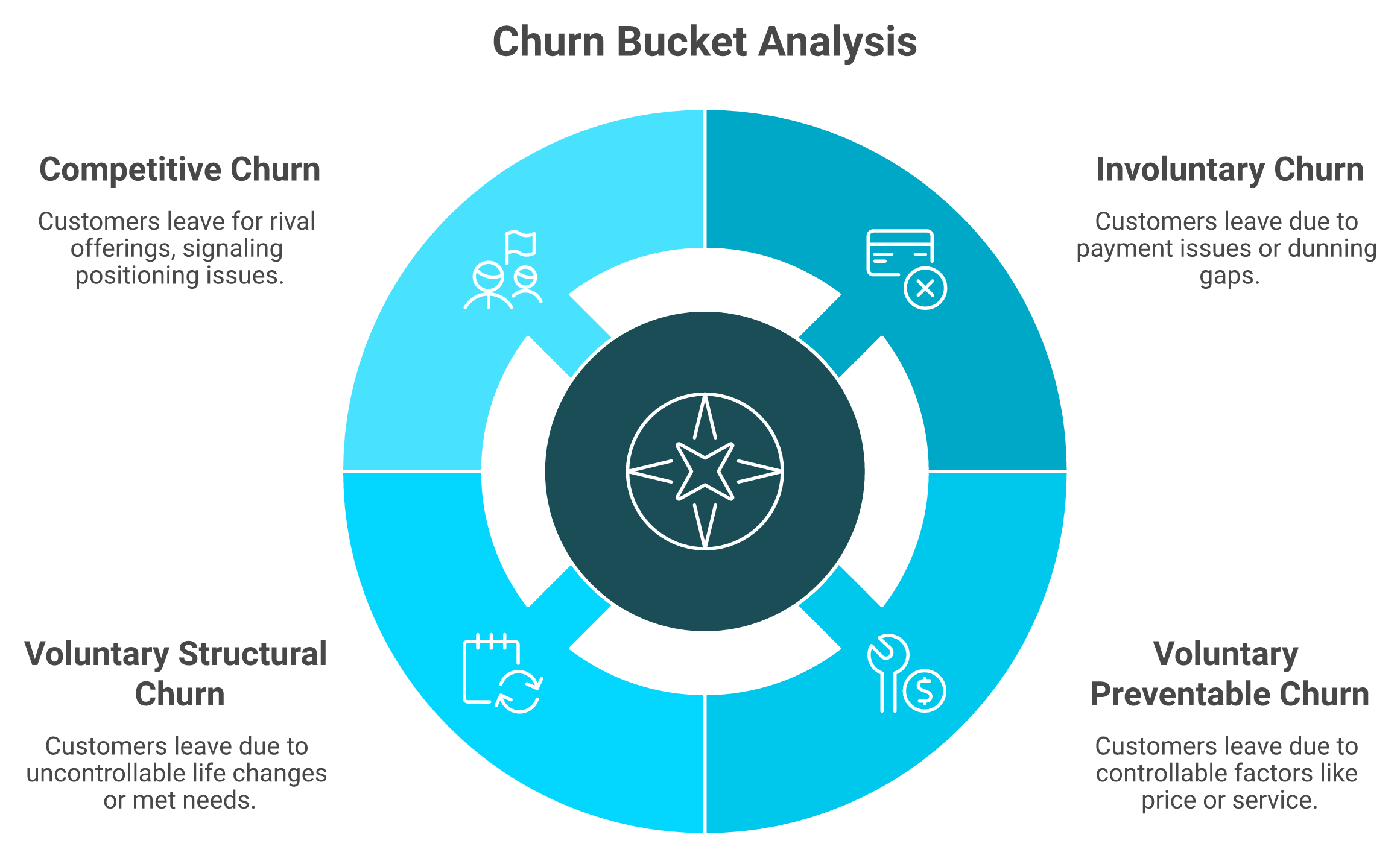
🗂️ The four buckets, in plain terms
Before you spend a rupee or an hour on retention, sort your churn into four piles.
- Involuntary: the customer wanted to stay, but a payment failed. Expired card, insufficient funds, a dunning gap.
- Voluntary and preventable: they chose to leave for a reason you control, price, a product-fit gap, or a bad service moment.
- Voluntary and structural: they left for a reason you do not control, a one-time need that is now met, or a life change.
- Competitive: they left because someone else won them, which is really a positioning signal in disguise.
Stripe's churn-model guidance treats this voluntary-versus-involuntary split as the first fork in any serious analysis. Paddle frames the same point around recoverable versus genuine churn.
💰 Why involuntary churn is the cheapest dollar you will recover
Here is the math that reorders your whole week. If involuntary churn is 30% of your total churn, and you recover even half of it with a dunning sequence and a card-updater, you just cut total churn by 15% with zero discounting and no new acquisition spend.
That is the cheapest dollar in the business. No ad spend, no promo margin given away, just plumbing. Recovering it cleanly also protects your cash flow forecast for e-commerce, because the revenue was already underwritten once.
⚙️ Sequence the effort by recovery cost
So sequence your effort by recovery cost, not by what feels urgent. Fix involuntary churn first, because it is mechanical and fast. Then attack preventable voluntary churn, where you reframe the reasons as product fit, economic, competitive, or internal change, and look hard for the early warning signals you missed.
Structural churn you mostly accept and design around. A customer who bought a one-time gift is not a retention failure, and chasing them wastes the budget that should go to the recoverable buckets. Inside Luca's use cases, we quantify the involuntary share for you by reading payment, dunning, and subscription data together, so you know exactly how big that cheapest-dollar pile is before you build a single campaign.
Q5. Why does cohort and segment analysis find churn a single rate hides? [toc=Cohort and Segment Analysis]
There is a painter's trick that explains most churn mistakes. If you study a Van Gogh through a magnifying glass fixed on one square inch, you see brushstrokes and miss the painting. A blended churn rate is that magnifying glass.
A blended churn rate is an average that hides your problem. Slice by signup cohort, billing cycle, acquisition channel, and first-product-bought, and the loss almost always concentrates in a pocket, cancellations spiking at billing cycle three, or a channel whose customers never reorder. Cohort analysis turns "we're losing people" into "these 400 customers leave here, for this reason."
🔪 The slices that actually expose the leak
A cohort is just a group of customers who share a start point, usually the month they signed up. You track each cohort's retention over time instead of mashing everyone into one rate.
Cut your churn four ways and watch where it clusters:
- Signup cohort: which month's customers decay fastest.
- Billing cycle: the exact renewal where cancellations spike, often cycle three when a discount ends.
- Acquisition channel: the source whose customers never make a second purchase.
- First product bought: the entry SKU that predicts whether they stay.
A Medium framework piece walks this cohort method through a full simulated dataset if you want the mechanics. Chargebee's guide lays out the segmentation steps in plainer business terms. Running these cuts cleanly is exactly what good e-commerce analytics platforms are built to handle.
🧬 The slice almost nobody runs
Here is where the standard read gets it backwards. Most operators assume frequency drives lifetime value, so they segment by how often people buy. I think that is the wrong first cut.
The bigger lever is often product-category diversity. One operator found that customers who bought body care jumped 50 to 100% in lifetime value, something he would never have guessed before slicing the data that way.
So cohort by first-product-category, not just by signup month. The category a customer enters through quietly predicts whether they stay or churn. The catch is that this many slices, cross-referenced, is a real analytical chore by hand, which is why we built Luca's product management to run the cohort cut conversationally and hand you the leaking pocket in minutes instead of an afternoon.
Q6. How do you move from "who churned" to "why," the root-cause diagnosis? [toc=Root-Cause Diagnosis]
A founder once slid an invoice across the table to a colleague of mine and said, "This is our best seller, 72% gross margin." Twenty minutes later she was crying. Not from the margin number, from what hid behind it.
Root-cause diagnosis maps each churned cohort to the specific reason it left: a payment gap, a product-fit miss, a returns experience, a pricing cliff, or a support failure. Combine quantitative signals (skipped shipments, failed cards, and ticket spikes) with qualitative ones (exit surveys, NPS or net promoter score, sentiment, and session recordings). The goal is not a reason category. It is the one lever that, pulled, stops that cohort from leaving.
📉 When the surface number lies
Back to that invoice. When they rebuilt it line by line, the real contribution margin (revenue minus every cost to make and sell the thing) was 8%, not 72%.
She had spent two years scaling a product that was barely breaking even. The gross margin was true and the gross margin was a lie, because it stayed silent on the eight costs between the supplier invoice and actual profit, where businesses quietly bleed. This is the gap that the right approach to tracking e-commerce unit economics is meant to close.
🔬 Diagnose churn the same way you diagnose margin
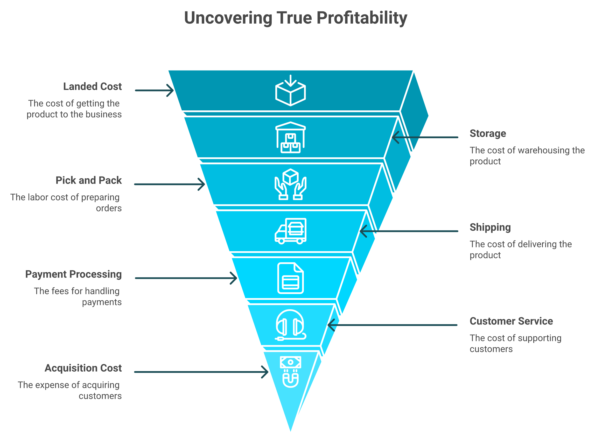
Churn root cause works exactly like that line-by-line rebuild. A "churn reason" label is not enough. You have to cost and sequence the real driver behind each leaving cohort.
Take returns. The true cost of a return can run $6.20 a unit once you stack revenue, landed cost, storage, pick-pack, shipping, payment processing, customer service, and the customer acquisition cost (CAC) you already spent. A churn caused by a bad returns experience is far more expensive than a returns-rate dashboard suggests.
Pair the numbers with the words. Sprig's churn-analysis work is built around capturing the qualitative "why" behind user actions. Research on text-based churn prediction shows sentiment and language signals add real predictive lift over numbers alone. Reading those signals together is the core of Luca's data analysis and deep industry research.
🎯 Chase the lever, not the label
The output of a good diagnosis is not a tidy pie chart of reasons. It is one sentence per cohort: this group left because of this specific, fixable thing.
That sentence is what you act on. Finding it means reading payments, returns, support tickets, and ad data together, the same line-by-line discipline that rebuilt that founder's margin, which is the kind of cross-source reasoning we designed Luca's financial management to do.
"Daily revenue totals are wrong, entire order blocks are missing, and every week we have to open new support tickets just to get our numbers halfway close."
XTRA FUEL Triple Whale Trustpilot Verified Review
"The integrations are inconsistent, the attribution numbers swing, and we end up reverting back to direct data sources like Meta, Shopify, Recharge."
Matt Huttner Triple Whale Trustpilot Verified Review
You cannot diagnose root cause on data you do not trust. That is the trap operators fall into first.
Q7. In B2B, who actually made the decision to leave, and what does it say about your ICP? [toc=B2B Decision-Maker and ICP Fit]
Here is the claim I will plant flag on. In B2B, a logo does not churn, a person does. Until you know which person killed the account, your churn data is a name on a spreadsheet, not a cause.
Attribute every cancellation to a role, the champion who left, the CFO who cut spend, or the new exec who standardized elsewhere, and the pattern exposes your real problem. When the same reason repeats across accounts, the churn is not a retention issue. It is an ICP and positioning issue, meaning you are selling to the wrong fit or promising the wrong outcome.
👤 Account-level churn hides the human
When an account cancels, most teams log "churned" and move on. That tells you nothing you can fix. The decision was made by a specific human, for a specific reason.
Attribute each loss to a role and a trigger:
- Champion left: your internal advocate changed jobs, and nobody else saw the value.
- CFO cut spend: an economic decision, not a product one.
- New exec standardized: someone consolidated tools onto a competitor.
- Product-fit gap: the account never reached the outcome you sold.
Clozd's B2B churn work centers on capturing these real decision drivers through structured loss analysis. A practitioner metrics breakdown from CSM Ravi Ranjan stresses tracking the reason and timing, not just the rate. Surfacing those patterns is where Luca's sales performance view earns its place.
🧭 When churn is really a positioning problem
Now read the pattern across accounts. If "never reached the outcome we sold" repeats five times, you do not have a retention problem. You have a positioning and ideal-customer-profile (ICP) problem.
You are acquiring the wrong fit, or your messaging promises an outcome the product does not deliver fast enough. That fix lives in acquisition and positioning, not in a save-offer. The repeating reason is the signal, and surfacing it means clustering churn reasons across every account, which is the kind of cross-account pattern Luca's use cases are built to find where a single exit interview cannot.
Q8. Can AI find the churn signals your team will never catch manually? [toc=AI-Driven Churn Detection]
Most marketers I know review session recordings the same way. Once a week, you watch maybe five, you trust your gut, and you move on. I did this for years and thought it was diligence. It was sampling.
Yes, AI can find the signals you miss, and it is now the difference between catching churn early and finding out at the next reorder window. A marketer reviews maybe five session recordings a week. An AI agent reads 5,000 a day and extracts patterns no person on your team could surface. Built into an early-warning timeline, failed payment at day zero, skipped shipment at day fourteen, and ticket spike at day thirty, it flags the at-risk cohort before they cancel.
⏰ The volume problem nobody admits
Here is the flaw in the once-a-week habit. Five recordings out of thousands is not a read on your customers. It is a guess dressed up as analysis.
The data volume now dwarfs human review. Between recordings, tickets, payment events, and skipped shipments, no person on your team can read it all. So you end up reacting to churn at the reorder window, months after the signal first fired. This is the exact overwhelm behind why e-commerce founders are drowning in data.
📡 Build the early-warning timeline
The fix is to stop sampling and watch the whole stream against a timeline. Each churn signal has a typical day it shows up:
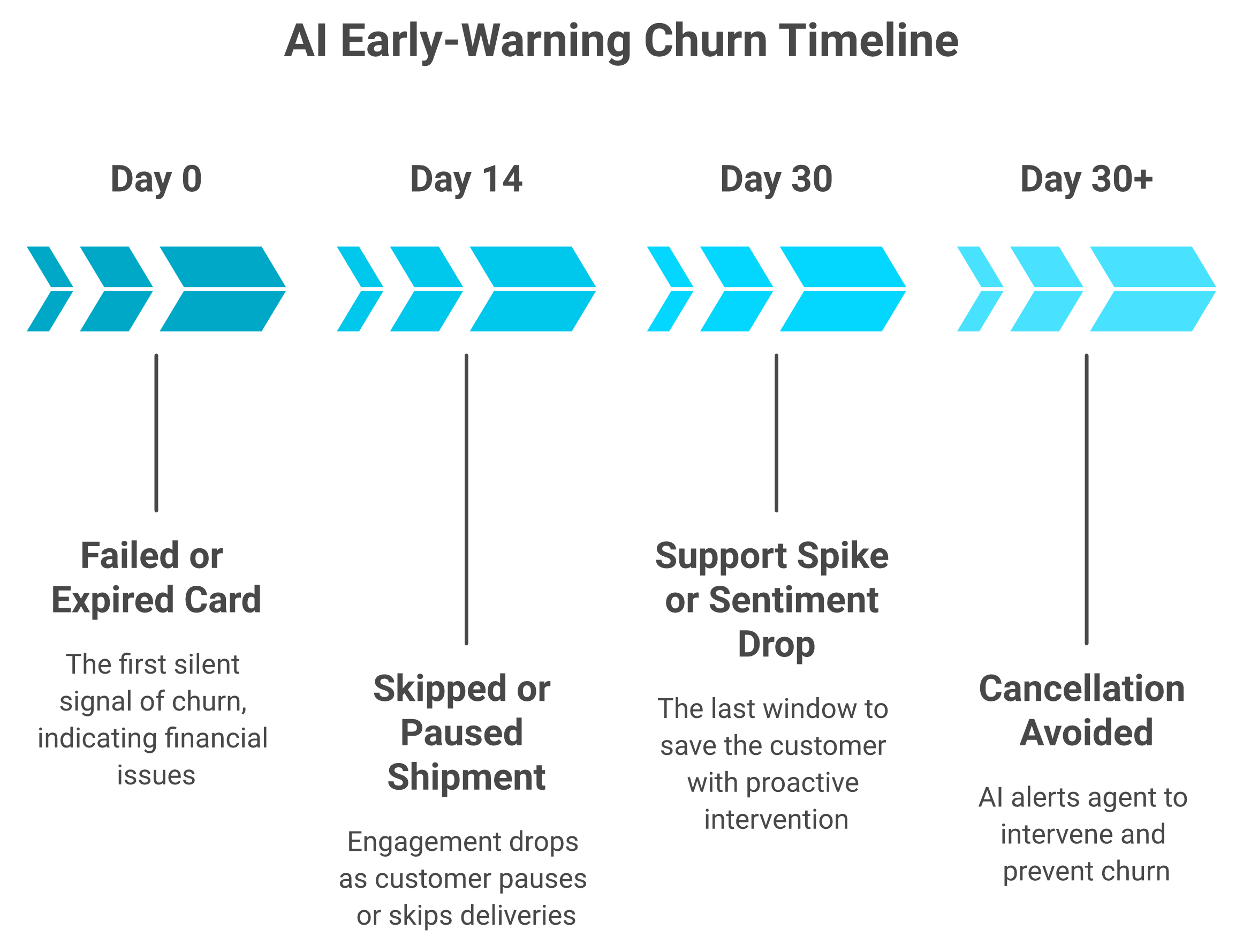
- Day 0: a failed or expired card.
- Day 14: a skipped or paused shipment.
- Day 30: a support-ticket spike or a sentiment drop.
An agent reading 5,000 recordings a day catches these as they happen and pings you while the customer is still saveable. Most analytics tools bolted AI on as a feature. Luca is AI at the core, reading the relationships across your stack 24 hours a day and pushing the alert to Slack or email the moment a signal fires, which is the promise behind agentic AI for e-commerce founders.
⚠️ Do not let the AI be your QA
One hard caveat, earned the expensive way. A premium bike brand let AI run unchecked and published a homepage image of a $20,000 bike with the rear derailleur mounted on the front wheel. Every cyclist who saw it bounced.
The lesson is simple. Use AI to read everything and surface the signal. Keep a human on the final check. Don't remove the quality assurance, and don't let the AI be the QA. Mixpanel's work on churn analytics makes the same point about AI surfacing patterns humans then validate. Moesif's framework treats prediction and human judgment as partners, not substitutes, which is exactly how we frame how AI can actually help you run your e-commerce business.
Q9. What does a cause-mapped win-back plan look like, and how do you prove it worked? [toc=Win-Back Plays and A/B Proof]
Most win-back plans are one generic "we miss you" email blasted at everyone who left. That is not a plan. It is a shrug with a discount code attached, and it recovers almost nothing.
Map every churn cause to one intervention, then prove it with a controlled test. Involuntary churn gets a dunning and card-updater sequence. A billing-cycle-three spike gets a pause-instead-of-cancel offer to the exact at-risk cohort. A product-fit gap gets a cross-sell into the LTV-lifting category. Run each against a holdout group so you know the recovered revenue is real, not seasonal noise.
🗺️ Match the play to the cause
You diagnosed the cause in the earlier sections. Now attach one specific play to each, and size the recovery before you spend.
The cross-sell row is the underrated one. One operator found that customers who entered the body-care category jumped 50 to 100% in lifetime value, so guiding at-risk buyers there beats a blanket discount. Tying that lever to your numbers is exactly what tracking e-commerce unit economics is for.
🧪 Prove it, do not assume it
Here is the discipline most teams skip. Run every play against a holdout group, a random slice of the at-risk cohort that gets nothing.
If the treated group retains better than the holdout, the lift is real. If they match, your "win-back" was just seasonal noise you would have gotten for free. Gong's retention work stresses tying every save motion to measured outcomes, not gut feel.
Set a concrete target and measure against it. One health brand defined a churn sub-goal of moving from 13% to 8%, and used that single number to judge every lever. Inside Luca's marketing analysis and automation, we flag the at-risk cohort, simulate the expected lift, and read the holdout result, so you reinvest only in the plays that actually moved the number, the way one founder described putting a surplus back into tilling up the future soil. That validated reinvestment loop is the heart of Luca's financial management.
"Polar Analytics centralizes revenue, acquisition, and emailing with ease. Sometimes the data takes time to update, and some ratios are more difficult to understand."
Juliette P., CEO Polar Analytics G2 Verified Review
When your retention numbers lag or the ratios are murky, you cannot trust the test result. Clean, fast data is the whole game here, which is why we obsess over the kind of e-commerce analytics platforms that normalize data on ingestion.
Q10. Analytics tool or capital provider, which gap is actually costing you on churn? [toc=Choosing Your Churn Stack]
I watch operators conflate two very different purchases. "I need to fix my churn" and "I need money to fund the fix" are not the same problem, and the same tool rarely solves both well.
Decide what you are actually shopping for. If you need to find and fix churn, judge analytics tools on reasoning depth, root-cause accuracy, and proactive alerting, not on whether they lend. If you need capital to fund the fix, judge providers on interest rate, disbursal time, repayment terms, and total cost, not on whether they show charts. The gap most operators miss is that the two usually live in separate tools.
📊 If you are buying analytics, judge it on analytics
For the intelligence purchase, ignore anything that is not about finding and explaining the leak. Score tools on these only.
The pattern in real reviews is that legacy tools stumble on trust and reasoning. Most analytics tools bolted AI on as a feature. Luca is AI at the core, reasoning across your stack to surface the cause and push the alert, which is the bar I would hold any analytics tool to, and the thesis behind the best Shopify analytics apps.
"Daily revenue totals are wrong, entire order blocks are missing, and every week we have to open new support tickets just to get our numbers halfway close to what our channel actually reports."
XTRA FUEL Triple Whale Trustpilot Verified Review
"The data just cannot be trusted. The sampling is increasingly wild, and now it applies a threshold. To make decisions based on grounded data, it is really difficult to trust it 100%."
Verified User in Retail Google Analytics G2 Verified Review
💰 If you are buying capital, judge it on capital
For the funding purchase, charts are irrelevant. Score providers on the money terms, full stop.
The receipts here are brutal. Operators report capital providers reversing approved offers and dragging on disbursal, the exact moments a founder needs the cash to fund a win-back push. Never use one buy to justify the other, a tool that shows you charts is not automatically a good lender, and a lender is not automatically good at finding your leak. If you are weighing providers, our breakdowns of Wayflyer alternatives and Clearco alternatives judge each strictly on rate, disbursal time, and repayment terms.
"Applying was slow, the terms were not clear up front, and support went quiet exactly when we needed answers about repayment."
u/ni4gbe5, r/paypal Reddit Thread
That is the whole point of separating the two purchases. Luca sits in both conversations honestly, judged as an analytics engine on reasoning and alerting, and judged as a capital option on rate, speed, and repayment terms, never using one to excuse the other, which is the core of the intelligence capital thesis.

.webp)
.svg)
.webp)

.png)