12 Best AI Data Visualization Tools for Ecommerce - Conversational Analytics and Dashboard Providers Discussed
11
mins read
TL;DR
Twelve tools ranked by architecture, not features: ecommerce-native conversational analytics, generic BI copilots that need a data owner, and file-to-chart tools for one-off questions.
Luca AI leads because it reads commerce, ad, retention, and accounting data through one normalised model, then explains which component moved the number.
Dashboards fail because they report what happened, not why. Reaching an answer through tiles takes about three hours, conversationally about three minutes.
Budget for connectors, not licences. GMV-tiered plans run $129 to $499 monthly, so a $5M brand can pay $4,500 to $10,000 yearly.
Read review-score divergence before buying. Triple Whale holds 4.5 on 482 G2 reviews against roughly 3.0 on Trustpilot, a bimodal fit signal.
Build four views that move money: contribution margin by SKU, blended CAC, channel concentration above 70%, and cash conversion cycle, each with a 2026 benchmark line.
Q1. What Are the 12 Best AI Data Visualization Tools for Ecommerce in 2026? [toc=1. 12 Best Tools]
The 12 best AI data visualization tools for ecommerce in 2026 are Luca AI, Triple Whale, Polar Analytics, Glew.io, Daasity, Shopify Sidekick Analytics, ThoughtSpot Spotter, Power BI Copilot, Tableau Pulse, Looker Studio with Gemini, Zoho Analytics, and Julius AI. Luca AI ranks first because it sits as an AI layer over your warehouse, so it traces root cause across sources instead of stopping at a chart.
I sorted this list by architecture, not by feature count. Ten of the twelve tools you see on every competing listicle were never built for a store. That single filter changes the ranking more than any pricing page does.
Upload a file, ask for charts, quick statistical analysis
One-off analysis, not a running store
From consumer-tier monthly plans
⚠️ Why the Category You Pick Matters More Than the Vendor
There are only three real categories here. Ecommerce intelligence tools that already understand store data, generic BI copilots that assume you own a governed data model, and file-to-chart tools that forget everything the moment you close the tab.
Most operators shopping this keyword think they are choosing between twelve products. They are actually choosing between those three architectures. Pick the wrong one and you buy a licence, then inherit a project, which is the same trap operators fall into when they compare ecommerce analytics platforms on feature lists alone.
💸 The Fragmentation Problem Nobody Prices In
A store doing $1M to $5M usually runs eight to twelve tools. Shopify for orders, Meta for acquisition, Klaviyo for retention, Xero or QuickBooks for the books, and a spreadsheet holding it together. Each one sees a fragment. None sees the whole.
That gap shows up in public. Merchants have publicly vented about losing comparison views in native analytics, and one operator summarised the real complaint plainly. It is the core argument for ecommerce data integration before you buy another dashboard.
"Calling Shopify Store Owners: What's Your Biggest Analytics Pain? I've been chatting with Shopify store owners and have seen a recurring issue: dashboards display figures but don't clarify why changes happen." — u/Similar-Cheek-6346, r/buildinpublic Reddit Thread.
"they've officially started redirecting the /dashboards URL now so the old dashboard is completely gone." — u/mmoore1234, r/shopify Reddit Thread.
✅ How to Read This List by Stage
Below $1M in revenue, exhaust the free baseline first. Between $1M and $5M, ecommerce intelligence tools earn their keep because you have data volume but no analyst. Above $10M with a data hire in place, generic BI copilots start to make sense, which is where a full ecommerce business intelligence build becomes defensible.
1.1 Luca AI [toc=1.1 Luca AI]
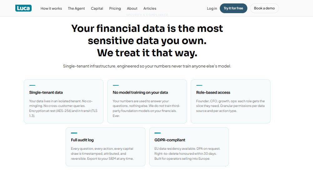
Luca AI keeps store financial data single-tenant, audited and never used for model training.
Luca AI is an AI layer over your ecommerce data warehouse. It connects your sources, normalises them on ingestion, and answers questions in plain English with the reasoning shown.
⭐ Why Did We Choose This Tool?
I put Luca AI first, and I built it, so let me give you the actual reason rather than a pitch. Every other tool on this list either shows you data or requires someone to model it first. Luca AI removes both jobs. It reasons across sales, marketing, product, profit, customer, and operational data at once, then tells you which component moved the number. Most analytics tools added AI to a dashboard. Luca AI was built as the reasoning layer, with the dashboard as one output among several.
📊 Core Capabilities
Connectors: 200+ native sources including Shopify, Meta, Google, and Klaviyo
Query method: Plain English chat, no SQL and no dashboard building
Reasoning depth: Root cause analysis across directly and indirectly linked metrics
Proactive monitoring: 24/7 anomaly alerts on ROAS dips, CAC spikes, and low inventory
Delivery: Scheduled reports with graphs and recommendations to Slack, email, or app
✅ Solutions Offered
Cross-functional analytics spanning sales, marketing, profit, customer, and operations
Predictive analytics for reorder timing, sales forecasts, and product-level trends
Automated periodic reporting with reasoning and recommendations attached
Anomaly and outlier detection benchmarked against your own multi-year patterns
Dashboards, graphs, and text answers from one normalised source of truth
❤️ Best For
Ecommerce stores in the $1M to $5M revenue band with data piling up unused
Teams with no analyst, no data engineer, and no appetite for a warehouse project
Operators who need the reason behind a metric move, not another tile
💰 Case Study
What was the problem? A European skincare brand selling on Shopify, doing roughly €2.8M a year across Meta, Google, and Klaviyo, had a bestseller at 71% gross margin. The founder reconciled three exports every Sunday night and still could not explain a slow margin slide.
How Luca AI helped? Luca AI connected commerce, ad, retention, and accounting data, then allocated returns, shipping, discounting, and support load down to SKU level. The bestseller's true contribution margin came back in single digits. A slower-moving bundle carried the real profit.
What was the outcome? The brand shifted spend behind the bundle, cut discount depth on the old hero product, and set a weekly Slack report on contribution margin by SKU. Sunday reconciliation stopped. I still want more quarters of data before I claim the margin gain holds through a full seasonal cycle.
💸 Pricing
[ Starter, €299 / Month | Growth, €499 / Month | Scale, Custom Pricing ]. Current tiers are listed on the Luca AI pricing page.
1.2 Triple Whale [toc=1.2 Triple Whale]
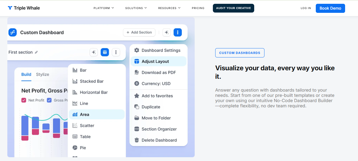
Triple Whale lets teams build custom dashboards manually, choosing chart types before any answer appears.
Triple Whale is a Shopify-native analytics platform built around first-party pixel attribution, creative reporting, and Moby AI agents. It is the default answer when the question is paid media performance.
⭐ Why Did We Choose This Tool?
Triple Whale earned its place because it solved a real problem well. Its first-party pixel collects data independent of platform tracking, which matters after years of iOS signal loss. Moby agents automate the analysis loop, and the marketing mix modelling gives budget guidance rather than raw numbers. It reports 4.5 out of 5 across 482 verified G2 reviews, which is a genuine signal at that volume.
📊 Core Capabilities
Connectors: Shopify-first, with major ad and email platforms
Query method: Dashboards plus Moby AI agent prompts
Reasoning depth: Attribution and creative analysis, marketing layer focused
Proactive monitoring: Alerts and automated summaries available
Delivery: In-app dashboards, mobile app, and scheduled reports
✅ Solutions Offered
Multi-touch attribution using the proprietary Triple Pixel
Creative and ad performance analytics across channels
Marketing mix modelling for budget allocation
Peer benchmarking drawn from aggregated DTC data
Moby AI agents for automated analysis workflows
❌ Where It Falls Short
The score depends on where you look. Triple Whale sits at 4.5 on G2 but closer to 3.0 on Trustpilot, and its Shopify App Store reviews split 79% five-star against 16% one-star. That divergence usually points at data accuracy and cost. Pricing also tiers with your GMV, so the bill rises because you grew, which is why operators start hunting Triple Whale alternatives at exactly that moment.
❤️ Best For
DTC brands whose primary question is paid media efficiency
Shopify-first stores with meaningful ad spend across two or more channels
Teams comfortable reconciling attribution differences between platforms
😊 Reviews
"Triple Whale is very user-friendly and easy to navigate to find the data you need across multiple channels. Relevant channels like emails, ads, organic, etc are already broken down for you and when looking at the specific channel, you have the option to customize the table displaying the data to choose which metrics are most relevant for your needs. Some data we still notice discrepancies between platforms, for example, tracking ads, and differences in the reported metrics like revenue." — Verified User, Triple Whale - G2 Verified Review
$129 / Month to $499 / Month, with custom pricing above roughly $30M GMV.
Luca AI differs from Triple Whale on one axis that decides most evaluations at this stage: it reads the whole store, including the operational and financial layers, so the answer explains the metric rather than attributing a click. The reasoning behind that architecture sits in declining platform ROAS versus true profitability.
1.3 Polar Analytics [toc=1.3 Polar Analytics]
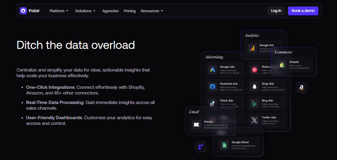
Polar Analytics centralises Shopify and ad data through one-click connectors for lean DTC reporting teams.
Polar Analytics is a Shopify-first analytics platform built for lean teams. It ships prebuilt reports so operators skip the dashboard build.
⭐ Why Did We Choose This Tool?
Polar earns a spot because it respects how small teams actually work. You connect Shopify, your ad accounts, and Klaviyo, then get usable reports on day one. Operators consistently praise how it centralises revenue and acquisition data in one view. That said, it is not plug and play at the advanced end, and reviewers flag a learning curve on deeper features.
📊 Core Capabilities
Connectors: Shopify, major ad platforms, email, and select marketplaces
Query method: Prebuilt and custom dashboards, plus AI insight summaries
Reasoning depth: Cross-channel reporting, marketing and revenue focused
Proactive monitoring: Metric alerts available
Delivery: Web dashboards, scheduled reports, limited mobile
✅ Solutions Offered
Prebuilt Shopify and cross-channel revenue reports
Small DTC teams under 50 people with no analyst on payroll
Shopify-first brands running two to four paid channels
Operators who want reports fast and can live with a support queue
😊 Reviews
"Shortly after onboarding we were assigned an account manager. About a month later, she was laid off and we were never assigned a new account manager. I have the direct email of a support specialist, but the response time has been less than ideal, especially when real-time data is important for our team." — Ben S., Director of Commercial Operations, Polar Analytics - G2 Verified Review
"The pricing communicated when installing the app via Shopify was completely different from the one provided by sales after the installation (which was much higher)" — Maja, Polar Analytics - TrustPilot Verified Review
💸 Pricing
Quote-based. Reviewers report the Shopify listing price and the sales quote have differed.
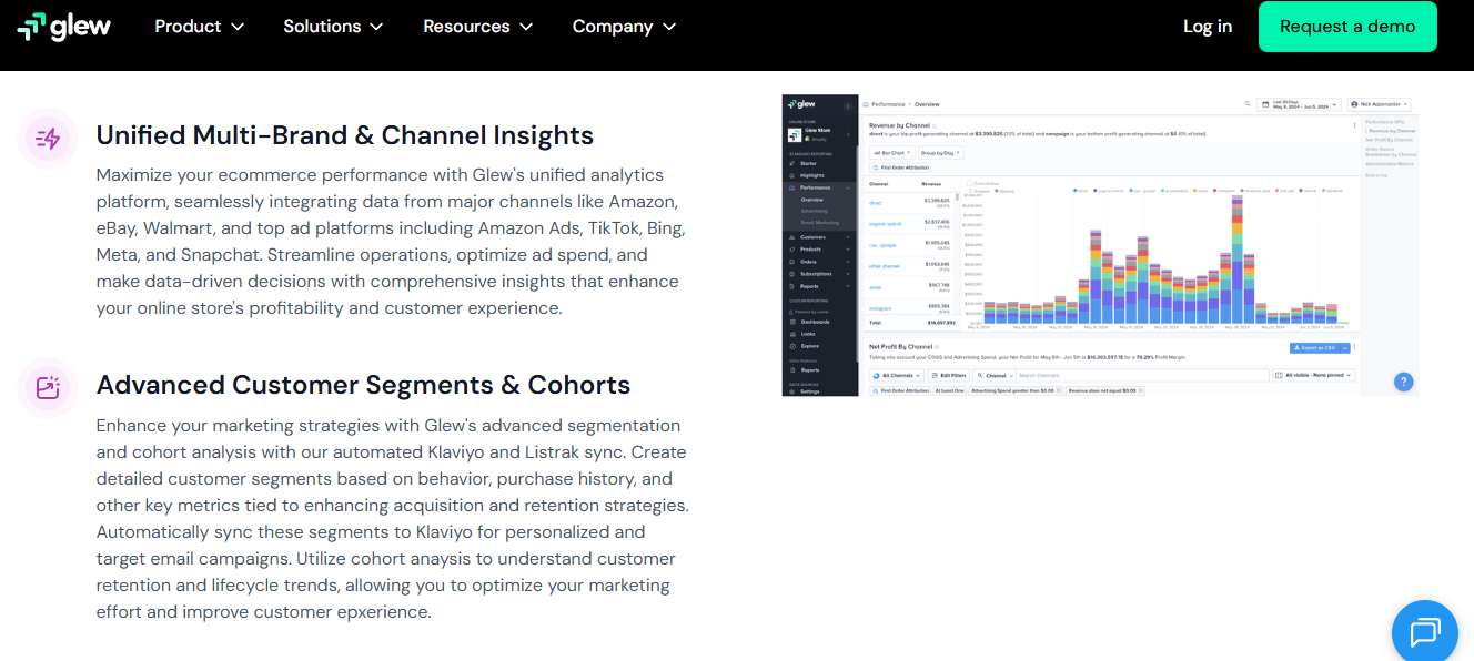
1.4 Glew.io [toc=1.4 Glew.io]
Glew.io unifies marketplace and ad channel reporting with segmentation built for budget-conscious multi-channel sellers.
Glew.io is a multi-channel ecommerce reporting tool with product, customer, and channel analytics. It is the budget entry point on this list.
⭐ Why Did We Choose This Tool?
Glew is here on price and breadth. It starts near $79 a month, which lands well under Triple Whale's $4,500 to $10,000 a year at $5M revenue. Merchants report stronger segmentation and export options than native Shopify reporting gives them. The trade-off is accuracy and polish, which reviewers raise directly.
📊 Core Capabilities
Connectors: Shopify, marketplaces, ad platforms, and email tools
Query method: Prebuilt reports plus Looker-based custom dashboards
Reasoning depth: Descriptive reporting on products, customers, and channels
Budget-conscious sellers running Shopify plus a marketplace
Teams that need exportable segments for email and ads
Brands that value breadth over data precision
😊 Reviews
"Glew reports are easy to segment and export. Data is displayed in easily digestible results with points of reference to previous period and year. For a Shopify-based business, Glew offers more powerful analytical solutions than available to us in Shopify." — Verified User, Glew - G2 Verified Review
"Data was often not accurate and adding new data sources was hard. The visualization was also subpar." — Verified User, Glew - G2 Verified Review
💸 Pricing
From $79 / Month, roughly $2,148 to $4,788 per year on annual plans.
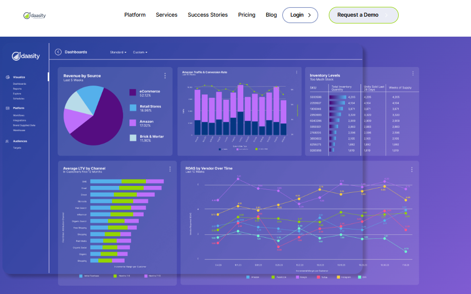
1.5 Daasity [toc=1.5 Daasity]
Daasity models warehouse data into dashboards covering revenue, inventory, lifetime value and vendor ROAS.
Daasity is managed data infrastructure for ecommerce brands. It builds and models your warehouse, then serves reports through Looker or Tableau.
⭐ Why Did We Choose This Tool?
Daasity answers a different question than the rest of this list. It gives you an owned warehouse without hiring a data engineering team. It rates 4.7 out of 5 on G2, which is the highest average among the ecommerce-native options here. It is also the slowest to first answer, because modelling comes before insight.
📊 Core Capabilities
Connectors: Broad ecommerce, ad, retail, and 3PL source coverage
Query method: SQL and BI tools, not conversational
Reasoning depth: Deep, governed modelling once built
Proactive monitoring: Depends on the BI layer you choose
Delivery: Looker, Tableau, or your own BI front end
✅ Solutions Offered
Managed ELT pipelines into a cloud warehouse
Prebuilt ecommerce data models and metric definitions
Omnichannel reporting across DTC, retail, and wholesale
Custom dashboard delivery through partner BI tools
Analyst support for modelling requests
❤️ Best For
Brands above $10M committing to owned data infrastructure
Teams with an analyst or agency to run the BI layer
Operators reporting across DTC, Amazon, and wholesale together
💸 Pricing
Quote-based, positioned for mid-market and above. Before committing to a build like this, it is worth pressure-testing your ecommerce tech stack against what you actually ask each week.
Shopify Sidekick Analytics is the native option inside your admin. The analytics query editor now understands plain-language questions.
⭐ Why Did We Choose This Tool?
This is the free baseline every merchant should exhaust first. Shopify's changelog confirms the query editor integrates with Sidekick and accepts natural language, so advanced reporting no longer needs ShopifyQL knowledge. My honest read is that most stores under $1M never need more than this. Merchants have also been loud about losing dashboard functionality they relied on, which is covered in depth in our Shopify analytics dashboard breakdown.
📊 Core Capabilities
Connectors: Shopify data only, no ad or accounting sources
Query method: Plain-language questions inside the admin
Reasoning depth: Descriptive reporting on store data
Proactive monitoring: Limited
Delivery: Admin reports and saved views
✅ Solutions Offered
Natural-language report building in the analytics query editor
Single-channel Shopify stores with low data volume
Anyone setting a free benchmark before paying for a tool
😊 Reviews
"The new dashboard is absolutely awful. They took away all the functionality that I used previously and made it nearly impossible to compare sales in an easy way." — Shopify merchant, Shopify Community Thread.
"I've opened multiple tickets with Shopify support because the analytics are utterly ineffective." — u/Ambitious-Cheek6480, r/EcommerceWebsite Reddit Thread.
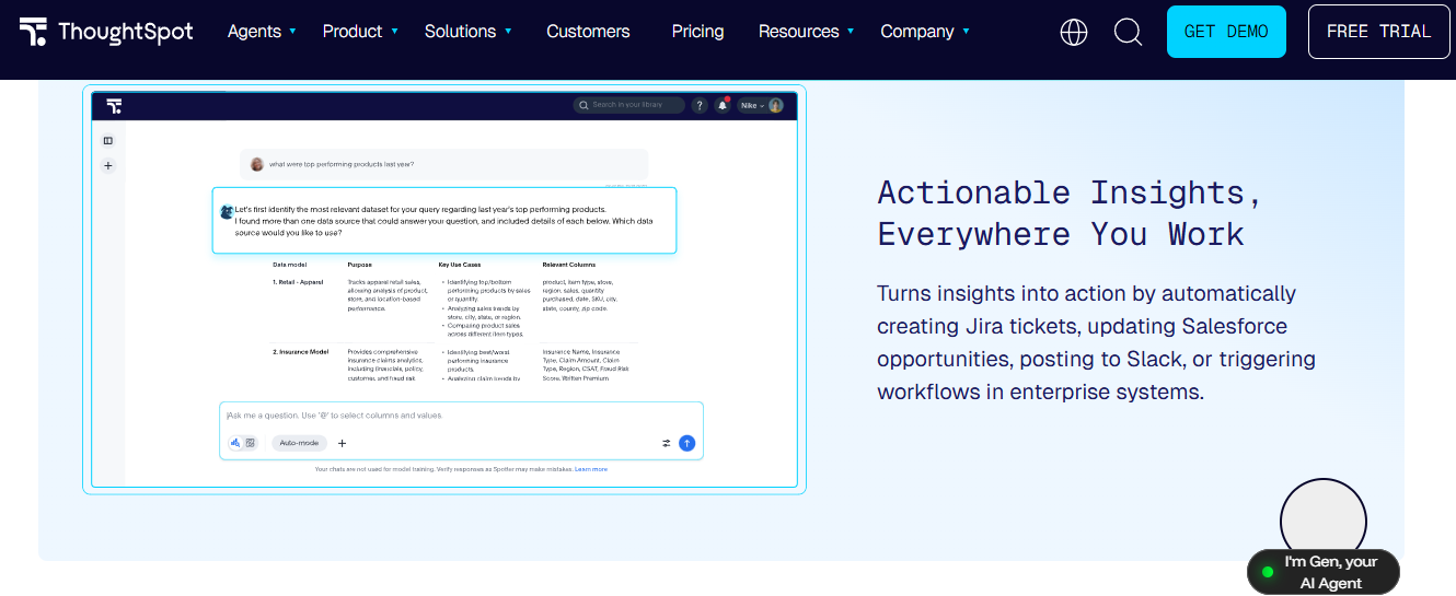
ThoughtSpot Spotter answers typed questions against governed data models, then triggers downstream workflow actions.
ThoughtSpot Spotter is an agentic analytics layer for governed enterprise data. You type a question and it returns a chart with drill paths.
⭐ Why Did We Choose This Tool?
Spotter is the strongest search-style experience among the general BI options. It handles follow-up questions well and keeps answers tied to a governed model. The catch is the prerequisite. You need a warehouse and someone who owns the metric definitions, which most sub-$5M stores do not have.
📊 Core Capabilities
Connectors: Cloud data warehouses, not native ecommerce apps
Query method: Natural-language search and agentic follow-ups
Reasoning depth: Strong within the governed model you build
Proactive monitoring: Change analysis and monitoring features
Delivery: Liveboards and embedded analytics
✅ Solutions Offered
Search-style natural-language querying
Agentic analysis with drill-down explanations
Governed semantic modelling
Embedded analytics for customer-facing apps
Automated change and anomaly analysis
❤️ Best For
Mid-market and enterprise teams with a warehouse in place
Companies with a data owner maintaining definitions
Analysts fielding repeat ad-hoc questions from the business
💸 Pricing
Quote-based, with an entry tier for smaller deployments.
1.8 Power BI Copilot [toc=1.8 Power BI Copilot]
Power BI Copilot adds natural-language visual creation and DAX help to Microsoft's BI platform. It fits teams already inside the Microsoft estate.
⭐ Why Did We Choose This Tool?
Power BI belongs here because it is everywhere, and Copilot genuinely speeds up report building. Reviewers report straightforward setup for teams already using Microsoft tools. One practitioner I trust argues Power BI has fallen behind on AI readiness relative to its pace elsewhere. My read is similar: it is capable, but it assumes a modelled dataset first, which is the recurring theme across AI-powered BI tools for ecommerce.
📊 Core Capabilities
Connectors: Very broad, strongest inside Microsoft sources
Query method: Copilot prompts layered on DAX and Power Query
Reasoning depth: Deep, but only against the model you build
Proactive monitoring: Alerts and subscriptions
Delivery: Desktop, service, Teams, and embedded reports
✅ Solutions Offered
Natural-language visual and page generation
DAX formula assistance and explanation
Data modelling and transformation with Power Query
Governed sharing through workspaces
Fabric integration for warehousing
❤️ Best For
Companies standardised on Microsoft 365 and Fabric
"Power BI can become slow with very large datasets, and complex DAX formulas have a steep learning curve. Also, advanced customization of visuals and version control for reports could be improved." — Verified User, Microsoft Power BI - G2 Verified Review
"It may allow you to create a multitude of custom calculations but it is not flexible and the query becomes cumbersome. The outcome of these cannot always be good for the dashboard performance or speed. Power BI has a limit on the size of data that it can ingest." — Verified User, Microsoft Power BI - G2 Verified Review
💸 Pricing
Quote-based, per-user licensing with Fabric capacity for Copilot features.
1.9 Tableau Pulse [toc=1.9 Tableau Pulse]
Tableau Pulse pushes metric digests and guided insights to users. It watches your defined KPIs and summarises what changed.
⭐ Why Did We Choose This Tool?
Pulse is the best guided-monitoring experience among the enterprise options, and independent scoring reflects that. It turns dashboards into a digest, which suits executives who will not log in. It stays on the monitoring side of the line though. It tells you what moved, not what to do about your inventory position.
📊 Core Capabilities
Connectors: Broad enterprise sources through Tableau
Query method: Metric subscriptions plus limited natural language
Reasoning depth: Anomaly summaries on defined metrics
Proactive monitoring: Strong, digest-led by design
Delivery: Slack, email, and mobile digests
✅ Solutions Offered
Automated metric digests with plain-language summaries
Organisations with governed metric definitions already set
💸 Pricing
Quote-based, included with Tableau licensing tiers.
1.10 Looker Studio with Gemini [toc=1.10 Looker Studio Gemini]
Looker Studio is Google's free dashboard tool, now with Gemini assistance. It is the default for marketing reporting on Google data.
⭐ Why Did We Choose This Tool?
Free plus Google connectors is a hard combination to argue with. For paid search and GA4 reporting, Looker Studio does the job at zero licence cost. Performance is the recurring complaint, and reviewers do not hold back about it. It also has no opinion about your data, so blending ecommerce sources still means manual work, which is why Google Analytics for ecommerce rarely stands alone.
📊 Core Capabilities
Connectors: Free Google sources, paid third-party connectors
Query method: Manual chart building plus Gemini assistance
Reasoning depth: Descriptive, no cross-source reasoning
Proactive monitoring: Scheduled email delivery only
Delivery: Web dashboards and PDF or email reports
✅ Solutions Offered
Free multi-source dashboards
Native GA4, Google Ads, and BigQuery connections
Gemini-assisted chart and formula creation
Scheduled report delivery by email
Shareable public or private reports
❤️ Best For
Teams reporting mainly on Google Ads and GA4 data
Agencies producing client-facing dashboards at low cost
Stores testing whether they need paid tooling at all
😊 Reviews
"It seems to have the potential of being useful. This potential isn't easily realized, but it's there." — Verified User, Looker Studio - G2 Verified Review
"Sampling, sampling, sampling. For a data and algorithm based company, Google does a terrible, terrible job of estimating reality out of the sampling they do." — Gitai B., Marketing, Web Analytics, and Testing Lead, Google Analytics - G2 Verified Review
💸 Pricing
Free, with a paid Pro tier.
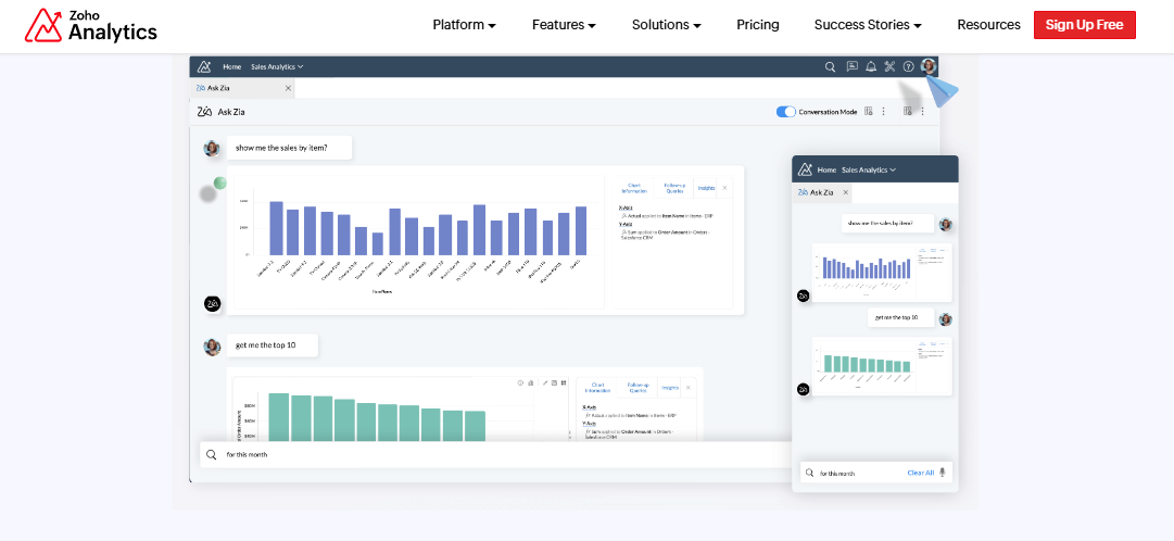
1.11 Zoho Analytics [toc=1.11 Zoho Analytics]
Zoho Analytics Ask Zia converts plain-English sales questions into charts for budget-conscious small teams.
Zoho Analytics is low-cost self-serve BI with an assistant called Ask Zia. It suits small teams watching every line of spend.
⭐ Why Did We Choose This Tool?
Price and a free tier put Zoho on the list. Ask Zia handles plain-language questions well enough for non-technical users. The gaps show in ecommerce specifically. Reviewers cite a steep learning curve, clunky data integration, and missing native ecommerce connectors.
📊 Core Capabilities
Connectors: Broad general sources, thin on native ecommerce apps
Query method: Ask Zia natural-language queries plus manual builds
Reasoning depth: Descriptive with basic forecasting
Proactive monitoring: Threshold alerts available
Delivery: Dashboards, scheduled email reports
✅ Solutions Offered
Ask Zia conversational querying
Blended reporting across multiple sources
Drag-and-drop dashboard building
Basic forecasting and what-if analysis
Embedded analytics for portals
❤️ Best For
Small teams already inside the Zoho ecosystem
Businesses needing cheap BI across non-ecommerce data
Operators comfortable investing setup time to save licence cost
💸 Pricing
Free tier, then low monthly paid plans with hard user caps.
1.12 Julius AI [toc=1.12 Julius AI]
Julius AI turns an uploaded file into charts and statistics through chat. It is built for one-off analysis, not a running store.
⭐ Why Did We Choose This Tool?
Julius is the fastest path from a CSV to a chart, and it holds 4.5 out of 5 on G2 across a large user base. For a quick vendor comparison or a survey read, it is genuinely useful. It is also the weakest fit for ongoing store reporting. There are no live dashboards, no scheduled refresh, and reproducibility is a known problem, which matters if you need automated data reporting every week.
📊 Core Capabilities
Connectors: File uploads first, database connectors on higher tiers
Query method: Chat prompts on uploaded data
Reasoning depth: Good for basic stats, shaky on advanced methods
Proactive monitoring: None
Delivery: In-session charts and exports
✅ Solutions Offered
Plain-English analysis of uploaded spreadsheets
Automatic chart generation with code shown on request
Basic statistical testing and forecasting
Data cleaning assistance on messy files
Shareable session links
❤️ Best For
One-off analysis of a file, not recurring reporting
Founders testing a hypothesis before committing budget
Teams with someone who can sanity-check statistical output
😊 Reviews
"Limitations include struggles with large or complex datasets. A significant limitation of Julius is its initial design for CSV files only, which is quite limiting." — u/Cheap_Scientist6984, r/datascience Reddit Thread.
"The only downside is that it costs $20 per month following the trial period, but since bill my hours at25 per, it has already paid for itself within two projects." — u/Ok-Prune-4014, r/spss Reddit Thread.
💸 Pricing
From roughly $20 / Month, up to about $45 / Month on Pro.
Luca AI sits at the top of this list for a structural reason, not a stylistic one: it is the only option here that reads commerce, ad, retention, and accounting data through one normalised model, then explains which component moved the number. Nine of the other eleven either report one slice well or need a data owner first. If you want the reasoning behind that architecture, it is laid out in ecommerce data visualization and in how agentic AI works for ecommerce founders.
Q2. How Were These 12 Tools Scored and Ranked? [toc=2. Scoring Methodology]
Each tool was scored on five weighted criteria: Cross-Source Reasoning Depth 25%, Ecommerce Data Model and Connectors 25%, Answer Accuracy and Traceability 20%, Setup and Time to First Answer 15%, and Verified User Reviews 15%. Zero to 20 earns one star, 21 to 40 two, 41 to 60 three, 61 to 80 four, and 81 to 100 five. Luca AI scores 5 stars.
The Rubric, Published in Full
Scoring Rubric for AI Data Visualization Tools
Criterion
Weight
What It Measures
Cross-Source Reasoning Depth
25%
Can it relate ad, commerce, retention, and cost data in one answer
Ecommerce Data Model and Connectors
25%
Native coverage of Shopify, Meta, Google, Klaviyo, and accounting
Answer Accuracy and Traceability
20%
Can you audit how the number was produced
Setup and Time to First Answer
15%
Days from connection to a usable answer
Verified User Reviews
15%
Volume-weighted ratings across G2, Trustpilot, and app stores
📊 Why Reasoning and Connectors Carry Half the Score
Those two criteria decide whether a tool works for a store at all. A beautiful chart on incomplete data is still a wrong decision. Luca AI normalises and standardises every connected source on ingestion, which is what drives its Setup and Time to First Answer score.
Reasoning depth then separates the categories quickly. Marketing-only tools cap out because they cannot see cost or cash. General BI caps out because it needs a model built first, which is the standing trade-off across ecommerce analytics platforms.
⚠️ Why Traceability Is Scored at All
An answer you cannot audit is a guess with better typography. Operators already report attribution numbers that do not tally with Shopify, which is exactly the trust gap this criterion measures. Ask Luca AI which sources and definitions produced a figure, and the components are visible before you act.
Review scores were weighted by volume, not headline average. A 4.5 across 482 G2 reviews carries more signal than a 5.0 across nine.
😊 Where Review Scores Disagree
Verified User Reviews got the smallest weight for a reason. The same product often scores very differently depending on which platform you read.
"Very useful for top down view for a very fast reporting. Supports and tracks many different platforms as well. almost a no brainer for pulling out stats quickly. However, some stats are not so accurate in pulling in data; they do not tally with shopify" — Verified User, Triple Whale - G2 Verified Review
"Mobile limitations and the platform isn't a plug-and-play solution, it requires time and effort to learn its advanced features and capabilities. There are instances that certain intergrations are not yet fully functioning so you have to always check with Customer Support." — Charlene R., Head of Operations, HR & Culture, Polar Analytics - G2 Verified Review
❌ The Conflict I Am Not Hiding
I publish this list and I built one of the tools on it. That is a real conflict, so here is the honest handling of it. The rubric is above in full, the weights are stated, and you can re-weight them.
If capital, mobile apps, or enterprise governance matter more to you, change the percentages. My read is that reasoning and connectors still decide the outcome for a store under $5M. I could be wrong for brands with an analyst already on payroll, which is the same judgement call behind any ecommerce tech stack decision.
Luca AI scores highest on reasoning depth and connector coverage because both describe its architecture, an AI layer reading one normalised model across 200+ native sources, rather than AI features added to a dashboard product. The reasoning approach is documented openly.
Q3. What Does AI Actually Change About Data Visualization, and Why Do Dashboards Still Fail Operators? [toc=3. What AI Changes]
AI changes four things: you ask in plain English instead of building a query, the tool picks the chart, it watches for anomalies without being asked, and it writes the reasoning alongside the visual. Dashboards still fail because they report what happened, not why, and most operator questions cross tools a single dashboard was never built to see.
The Four Real Shifts
Natural-language query means you type a question and the tool writes the query behind it. Shopify's own analytics editor now works this way through Sidekick. Auto-charting means the tool picks the visual, so you stop hunting chart types.
Anomaly detection means the system watches your metrics continuously. Narrative reasoning means it explains the movement in words. Luca AI runs all four, then pushes the alert to Slack or email when a threshold breaks, which is the practical shape of conversational analytics for ecommerce.
⏰ The Sunday Night Scene
Here is the version I see most. Exports from Shopify, exports from the returns system, ad numbers pasted into a sheet, and a total nobody fully trusts.
One operator running a business at 200 million GMV described that exact routine as something that makes him shudder now. He is not a small store owner. He had the budget and still lived in exports.
❌ Dashboards Report, They Do Not Explain
The complaint is public and consistent. Merchants say the tiles show figures without explaining the change.
"Calling Shopify Store Owners: What's Your Biggest Analytics Pain? I've been chatting with Shopify store owners and have seen a recurring issue: dashboards display figures but don't clarify why changes happen." — u/Similar-Cheek-6346, r/buildinpublic Reddit Thread.
"I integrated this data with an LLM using MCP, which is essentially a collection of technical terms" — u/Kwaleseaunche, r/shopify Reddit Thread.
⚠️ Three Hours Versus Three Minutes
One practitioner who builds these systems puts the gap bluntly. Reading dashboards to reach an answer takes about three hours. Asking conversationally takes about three minutes.
His harder claim is the one worth sitting with. Roughly 70 to 80 percent of the real questions clients have cannot be answered through a dashboard at all. My read is that this is directionally right, though the exact split will vary by store.
✅ What Root-Cause Reasoning Looks Like
Say contribution margin slipped two points last month. A dashboard shows the dip. It does not tell you that returns rose on one SKU while discount depth widened on a second, which is the exact gap covered in contribution margin versus gross margin.
Ask Luca AI why margin moved, and it tests the influencing components across ad, commerce, returns, and retention data in one pass. The visual comes after the reasoning, not instead of it.
💰 The Test to Run This Week
Write down the five questions your current stack cannot answer. Not metrics, questions. Then take the same five to any trial tool and time the answers.
If a tool cannot answer three of the five, the problem is architecture, not your dashboard skills. Visualization is a courtesy for the human reader. The reasoning is the substance, though you still need the chart to defend the call to a partner or lender.
Luca AI was built for the questions a dashboard cannot hold, tracing why CAC rose while ROAS held by relating ad, commerce, and retention data in a single pass rather than in three tabs. That thesis is unpacked further in declining platform ROAS versus true profitability.
Q4. Which Category of Tool Fits Your Store: Ecommerce-Native, Generic BI Copilot, or File-to-Chart? [toc=4. Choosing Your Category]
Pick the category before the vendor. Ecommerce-native conversational analytics fits operators without a data hire. Generic BI copilots like Power BI Copilot, Tableau Pulse, and Looker with Gemini only pay off if someone already owns a governed data model. File-to-chart tools like Julius suit one-off analysis, not a running store.
The One Question That Sorts You
Ask this: does someone on your payroll own your metric definitions? If yes, BI copilots are live options. If no, they are a project disguised as a purchase.
Generic BI copilot (Power BI, Tableau Pulse, Looker, ThoughtSpot)
Yes
Weeks to months
Mid-market with an analyst
File-to-chart (Julius AI)
No
Minutes
One-off questions
⚠️ The Hidden Cost of BI Copilots
The licence is not the cost. The modelling and maintenance are. Reviewers describe a steep DAX learning curve and slowdowns on large datasets.
There is also a pace problem. One operator I rate argues Power BI has fallen behind on AI readiness relative to how fast the rest of the category moves. Luca AI removes that prerequisite, because there is no semantic model to build before the first useful answer.
✅ Where BI Copilots Genuinely Win
They win when you are already inside the estate. If your finance team lives in Microsoft, Power BI Copilot is the cheapest good answer you have.
One operator turned Copilot on for her spreadsheets and said it simplified her work immediately. That is real, and I would not talk anyone out of it. The wider case for tooling like this sits in AI-powered BI tools for ecommerce.
❌ Where File-to-Chart Tools Break
They have no memory, no connectors, and no alerting. You upload, you ask, you close the tab, and the context is gone.
There is a second failure mode worth naming. One founder asked AI for analysis and got twenty executive summaries at twenty-five pages each. Output volume is not insight.
"Limitations include struggles with large or complex datasets. A significant limitation of Julius is its initial design for CSV files only, which is quite limiting." — u/Cheap_Scientist6984, r/datascience Reddit Thread.
"Sampling, sampling, sampling. For a data and algorithm based company, Google does a terrible, terrible job of estimating reality out of the sampling they do." — Gitai B., Marketing, Web Analytics, and Testing Lead, Google Analytics - G2 Verified Review
💰 The Build Versus Buy Call
Think about onboarding, not features. Hiring a brilliant analyst and saying "you are smart, go report" fails on day one. Every capable system needs context before it produces anything useful.
The same logic applies to tools. Under $5M with no analyst, buy ecommerce-native. Above $10M with a data hire, build on BI. Between the two, my honest read is that it depends on whether your data person has spare capacity, and on how much ecommerce data integration work you are willing to own.
Luca AI belongs in the first column of that table for a specific reason: it needs no SQL, no analyst, and no dashboard build, because the modelling happens on ingestion rather than in a project plan. The use cases page shows what that looks like in practice.
Q5. What Do These Tools Cost Once Connectors and GMV Tiers Are Counted? [toc=5. Connectors and Pricing]
Budget for connectors, not licences. GMV-tiered plans run roughly $129 to $499 a month with custom pricing above $30M, so a $5M brand can pay $4,500 to $10,000 a year while Glew sits nearer $2,148 to $4,788. Free options exist: Shopify Sidekick analytics, Looker Studio, and Zoho Analytics on a limited free tier.
💸 What You Actually Pay
Connector Coverage and Pricing Across AI Data Visualization Tools
Tool
Ecommerce Connectors
Accounting Data
Price Signal
Luca AI
200+ native sources
Yes
Starter €299, Growth €499, Scale custom
Triple Whale
Shopify, ads, email
No
$129 to $499 / Month by GMV
Polar Analytics
Shopify, ads, email
No
Quote-based
Glew.io
Shopify, marketplaces, ads
No
From $79 / Month
Daasity
Broad, plus 3PL and retail
Via warehouse
Quote-based
Shopify Sidekick
Shopify only
No
Included
Looker Studio
Google sources free
No
Free, paid Pro tier
Zoho Analytics
Thin on ecommerce apps
Partial
Free tier, then paid
⚠️ The Cleanup Cost Nobody Quotes
Connector counts hide a bigger line item. Cleaning, tagging, and normalising data is where months disappear, which is the hidden bill behind most ecommerce data management projects.
One real example: retail week numbering appears as 554 in one system and 332 in another. Luca AI normalises and standardises data on ingestion, which removes the cleanup project usually buried in a connector budget.
✅ Start With the Free Baseline
Run three plain-language questions through Shopify's analytics query editor this week. Then build one Looker Studio dashboard on your ad data. Our Shopify analytics guide walks through what the native reports can and cannot do.
If both answer your questions, stop there and keep the cash. Free options break at the same place: no cross-source reasoning, no proactive alerts, and no memory of last month.
❌ Why GMV Tiers Punish Growth
Here is the part vendors do not spotlight. Tiered pricing means your bill rises because revenue rose, not because you got more value.
A brand at $5M pays roughly double what a brand at $2M pays for the same reports. Reviewers also report the plan quoted at install differing from the sales quote afterwards. Operators comparing Triple Whale alternatives usually start at exactly that renewal moment.
Base plans limit what you can slice, which surfaces fast in reviews.
"With many different features, it's seems difficult to find the exact report I'm looking for, and to be able to get channel revenue for a whole segment of products, rather than have to go through each product indiviudually to see where the orders and being attributed. We are only on the base plan though, and I'm sure custom reporting would solve this issue." — Verified User, Glew - G2 Verified Review
"It is also a miss that the "Starter" area and pretty much all other areas are redudant for me due to limited filter options that doesn't allow me to slice and dice info." — Verified User, Glew - G2 Verified Review
⏰ The Paid Trigger
The trigger is a repeat question, not a feature you want. If the same cross-source question comes up weekly and your free stack cannot answer it, pay for the answer.
A practitioner I trust put the value plainly. Tasks you assume take two weeks of manual data wrangling get done in about 90 seconds. That maths works at $299 a month. It does not work if you only need a chart twice a year.
Luca AI prices against reasoning capacity rather than your GMV, so the bill does not climb simply because the store grew. Current tiers sit on the pricing page.
Q6. How Do You Know the AI Chart Is Telling You the Truth? [toc=6. Accuracy and Trust]
An AI chart goes wrong at the input, not the pixel: a broken connector, an ungoverned metric definition, or a missing attribution signal. Read the score divergence before buying. Triple Whale holds 4.5 on 482 G2 reviews against 4.2 across 91 Shopify App Store reviews and roughly 3.0 on Trustpilot, with 79% five-star and 16% one-star.
The Three Failure Points
Failure one is the pipe. A connector silently misses orders or double-counts them.
Failure two is the definition. Two tools disagree on what revenue means. Failure three is the missing signal, where no system ever captured the input you need, which is a data collection problem rather than a reporting one.
⚠️ When the Same Question Returns Two Answers
This is the most common complaint in ecommerce analytics reviews, and it is a definition problem, not an AI problem.
"We are a startup company and mainly use Supermetrics for Shopify API. Data is inaccurate when it comes to Daily Total Sales and Returning Orders figures. Tickets have been opened since the start of January 2021 with barely any response whatsoever." — Verified User, Supermetrics - G2 Verified Review
"Sometimes the data takes time to update, and some ratios are more difficult to understand." — Juliette P., CEO, Polar Analytics - G2 Verified Review
❌ The Signal That Was Never Collected
No model can infer what nobody captured. Post-purchase surveys asking how a customer heard about you are the cheapest fix here, and they feed directly into customer journey analytics.
Matt Bahr made this case years ago on the 2X eCommerce podcast, and it holds. Luca AI surfaces outliers by relating multiple metrics across sources, though it still cannot invent an input that was never recorded.
📊 Read the Trust Gap, Not the Average
Triple Whale Ratings Across Review Platforms
Platform
Triple Whale Score
What It Tells You
G2
4.5 / 5 across 482 reviews
Buyer-side sentiment, often at purchase time
Shopify App Store
4.2 / 5 across 91 reviews
Merchant sentiment, closest to the money
Trustpilot
~3.0 / 5
Billing, support, and cancellation friction
Read in this order: one-star app-store reviews first, then Trustpilot, then the G2 average. The bimodal split of 79% five-star against 16% one-star usually means the tool works brilliantly for one profile and badly for another.
✅ Three Questions to Ask Before Signing
Ask where each number comes from and how the tool defines revenue, orders, and returns. Ask what happens when a connector fails silently.
Then ask whether you can see the components behind an answer. Ask Luca AI why a figure moved, and the sources and definitions behind it stay visible before you act.
⚠️ Never Let the AI Be the QA
A premium bike brand published a homepage image of a $20,000 bike with the rear derailleur mounted on the front wheel. Unsupervised autonomy did that.
The lesson transfers directly to reporting. A human reviews anything that reaches a customer, a board, or a lender. One founder spent about $10 million building a proprietary meaning layer before general models overtook it, which tells you the model is not the moat. The data discipline is.
Luca AI shows the components behind an answer, so an operator can check which sources and definitions produced a number before spending against it. That posture is explained further in how AI can actually help you run your ecommerce business.
Q7. Which Views Actually Move Money, and How Do You Roll One Out in 30 Days? [toc=7. Money Views and Rollout]
Build four views: contribution margin by SKU after allocated costs, blended CAC by channel against an owned-channel floor of $5 to $15, channel concentration flagged above 70% of spend on one platform, and cash conversion cycle. Overlay 2026 medians, Meta CPM $14.19 and median ROAS 1.86, then set alert thresholds in week four.
The Four Views Worth Building
Everything else is decoration until these four exist. Each one changes a spending decision.
The Four Ecommerce Views That Change Spending Decisions
View
Benchmark Line
Decision It Drives
Contribution margin by SKU
Your own blended average
What to scale, what to kill
Blended CAC by channel
$5 to $15 owned, up to $120 mega-influencer
Where the next dollar goes
Channel concentration
Flag above 70% on one platform
Diversification urgency
Cash conversion cycle
Your reorder lead time
Whether you can fund the scale
💰 Gross Margin Lies to You
A founder I worked with slid an invoice across the table. Her bestseller showed 72% gross margin.
Twenty minutes later she was crying. Line by line, actual contribution margin came out at 8%. She had spent two years scaling a product that barely broke even, which is the pattern behind most ecommerce profit margin surprises.
⚠️ Allocate the Support Load
Here is the cost most stores never assign. One product drove 42% of all customer service tickets, which worked out to $1.45 per unit.
Add returns, shipping, payment fees, and discount depth. Gross margin only tells you what the thing costs to make, never what it costs to sell. The mechanics sit in tracking ecommerce unit economics.
❌ ROAS Is Not the Answer Either
Media buyers lean on ROAS because it is easy to pull. It hides bottom-line impact.
Meta CPM ran $14.19 in 2026, up 20.03% year over year, with median ROAS at 1.86 across 35,000 accounts. If your chart has no benchmark line, you cannot tell a bad month from a bad market. Ask Luca AI to send the weekly CAC report with graphs, reasoning, and the benchmark comparison attached.
⏰ The 30-Day Rollout
30-Day Rollout Plan for an AI Data Visualization Tool
Week
Action
Outcome
1
Write the five questions your stack cannot answer
A real test, not a feature list
2
Connect two tools to live store data
Same-question bake-off begins
3
Verify every answer against source of truth
Trust established or vendor eliminated
4
Set three alert thresholds
Monitoring runs without you
Never run a bake-off on demo data. Demo datasets are clean, and yours is not.
✅ Make the Alerts Do the Watching
Three thresholds are enough to start. Contribution margin below your floor, channel concentration above 70%, and inventory below reorder point, which is where ecommerce monitoring tools earn their keep.
Luca AI scans connected data continuously and pushes the alert to Slack or email when one of those breaks. One retailer told me she spends three weeks before each buying cycle analysing vendor performance by hand, which is exactly the work a threshold replaces.
⭐ Where I Think This Goes
My read is that by 2027, the dashboard becomes an artefact you generate to defend a decision, not the place you make it. I could be early on that, and the argument is laid out in agents for ecommerce.
The open question I am sitting with is trust. Operators will hand over monitoring quickly. They will hand over recommendations slowly, and probably should. If you are running this test on your own store, I would like to hear which of your five questions the tools failed, so tell us what you are building.
FAQ's
What are AI data visualization tools, and how are they different from a normal dashboard?
AI data visualization tools turn a plain-English question and a connected dataset into a decision-ready visual. Four things change compared with a classic dashboard.
Natural-language query: you type the question, the tool writes the query behind it.
Auto-charting: the tool picks the chart type instead of you hunting for it.
Anomaly detection: the system watches metrics continuously rather than waiting for you to log in.
Narrative reasoning: the movement gets explained in words alongside the visual.
A traditional dashboard stops at the first two, at best. It shows what happened. It does not explain why, because most operator questions cross tools that a single dashboard was never built to see.
Luca AI runs all four, then pushes the alert to Slack or email when a threshold breaks, which is the practical difference between monitoring and recommending. We built it that way because the chart is the output and the reasoning is the product.
If you want the fuller comparison of how this category evolved past static tiles, we walk through it in our guide to ecommerce data visualization.
Which AI data visualization tools work best for a Shopify store doing $1M to $5M?
At that revenue band you have real data volume and no analyst, so ecommerce-native tools win. Generic BI copilots assume someone already owns your metric definitions.
Luca AI: conversational analytics across commerce, ad, retention, and accounting data.
Triple Whale: strongest when your main question is paid media attribution.
Polar Analytics: prebuilt reports for lean teams that want speed over depth.
Glew.io: the budget option, from roughly $79 a month, with accuracy trade-offs.
Shopify Sidekick: free baseline inside your admin, worth exhausting first.
Luca AI normalises and standardises every connected source on ingestion, which is why an operator at this stage can ask a cross-source question in week one rather than after a modelling project. We are honest about fit, though. Below roughly $1M in revenue, the free native reports usually cover you, and above $10M with a data hire on payroll, a governed warehouse build starts to make sense.
Are there free AI data visualization tools worth using before paying for one?
Yes, and we think you should exhaust them first. Three free options genuinely earn a place in the evaluation.
Shopify Sidekick analytics: the query editor now accepts plain-language questions, so advanced reports no longer need ShopifyQL knowledge.
Looker Studio: free dashboards with native Google Ads, GA4, and BigQuery connections.
Zoho Analytics: a limited free tier with hard user and row caps.
All three break in the same three places. There is no cross-source reasoning, no proactive alerting, and no memory of what you asked last month. That is the honest boundary.
Run three plain-language questions through your Shopify admin this week and build one Looker Studio dashboard on your ad data. If both answer your questions, stop there and keep the cash sitting in inventory or ad spend where it belongs.
The paid trigger is a repeat question, not a feature you want. When the same cross-source question comes up weekly and the free stack cannot answer it, that is when Luca AI earns its place at €299 a month. Compare tiers on our pricing page before you book anything.
How accurate are AI generated charts, and how do I know the number is right?
An AI chart goes wrong at the input, not the pixel. There are three failure points worth checking before you trust anything.
The pipe: a connector silently misses orders or double-counts them.
The definition: two tools disagree on what revenue, orders, or returns actually mean.
The missing signal: nobody ever captured the input, so no model can infer it.
The definition problem is the most common complaint in ecommerce analytics reviews. Merchants regularly report figures that do not tally with Shopify, and that is a governance gap rather than an AI failure.
Read review-score divergence before signing. One-star app-store reviews first, then Trustpilot, then the G2 average last. A bimodal split usually means the tool works brilliantly for one profile and badly for another.
Luca AI shows the components behind an answer, so an operator can check which sources and definitions produced a number before spending against it. We also hold a hard line internally: a human reviews anything that reaches a customer, a board, or a lender. Never let the AI be the QA. More on that discipline in how AI can actually help you run your ecommerce business.
What should an ecommerce brand budget for an AI data visualization tool in 2026?
Budget for connectors and cleanup, not licences. Sticker price is the smaller number.
GMV-tiered plans: roughly $129 to $499 a month, with custom pricing above $30M GMV.
At $5M revenue: that can mean $4,500 to $10,000 a year for the same reports a $2M brand gets cheaper.
Glew.io: from about $79 a month, roughly $2,148 to $4,788 annually.
Enterprise BI: quote-based, plus the analyst time to model your data.
Tiered pricing has a structural problem worth naming. Your bill rises because revenue rose, not because you received more value. That is a tax on the growth the tool supposedly enabled.
The invisible line item is data cleanup. Retail week numbering shows up as 554 in one system and 332 in another, and reconciling that consumes months. Luca AI normalises and standardises data on ingestion, which removes the cleanup project usually hidden inside a connector budget.
Whatever you choose, judge it against the money it moves rather than the hours it saves. Our framework for that sits in tracking ecommerce unit economics.
Enjoyed the read? Join our team for a quick 15-minute chat — no pitch, just a real conversation on how we’re rethinking Ecommerce with AI - Luca
Loading Schedule...
Your AI Co-Founder is here.
Here’s why:
Shopify, Meta, Xero - one brain.
"Should I scale?" Answered with real data.
Growth capital. No applications. One click.
Thank you! Your submission has been received! Please book a time slot for the Meeting
Oops! Something went wrong while submitting the form.