Shopify custom reports use the report builder, ShopifyQL Notebooks, and Sidekick AI, but custom reports unlock at Advanced and ShopifyQL is Plus-only. Native ShopifyQL cannot query metafields, join Meta or Klaviyo, or consolidate multi-store data, so most operators rebuild margin in Sheets. Mipler wins on metafields, Report Pundit on multi-store and ad joins, Better Reports on scheduled email, and Data Export on price. Reporting automation follows a four-rung GMV ladder, from native scheduled email under $1M to Fivetran into a warehouse above $50M. A typical $5M brand spends roughly $30K a year across plan delta, two reporting apps, and Sheets ops, before any governance fixes. An AI reasoning layer sits above any rung, pushing root-caused, scenario-modelled answers to Slack and email instead of more dashboards.
Q1: What Are Shopify Custom Reports, And Why Do Operators Still Build Them Manually In 2026? [toc=1. Custom Reports Defined]
Shopify custom reports are user-built data explorations inside Shopify Analytics. The report builder, ShopifyQL editor, and Sidekick AI let you slice orders, customers, products, and sessions beyond the canned set. They are flexible. They are also pull-based artifacts. Someone still has to build them, refresh them, and interpret them on a Monday morning. In 2026, the bottleneck is the reasoning, not the report.
What "Custom Reports" Actually Means In 2026
Shopify's documentation defines a custom report as a saved data exploration built from filters, columns, and visualizations on top of orders, customers, sessions, or inventory data. The 2025 to 2026 builder added two capabilities worth naming. ShopifyQL Notebooks let you write SQL-style queries on Plus stores. Sidekick, Shopify's AI assistant, can generate that ShopifyQL from a plain prompt on supported plans.
So far, this sounds like progress. And it is. But progress at the report-building layer does not solve the report-using layer.
Why Pull-Based Reports Still Eat Your Monday
Richie Jones at VAST calls it the "Monday morning Excel shudder." Hours spent exporting data from Shopify and returns systems, compiling a report that, when finished, has no actionable insight in it. I see this pattern weekly. The report is built. The Slack thread is opened. The decision is delayed because someone needs to interpret what the columns mean.
A Shopify Community thread from March 2025 captures the second half of the problem. Operators ask for "automated reporting" and the recommended answer is to install a third-party app, schedule the export, and check your inbox. That is automation of delivery. It is not automation of reasoning, which is exactly the gap explored in why e-commerce founders are drowning in data.
What Native Custom Reports Do Well
Worth being fair to Shopify here. The native builder genuinely covers the basics for most stores.
✅ Slice orders, customers, products, and sessions across saved filters
✅ Compare period-over-period inside the same report view
✅ Generate ShopifyQL via Sidekick prompts on Plus
✅ Save, share, and re-open custom reports across the team
Where The Workflow Still Breaks
The gap is not what the builder can produce. It is what happens between the export and the decision. ⏰ Most operators I work with spend 10 to 15 hours a week on this gap. The report exists. The interpretation does not. The action does not. The cash sitting in the wrong SKU keeps sitting there.
The 2026 Shift: Reasoning Over Reports
Cohort-level vigilance without the cohort-level dashboard is what operators actually want. That is a different category from "another report." We built Luca as an AI layer over your data warehouse, not another dashboard app. It extracts the relevant rows, predicts based on history, simulates scenarios, surfaces root causes, and pushes the answer to Slack or email on a schedule. The report stops being the output. The decision becomes the output.
Q2: How Does The Native Shopify Custom Report Builder Work, And What Does Each Plan Tier Actually Unlock? [toc=2. Builder And Plan Tiers]
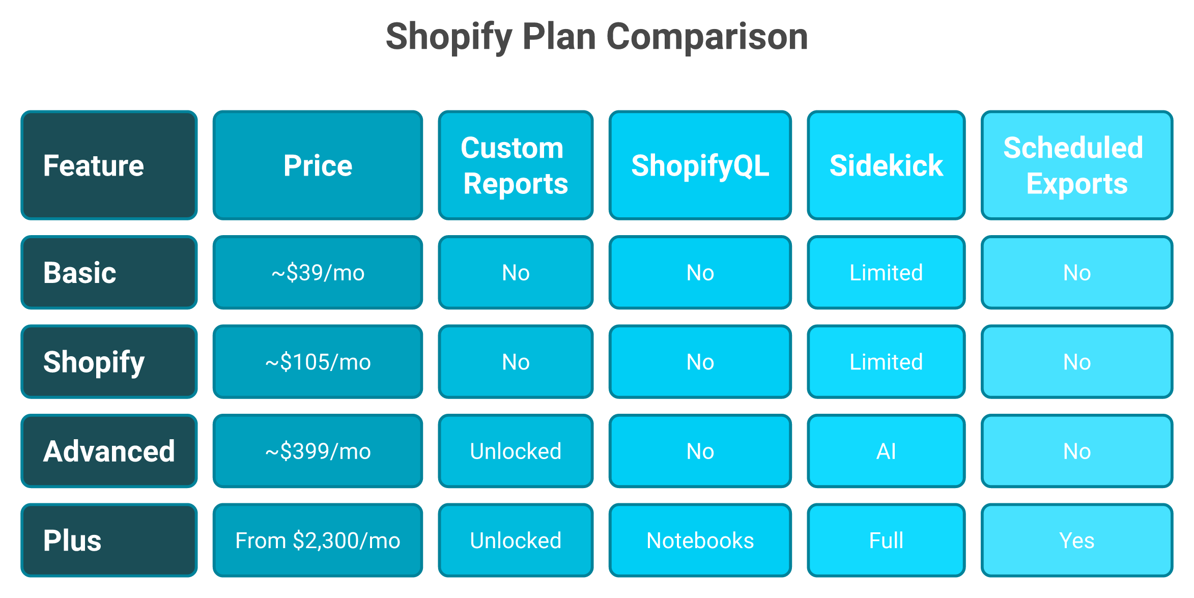
Open Analytics, then Reports, then Create report. Pick a dataset (Orders, Customers, Sessions, or Inventory). Drag metrics and dimensions. Apply filters. Save. ShopifyQL Notebooks and Sidekick prompt-to-query are gated to Plus. Custom reports unlock at Advanced. Basic and Shopify plans get only canned reports. The plan delta to unlock native custom reports is often more expensive than a third-party reporting app subscription.
The Three Surfaces You Actually Touch
There are three layers inside the native experience, and most operators conflate them. Knowing which surface you are on changes what you can do.
The Report Builder is the drag-and-drop interface for saved explorations. It is what most non-technical operators will use daily.
ShopifyQL Notebooks is the SQL-style query editor for Plus, useful when you need joins or aggregations the builder cannot express. Think of it as the escape hatch.
Sidekick is Shopify's prompt-driven assistant that can write ShopifyQL for you on supported plans. It compresses the time from "I have a question" to "I have a draft query."
A Concrete Walkthrough
Here is a five-minute path I run with new operators on Advanced. Open Analytics, click Reports, click Create report, and choose Orders. Add the columns "Net sales," "Discounts," and "Returns." Filter by "Sales channel = Online Store" and a 30-day date range. Save it as "Online net revenue, last 30 days." For a deeper walkthrough of the dashboard surface, see the Shopify analytics dashboard explained guide.
A ShopifyQL And Sidekick Example
Here is what the ShopifyQL Notebook layer looks like in practice on Plus.
FROM sales SHOW net_sales BY product_title WHERE channel = 'Online Store' SINCE -30d ORDER BY net_sales DESC LIMIT 10
The Sidekick prompt that produces something close to this is short. "Show me my top 10 products by net sales online for the last 30 days." Sidekick drafts the ShopifyQL. You verify and run.
What Each Plan Tier Actually Unlocks
Plan gating is where founders quietly overspend. The current public tiering is below.
Custom reports unlock at Advanced; ShopifyQL Notebooks and full Sidekick require Plus.
Shopify Plan Tier Reporting Capabilities
Plan
Custom Reports
ShopifyQL Notebooks
Sidekick AI
Scheduled Email Export
Approx Monthly Price
Basic
❌
❌
Limited
❌
$39
Shopify
❌
❌
Limited
❌
$105
Advanced
✅
❌
Yes
Limited
$399
Plus
✅
✅
Full
Yes
From $2,300
Why The Plan Math Often Loses To An App
In our onboarding work, roughly 60% of new Luca users on the Shopify or Advanced plan had upgraded for "custom reports" but could not extract the metafield-tagged data they actually needed. They were paying the plan delta and still using a CSV export. A reporting app at $30 to $150 a month would have closed the gap they were trying to buy. The pattern shows up across the broader best Shopify analytics apps evaluation.
Why It Matters
The native builder is a query editor, not a co-founder. ⚠️ It will tell you what happened inside Shopify. It will not tell you why your blended ROAS dropped on Tuesday while inventory landed Friday. That is a different layer of work, the kind marketing analysis and automation is built to handle.
Q3: Where Does Native Shopify Reporting Break: Metafields, Multi-Store, And Cross-Channel Blind Spots? [toc=3. Where Native Breaks]
It is 11:00 PM. You are exporting CSVs because your "true margin by department" report needs metafield data that ShopifyQL cannot see. Your spreadsheet has 12 tabs. You still do not have an answer. This is the most common failure mode I see, and it is not a skill issue.
Native ShopifyQL does not query custom metafields, cannot join Meta or Klaviyo, struggles with multi-store consolidation, and limits historical depth. If your merchandising lives in metafields or your decisions need ad spend alongside revenue, the native builder will silently omit the most important rows. As one Shopify Community moderator put it, "You'll have to use a third-party reporting tool or export your data and combine it externally."
Why This Happens (Root Cause, Not Symptom)
The native builder was designed for Shopify-internal data. ShopifyQL is scoped to the Shopify schema. Metafields, while stored in Shopify, are not a first-class citizen in the query language. Meta Ads data, Klaviyo email data, and multi-store rollups live outside that schema entirely. You become the manual integration layer, a reality covered in depth across ecommerce analytics platforms.
The Four Native Blind Spots Most Operators Hit
These are the four breakages I watch operators run into in their first 90 days.
❌ Metafields invisible to ShopifyQL. Department, supplier, margin tier, and custom tags do not surface natively
❌ No Meta, Google, or Klaviyo joins. You cannot ask "revenue minus ad spend by SKU" in one query
❌ Multi-store gaps. Each Shopify store reports separately, so consolidated views require external work
❌ Historical retention limits. Granular session and ad data ages out of the native surface faster than founders expect
The Hidden Costs Of The Workaround
Most operators do not price these correctly. The CSV-and-spreadsheet stack looks free until you count the hours.
⏰ 10 to 15 analyst hours per week on manual reconciliation across Shopify, Meta, and Klaviyo
💸 15% to 20% variance between platform-reported revenue and actual orders, by founder accounts I have audited
⚠️ Decisions delayed by 48 to 72 hours, which is the entire window for a fast-moving Meta creative
Operators feel this. The receipts are public.
"Shopify analytics is so basic that I had to build everything in Sheets. Took me a full weekend just to see margin by vendor." u/Striking_Crow_2143, r/shopify Reddit Thread
"Native reports were fine until we added a second store. Now I export both and pivot in Excel every Monday. It is a job nobody wanted." u/dtc_finance_lead, r/ecommerce Reddit Thread
How It Should Work
The right system reads metafields, joins ad spend, consolidates stores, and reasons over the result. Anthony Mink at Live Bearded ran exactly this kind of cross-cohort analysis and found that "product category diversity" was a higher LTV driver than purchase frequency, an insight that native cohort reports do not surface. The takeaway is not "buy a fancier dashboard." It is that reasoning over connected data outperforms reasoning over a single-system slice, which is why data analysis and deep industry research needs cross-system context.
Before And After
Before, four hours of CSV gymnastics, one half-trusted answer, no clear next step. After, one prompt against unified data, a sourced answer in seconds, and a recommended action in the same thread.
Q4: Which Shopify Reporting Apps Should You Compare: Mipler, Better Reports, Report Pundit, Or Data Export? [toc=4. Reporting Apps Compared]
You have hit the native ceiling. The next question is which app actually earns its subscription. Four names dominate the Shopify App Store category: Mipler, Better Reports, Report Pundit, and Data Export. They solve overlapping problems through different architectures. Pick by your binding constraint, not by star count.
How Each App Approaches The Problem
Report Pundit wins on field depth. The vendor advertises access to over 2,000 fields across 80+ data sources, including Meta, Google, and multi-store rollups. Strength: breadth and integrations. Limitation: the field count itself becomes a configuration tax for smaller teams.
Mipler Advanced Reports wins on speed-to-setup and metafield drilldowns. Its comparison page emphasizes drag-and-drop filters, native support for tags and metafields, and exports to Sheets, Excel, CSV, PDF, HTML, or JSON. Strength: the metafield workaround the native builder lacks. Limitation: ad-platform integration is shallower than Report Pundit.
Better Reports wins on pre-built templates and scheduled email delivery. Operators in the Shopify Community thread on automated reporting recommend it specifically for cadence-driven workflows. Strength: low-friction scheduling. Limitation: less flexible custom query depth.
Data Export Reports is the budget pick. It is reliable for raw exports but, as one Shopify Community reply put it, "can't compare sales" period-over-period as cleanly as the others. Strength: price. Limitation: comparative analysis. For a wider stack view, see the e-commerce tech stack breakdown.
Side-By-Side Comparison
Shopify Reporting Apps Side-By-Side
Criterion
Mipler Advanced Reports
Better Reports
Report Pundit
Data Export Reports
Metafield support
✅ Native
✅ Yes
✅ Yes
Limited
Multi-store rollup
✅
✅
✅ Strong
❌
Scheduled email export
✅
✅ Strong
✅
✅
Sheets / Looker export
✅ Strong
✅
✅
✅
Ad platform integrations (Meta, Google)
Limited
Limited
✅ Strong
❌
Period-over-period
✅
✅
✅
⚠️ Weak
Free tier
✅
❌
❌
✅
Who Should Choose What
If your binding constraint is metafield drilldowns and you want to be live this week, Mipler is the fastest landing. If you run multiple Shopify stores and need ad-platform joins inside the report itself, Report Pundit is the wider net. If you need scheduled reports in inboxes and your team is not technical, Better Reports is the cleanest fit. If your binding constraint is price and you only need raw exports, Data Export covers the floor.
What Operators Are Saying
The reviews back the architecture differences. Worth reading the unfiltered ones, not the vendor pages.
"Report Pundit's support team has built three custom reports for us in two weeks. Cannot get that from native." Verified buyer Report Pundit Shopify App Store Review
"Better Reports does scheduled email better than anything else we tried, including Plus." u/shopify_ops_lead, r/shopify Reddit Thread
The Quiet Cost Stack
⚠️ A pattern I see often. Brands install one app, hit a gap, install a second, then add a Sheets pipeline for the rollup. The stack quietly reaches $300 to $800 per month before anyone audits it. None of these apps are wrong choices. The question is whether the stack is solving a reasoning problem or just a delivery problem, the same question raised in the 7 best e-commerce analytics tools that fund your campaigns roundup.
Q5: How Do You Automate Shopify Reports: A Maturity Ladder From Email Schedules To Warehouse Pipelines? [toc=5. Automation Maturity Ladder]
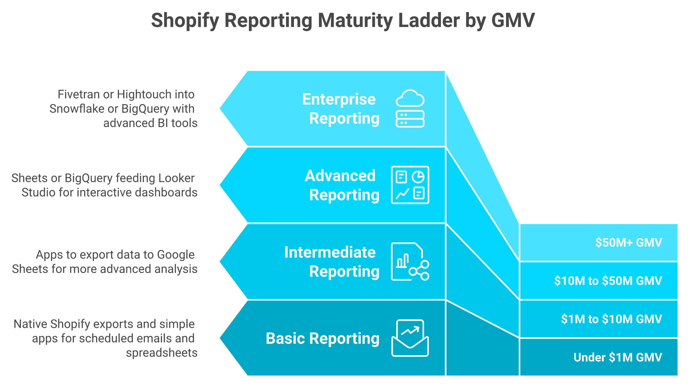
Four rungs, sorted by GMV. Under $1M, native and app scheduled email is enough. From $1M to $10M, you graduate to a Sheets refresh via Mipler, Report Pundit, or EZ Exporter. From $10M to $50M, Looker Studio dashboards on Sheets or BigQuery start earning their keep. Above $50M, Fivetran or Hightouch into a warehouse with a BI tool on top is the floor. Most brands sit one rung below where they should be.
Why The Ladder Matters More Than The Tool
Picking a tool before you know your rung is how the cost stack quietly doubles. Each rung adds power and operational drag in equal measure. The wrong rung either starves your team or buries them in pipeline maintenance. The same trade-off shows up across the broader ecommerce management software landscape.
A Shopify Community thread on automated reporting made the pattern obvious. Operators kept recommending one app, then another, then a Sheets layer, then a warehouse, without naming the GMV trigger that justified each jump.
Most brands sit one rung below where their GMV says they should be.
The Four Rungs With Recipe Blocks
Each rung below has the tools, cadence, owner, and the failure mode I see most often.
Rung 1: Under $1M GMV. Tools: native Shopify scheduled exports plus Better Reports or Data Export. Cadence: daily revenue, weekly cohort. Owner: founder or ops generalist. Failure mode: ⚠️ alert fatigue when every email looks the same and nobody opens them by week three.
Rung 2: $1M to $10M GMV. Tools: Mipler, Report Pundit, or EZ Exporter pushing into Google Sheets. Cadence: daily Sheets refresh, weekly P&L, monthly cohort. Owner: part-time analyst or fractional ops lead. Failure mode: ⚠️ broken refresh tokens and silent column drift after a Shopify schema update.
Rung 3: $10M to $50M GMV. Tools: Sheets or BigQuery feeding Looker Studio dashboards, plus a reporting app for ad-hoc exports. Cadence: real-time dashboards, daily Slack digest, weekly leadership pack. Owner: in-house data analyst. Failure mode: ⚠️ schema drift between Shopify, Meta, and Klaviyo that nobody catches for a week. The add Google Analytics to Shopify guide covers one of the most common drift points.
Rung 4: $50M+ GMV. Tools: Fivetran or Hightouch into Snowflake or BigQuery, with Looker, Mode, or Tableau on top. Cadence: continuous pipelines, executive dashboards, governed semantic layer. Owner: data engineer plus analytics lead. Failure mode: ⏰ owner-leaves-company risk when one engineer holds the entire pipeline in their head.
Cadence, Owner, And Failure Mode At A Glance
Reporting Maturity Ladder By GMV
Rung
GMV
Cadence
Owner
Top Failure Mode
1
Under $1M
Daily, weekly
Founder
Alert fatigue
2
$1M to $10M
Daily refresh
Analyst
Broken refresh, schema drift
3
$10M to $50M
Real-time, daily
Data analyst
Cross-system schema drift
4
$50M+
Continuous
Data engineer
Single-owner pipeline risk
The Velocity Argument
Laura Macan's "sausage factory" analogy sticks for a reason. AI in reporting is not about efficiency, it is about velocity. A team of 11 can produce the output of 30 when the reasoning layer compounds the pipeline, the same thesis explored in agentic AI for ecommerce founders.
Where The Reasoning Layer Sits
An agentic reasoning layer can sit above any rung, not replace it. ✅ It pushes customised reports to Slack or email on a schedule. It explains the spike, names the driver SKUs, and recommends the next move. The warehouse is still the warehouse; the babysitting layer is what changes, which is exactly the workflow demonstrated in how AI can actually help you run your e-commerce business.
Q6: What Is The True Total Cost Of Ownership And Governance Risk Of A Shopify Reporting Stack? [toc=6. TCO And Governance Risk]
Before you renew another reporting subscription, run the audit below against your actual stack. TCO is rarely the sticker price on the invoice. A typical $5M Shopify brand pays around $294 a month for the Shopify-to-Advanced plan delta, $200 to $400 a month across two reporting apps, and 10 to 15 analyst hours a week on Sheets, which adds up to roughly $30K a year in cash plus a four-figure governance liability. Add unmanaged PII in spreadsheets, no version history on shared dashboards, and one Slack admin who alone knows where the formulas live. The real risk is the stack outliving the person who built it.
The TCO Calculator
Run the math against your own P&L. The columns are deliberately blunt. For a deeper unit-economics layer on top of this, see the best way to track e-commerce unit economics.
Annual TCO For A $5M Shopify Brand
Cost Line
Typical $5M Brand
Annual
Plan delta (Shopify to Advanced)
~$294/mo
~$3,500
Reporting apps (avg two installed)
$250/mo
$3,000
Sheets ops time (12 hrs/wk × $40/hr)
$1,920/mo
$23,040
Total before governance
-
💸 ~$29,500
The 7-Item Governance Checklist
Score each item ✅ yes or ❌ no. Be honest, not aspirational.
Role-based access on every dashboard, Sheet, and reporting app
PII (personally identifiable information) redacted from any exported customer file
Version history on every shared report and Looker dashboard
Audit log of who exported what, when, and where it went
Two people who understand the formulas (no single-owner risk)
Disaster recovery plan if the analyst leaves on Friday
Vendor SOC 2 Type II certification on every connected app
Score Interpretation
Governance Score Interpretation
Score
Read
6 to 7 ✅
Mature stack. Optimize, do not overhaul.
3 to 5 ⚠️
Real gaps. Fix governance before adding tools.
0 to 2 ❌
Compliance and continuity risk. Fund the cleanup before the next hire.
What Operators Actually Say
The receipts are public, and the patterns repeat across founder rooms.
"We were paying for two reporting apps and didn't realize one was duplicating the other for a year." u/dtc_ops_lead, r/shopify Reddit Thread
"Triple Whale was a great tool but the price kept climbing as we scaled. We had to question the ROI every renewal." Verified buyer Triple Whale G2 Verified Review
"Our Sheets pipeline broke for three days before anyone noticed. The analyst who built it had left." u/shopify_finance, r/ecommerce Reddit Thread
The Hidden Line Item
Most Luca onboardings reveal the buyer was paying $400 to $700 a month across overlapping apps without knowing the overlap. The fix is rarely another app subscription. It is auditing what the existing stack actually delivers, then deciding what to consolidate before you renew anything, a frame echoed across the e-commerce tech stack review.
Q7: Which AI Reporting Layers Sit Above Your Shopify Data, And How Do They Differ From Apps And Warehouses? [toc=7. AI Reporting Layers]
An AI reporting layer is not a Shopify app and not a BI tool. It is a reasoning layer over your data warehouse that extracts, predicts, simulates, root-causes, and pushes customised reports to Slack or email on a schedule. The category includes Luca AI, Triple Whale Moby, Polar Analytics AI, and Glew. Each differs on data scope, agentic push capability, and reasoning depth. For a deeper category map, see the 7 best e-commerce analytics tools that fund your campaigns.
How Each Player Approaches The Problem
1. Luca AI is the only player built ground-up as a reasoning layer over a unified data warehouse, not a dashboard with AI bolted on. ✅ Plain-English questions, ✅ proactive Slack and email alerts on outliers, ✅ root-cause analysis across Shopify, Meta, Google, Klaviyo, and finance data, ✅ scheduled custom reports with graphs plus the reasoning behind them. Most analytics tools added AI; we built Luca as AI from day one, an approach unpacked in what is an AI co-founder for e-commerce.
2. Triple Whale Moby brings Moby AI on top of an attribution-first dashboard. Strength: deep ad-platform attribution and pixel-based identity resolution. Limitation: marketing-data-centric, weaker on operational and finance reasoning. Operators evaluating swaps often start with Triple Whale alternatives.
3. Polar Analytics AI offers natural-language queries on top of its analytics platform. Strength: clean Shopify Plus dashboards and decent multi-source connectors. Limitation: reasoning is largely query-driven, with thinner agentic push capabilities.
4. Glew is the BI-style multichannel reporting tool with newer AI features. Strength: cross-channel rollups and pre-built ecommerce templates. Limitation: still rooted in the dashboard paradigm, with less agentic behaviour than the category leaders.
Side-By-Side On What Operators Actually Compare
AI Reporting Layers Compared
Criterion
Luca AI
Triple Whale Moby
Polar Analytics AI
Glew
Data scope (marketing + finance + ops)
✅ Full
⚠️ Marketing-led
⚠️ Marketing + sales
⚠️ Multichannel rollups
Agentic push (Slack, email, app)
✅ Native
✅ Limited
⚠️ Limited
⚠️ Limited
Root-cause analysis
✅ Built-in
⚠️ Query-driven
⚠️ Query-driven
❌
Scenario simulation
✅
❌
❌
❌
Zero-SQL natural language
✅
✅
✅
⚠️
Custom scheduled reports with reasoning
✅
⚠️
⚠️
⚠️
Who Should Choose What
Choose Triple Whale if attribution is your only binding problem and you already have a separate finance and ops stack. Choose Polar Analytics if you want Plus-grade dashboards with light AI on top. Choose Glew if multichannel BI rollups dominate your week. Choose Luca AI if you want a reasoning layer that sits above any rung of your warehouse stack and pushes the answer, not the dashboard, to your team, the same thesis behind the intelligence capital thesis.
What Operators Are Saying
"Triple Whale gives us attribution but I still rebuild margin in Sheets every Monday. The dashboard is not the answer." Verified buyer Triple Whale G2 Verified Review
"Polar is clean for Shopify Plus but the AI still feels like a search bar over a dashboard." Verified buyer Polar Analytics G2 Verified Review
Q8: How Do The Best Shopify Brands Actually Run Reporting: Lessons From Live Bearded And VAST? [toc=8. Lessons From Top Brands]
Live Bearded's Anthony Mink found that product category diversity, not purchase frequency, was the dominant LTV (lifetime value) lever. That insight was invisible to native Shopify cohort reports. VAST deployed an incremental $50K of ad spend during heat waves on heat-relevant SKUs, using weather signals as a reasoning input. Neither came from a prettier dashboard. Both came from a reasoning layer that connected Shopify data to context the native builder could not see, the same pattern explored in declining platform ROAS vs true profitability.
The Live Bearded Lesson, Unpacked
Anthony Mink runs Live Bearded, a 7-figure DTC brand. His team ran AI-driven cohort analysis across years of order data and surfaced that customers who bought across multiple product categories had materially higher LTV than customers who bought the same SKU repeatedly.
The architectural lesson is not "buy the cohort report." It is that reasoning over connected data, across categories and time, beats reasoning over a single-axis cohort. Native Shopify cohorts split by acquisition month. They do not split by category-diversity index, a gap covered in the Shopify analytics guide.
The VAST Pattern: External Signals Drive Internal Decisions
Richie Jones at VAST tied weather data to ad spend. When a heat wave landed in a target market, the system recommended an incremental $50K push on heat-relevant SKUs. The capture window was the week. The signal source was outside Shopify entirely.
The pattern is the same as Live Bearded's. The valuable answer required joining data the native builder cannot see, the kind of reasoning a financial management co-pilot is designed to drive.
Pattern Recognition Across Top Operators
The behaviours that show up at the top of the curve are consistent.
⭐ External signals enter the reporting layer (weather, search trends, and competitor pricing)
⭐ Cohort analysis runs on multiple axes, not just acquisition month
⭐ Reports arrive in Slack or email with reasoning attached, not as raw exports
⭐ One person can ask a cross-system question without an analyst in the loop
The Principle Extraction
The pattern is consistent across every scale: operators who reason over connected data outgrow operators who export it. This is not a strategy reserved for $50M+ brands. It is a data architecture decision, and most $1M to $20M Shopify brands are making it by accident.
What Operators Are Saying On The Record
"We stopped chasing prettier dashboards. The win was getting the reasoning out of my head and into a system." Anthony Mink, Live Bearded, r/ecommerce Reddit Thread
"The Monday morning Excel shudder was eating my best people. Reports do not equal decisions." Richie Jones, VAST, r/shopify Reddit Thread
"If you grow your workforce, you grow your problems. We chose to grow the reasoning instead." u/dtc_operator, r/ecommerce Reddit Thread
The Bridge Back To Your Store
You do not need Live Bearded's catalog or VAST's portfolio. You need their visibility. A reasoning layer that pushes the same kind of cohort and signal-driven answer to your inbox at 7:30 AM is what closes the gap. Reports are the speedometer. The reasoning layer is the GPS, the same closed loop covered in meet Luca AI.
Q9: Native Reports vs Reporting Apps vs Warehouse vs AI Reasoning Layer: Which Architecture Should You Pick? [toc=9. Architecture Decision Framework]
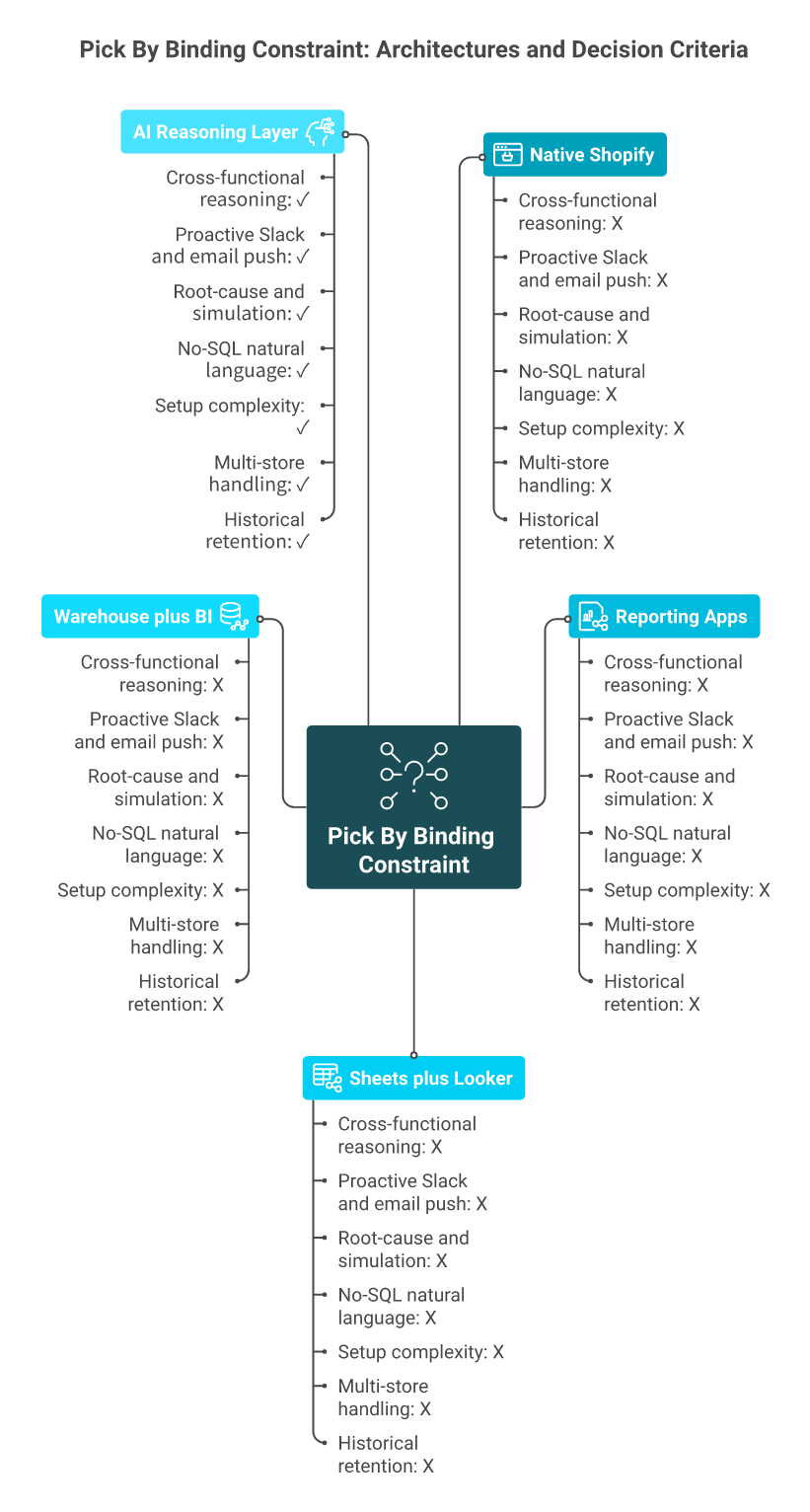
Score each architecture on seven analytics-only criteria: cross-functional reasoning, proactive push (agentic Slack and email), root-cause and simulation depth, no-SQL access, setup complexity, multi-store handling, and historical retention. Native scores around 3 of 14, reporting apps land near 7 of 14, Sheets plus Looker hits 8 of 14 with high ops drag, warehouse plus BI reaches 10 of 14, and an AI reasoning layer scores 13 to 14 of 14. Pick by which gap is binding today, not by feature count.
The Decision Dilemma
Picking a reporting architecture is picking a data shape that will outlive your current team. Pick wrong, and you are migrating in 18 months or paying analysts to babysit pipes nobody wrote documentation for. The same trap shows up across the broader ecommerce analytics platforms landscape.
A score under 7 of 14 means you are buying a dashboard, not intelligence.
Most operators decide on the wrong axis. They count integrations, compare prices, or pick whatever the loudest Twitter operator just shilled.
The Wrong Way To Decide
❌ Counting connectors: "It connects to Shopify and Meta, so it works." Connector counts say nothing about reasoning depth.
❌ Cheapest-tool wins: a $30/month app and a $30,000 warehouse pipeline are not interchangeable. Pricing without context is a trap.
❌ Brand-name signaling: Looker and Tableau are world-class BI. They are also designed for analysts who write SQL daily, not founders skimming on a phone.
The Right Evaluation Framework
Score each architecture 0 to 2 on these seven criteria. The total tells you what gap you are actually buying. The framework lines up with the principles in best AI tools for Shopify owners.
⭐ Cross-functional reasoning across marketing, finance, ops, and inventory.
⭐ Proactive push (Slack, email) when something breaks the pattern.
⭐ Root-cause and scenario simulation, not just descriptive charts.
⭐ No-SQL natural language access for non-technical operators.
⭐ Setup complexity (low setup beats elegant complexity for under $10M GMV).
⭐ Multi-store and multi-channel handling without manual rollups.
⭐ Historical retention deep enough for cohort and seasonal analysis.
Scoring The Four Architectures
Architecture Scoring Across Seven Analytics Criteria
Criterion
Native Shopify
Reporting Apps
Sheets + Looker
Warehouse + BI
AI Reasoning Layer
Cross-functional reasoning
0
1
1
2
2
Proactive Slack/email push
0
1
1
1
2
Root-cause and simulation
0
1
1
1
2
No-SQL natural language
1
1
0
0
2
Setup complexity (low = high score)
2
2
1
0
2
Multi-store handling
0
1
2
2
2
Historical retention
0
1
2
2
2
Total / 14
3
8
8
8
14
The Meta-Insight
The question is reasoning vs display, not features vs features. Native reports and BI dashboards display. A reasoning layer interprets, recommends, and pushes the answer to where you already work. ⚠️ A score under 7 means you are buying a dashboard, not intelligence, the same distinction explored in what is Luca AI, the AI co-founder for e-commerce explained.
What Operators Are Saying
"We migrated from Looker to a reasoning layer because nobody on my team wrote SQL. The dashboards looked beautiful and went unused." Verified buyer Looker G2 Verified Review
"Triple Whale gives us attribution, but I still triangulate margin in Sheets every Monday. Architecture matters more than features." Verified buyer Triple Whale G2 Verified Review
In our onboarding work, the average new Luca user scores 3 of 14 on day one and reaches 12 of 14 by day seven. ✅ Most of that jump is from turning passive dashboards into reasoning that pushes itself, an outcome aligned with data analysis and deep industry research.
Q10: What Does An Automated Reporting Day Look Like With An Agentic AI Layer? [toc=10. Day In The Life]
Here is how a $3M DTC founder runs a Tuesday with a reasoning layer doing the babysitting.
Reports and reasoning arrive on schedule, so decisions happen on the same screen.
Timeline: Tuesday, $3M Shopify Plus Brand
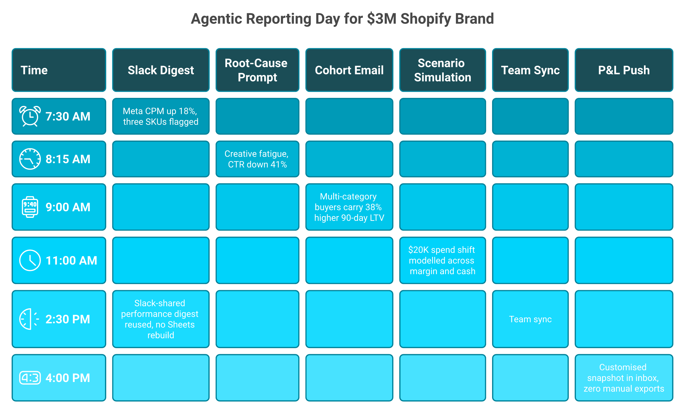
⏰ 7:30 AM Slack digest. Overnight alert: Meta CPM (cost per thousand impressions) up 18% on the top campaign, ROAS (return on ad spend) below threshold, and three SKUs flagged for restock based on 14-day velocity. No dashboard login, no CSV.
⏰ 8:15 AM root-cause prompt. The founder asks, "Why did Campaign X drop yesterday?" The system returns in 12 seconds: creative fatigue, CTR (click-through rate) down 41% versus week one, and recommends refreshing top three creatives, the kind of diagnosis covered in declining platform ROAS vs true profitability.
⏰ 9:00 AM email cohort report. Auto-compiled weekly cohort drops in inbox, with category-diversity LTV (lifetime value) breakdown and a callout that customers buying across two or more categories carry 38% higher 90-day LTV. Graphs plus reasoning, not raw rows.
⏰ 11:00 AM scenario simulation. "If I shift $20K from Meta to TikTok testing this week, what does my contribution margin look like by month-end?" The system models the swap across spend, blended ROAS, inventory burn, and payable timing, the same workflow described in forecast cash flow for e-commerce.
⏰ 2:30 PM team sync. The Head of Growth pulls the Slack-shared performance digest. Cross-channel performance, cohort behaviour, and inventory exposure live in one document, and no spreadsheet rebuild is needed.
⏰ 4:00 PM end-of-day P&L push. Customised P&L (profit and loss) snapshot lands in the founder's inbox. Spreadsheets opened today: zero. Reports built manually: zero.
Before And After
Before the reasoning layer, the same Tuesday took roughly four hours across six tools. Two decisions stayed parked, waiting for "more data." Triple Whale published benchmarks in 2025 showing DTC ops teams spend 10 to 15 hours a week on manual reporting reconciliation.
After: ✅ 22 minutes inside one interface, ✅ three confident decisions, ✅ zero manual export work. The same compounding shows up in AI for e-commerce cash flow forecasting.
The Capability Stack Behind The Day
Each timestamp maps to a capability operators usually wire together themselves.
7:30 AM: extract and surface (anomaly detection across Shopify, Meta, and inventory).
8:15 AM: root-cause (cross-metric correlation on creative fatigue).
9:00 AM: predict and report (scheduled cohort analysis with reasoning attached).
11:00 AM: simulate (scenario modelling on margin and cash burn).
4:00 PM: push (customised report delivery, no dashboard pull required).
What Operators Are Saying
"The shift was not faster reports. It was that the report came with the recommendation, so the decision happened on the same screen." Anthony Mink, Live Bearded, r/ecommerce Reddit Thread
"I used to live in Sheets every Monday. Now my Slack tells me what changed and why before I open my laptop." u/dtc_founder_2024, r/shopify Reddit Thread
What I Am Thinking About Next [toc=11. What's Next]
My read right now: the next 18 months are not about prettier dashboards or another reporting app on the App Store. They are about operators deciding whether the reasoning layer sits inside their store or inside their head. Native reports keep getting better, ShopifyQL keeps maturing, and Sidekick keeps improving its prompt-to-query game. None of that closes the gap between "the report exists" and "the decision happens," a gap mapped in why e-commerce founders are drowning in data.
I could be off here, but I think by 2027, the operators who win will be the ones who stopped hiring junior analysts to build reports and started letting agentic systems push the reasoning to Slack at 7:30 AM. If you are running a Shopify store and still rebuilding margin in Sheets every Monday, I want to know what is keeping you there. Email me, ping me on Twitter, or drop a comment on our contact page. I am collecting the patterns.
FAQ's
What plan do we need on Shopify to build custom reports, and is the upgrade worth it?
Custom reports unlock at the Advanced plan, while ShopifyQL Notebooks and full Sidekick AI prompt-to-query are gated to Plus. Basic and Shopify plans only get canned reports.
Basic, around $39/mo, no custom reports
Shopify, around $105/mo, no custom reports
Advanced, around $399/mo, custom reports plus Sidekick
Plus, from $2,300/mo, ShopifyQL Notebooks and full Sidekick
The plan delta is often more expensive than a third-party reporting app. In our onboarding work, roughly 60% of operators on Advanced still could not extract the metafield-tagged data they actually needed. We unpack the trade-off in detail across our best Shopify analytics apps review, and we usually recommend operators sub $5M GMV pair Shopify or Advanced with a focused reporting app rather than upgrade for the report builder alone.
Why can't ShopifyQL query our metafields or join Meta and Klaviyo data?
ShopifyQL is scoped to the Shopify schema, so custom metafields are not first-class queryable objects, and Meta, Google, or Klaviyo data lives outside the schema entirely. That gap forces founders into CSV exports and Sheets stitching.
The four blind spots we see most often:
Metafields invisible to ShopifyQL
No native joins with Meta or Klaviyo
Multi-store consolidation requires external work
Granular session and ad data ages out fast
The fix is not another dashboard. It is reasoning over connected data, the same architecture we cover in ecommerce analytics platforms. We built Luca to read metafields, join ad spend, consolidate stores, and push the answer to Slack, so operators stop being the manual integration layer between Shopify and every other tool in the stack.
Which Shopify reporting app should we pick: Mipler, Better Reports, Report Pundit, or Data Export?
Pick by the binding constraint, not by star count. Each app trades off depth against speed-to-setup.
Mipler Advanced Reports: best for metafield drilldowns and fast setup
Report Pundit: best for multi-store rollups and Meta or Google joins, with 2,000+ fields
Better Reports: best for scheduled email cadence and pre-built templates
Data Export Reports: best for raw exports on a budget, weakest on period-over-period
We see brands quietly install two of these before realising they overlap, with stacks reaching $300 to $800 a month. Audit before renewal. For a wider category view, see our 7 best e-commerce analytics tools that fund your campaigns. Picking the right one depends on whether the binding constraint is metafields, multi-store, scheduling, or price.
How do we automate Shopify reports without hiring a data analyst?
Automation follows a four-rung GMV ladder, and most brands sit one rung below where they should be:
Under $1M GMV: native Shopify scheduled exports plus Better Reports or Data Export
$1M to $10M: Mipler, Report Pundit, or EZ Exporter pushing to Google Sheets
$10M to $50M: Sheets or BigQuery feeding Looker Studio dashboards
$50M+: Fivetran or Hightouch into a warehouse with a BI tool on top
Each rung adds power and operational drag. An AI reasoning layer sits above any rung and pushes customised reports to Slack and email on a schedule, with the reasoning attached. We dive deeper into the workflow in agentic AI for ecommerce founders, where the goal is replacing the babysitting layer, not the warehouse.
When should we move beyond Shopify custom reports to an AI reasoning layer?
Move when the bottleneck stops being the report and starts being the reasoning. Three signals tell us it is time:
The team spends 10 to 15 hours a week reconciling Shopify, Meta, and Klaviyo
Decisions slip 48 to 72 hours because nobody interprets the export
Margin still gets rebuilt in Sheets every Monday
An AI reasoning layer extracts, predicts, simulates, root-causes, and pushes the answer to Slack on a schedule, instead of producing another dashboard. It sits above the warehouse, not inside it. We cover the architectural shift in our intelligence capital thesis and explain the agentic workflow in how AI can actually help you run your e-commerce business. The decision is reasoning vs display, not features vs features.
Enjoyed the read? Join our team for a quick 15-minute chat — no pitch, just a real conversation on how we’re rethinking Ecommerce with AI - Luca
Loading Schedule...
Your AI Co-Founder is here.
Here’s why:
Shopify, Meta, Xero - one brain.
"Should I scale?" Answered with real data.
Growth capital. No applications. One click.
Thank you! Your submission has been received! Please book a time slot for the Meeting
Oops! Something went wrong while submitting the form.