10 Best Data Storytelling Tools for Ecommerce in 2026: AI Native, BI Players, Ecommerce Specific Tools Compared
14
mins read
TL;DR
The ten tools we compared are Luca AI, Triple Whale, Polar Analytics, Glew.io, Tableau, Microsoft Power BI, Looker Studio, Domo, Powerdrill Bloom, and Flourish.
We scored every tool on Ecommerce Data Fit 25%, Explanation Depth 25%, Setup and Usability 20%, Verified User Reviews 15%, and Pricing Transparency 15%.
Eight of the ten were built for analysts. The criterion that separates them is whether the tool explains why a metric moved, not just what it is.
Sticker price is the smallest line. Add DAX or Tableau learning hours plus weekly reconciliation labor and real cost per answered question lands near 170 dollars.
Three stories your tool must handle in 2026: AI-referred traffic, fully burdened contribution margin per SKU, and peer-relative performance against your AOV tier.
Luca AI normalizes Shopify, Meta, Google, Klaviyo, accounting, and 3PL data on ingestion, then answers in plain English. It is wrong for enterprises with data teams.
Q1. What Are the 10 Best Data Storytelling Tools for Ecommerce in 2026? [toc=1. Best Tools Ranked]
The 10 best data storytelling tools for ecommerce in 2026 are Luca AI, Triple Whale, Polar Analytics, Glew.io, Tableau, Microsoft Power BI, Looker Studio, Domo, Powerdrill Bloom, and Flourish. Luca AI ranks first because it sits as an AI layer over your store's data, normalizes Shopify, Meta, Google, Klaviyo, and accounting sources on ingestion, then answers in plain English instead of handing you one more dashboard to maintain.
I screened these ten against five weighted criteria, pulled every rating from G2 or Trustpilot rather than vendor pages, checked published pricing pages, and read operator threads where store owners describe what their current tool cannot do. Eight of the ten were built for analysts. Two were built for operators. That gap is the whole story of this category. One store owner on Reddit put the problem plainly: basic sales and visitor numbers are fine, but deeper questions force an export. Read the list in three buckets: ecommerce-specific, BI players, and AI-native.
🧾 The Shortlist at a Glance
Luca AI, best for AI-native ecommerce intelligence and root cause answers
Triple Whale, best for DTC marketing attribution storytelling
Polar Analytics, best for GMV-scaled ecommerce BI with a managed warehouse
Glew.io, best for multichannel retail reporting on a small budget
Tableau, best for deep visual storytelling with an analyst on staff
Microsoft Power BI, best for Microsoft-stack teams and finance modeling
Looker Studio, best for free, lightweight reporting
Domo, best for enterprise data storytelling at scale
Powerdrill Bloom, best for fast narrative generation from a single dataset
Flourish, best for scrollytelling and board-deck visuals
📊 Data Storytelling Tools for Ecommerce Compared
Data Storytelling Tools for Ecommerce Compared
Tool
Key capabilities offered
Best For
Pricing
Luca AI ⭐⭐⭐⭐⭐
Plain-English questions over unified store data, root cause analysis, predictive reorder and sales alerts, automated Slack and email reports
$14 / Month (Pro) to $24 / Month (Premium per user) per user
Looker Studio ⭐⭐
Free dashboards, Google connector ecosystem, shareable reports
Stores under roughly $50K per month
Free, $9 / Month per user (Pro)
Domo ⭐⭐⭐
Data apps, storytelling cards, AI agents, governed enterprise pipelines
Enterprises with data teams
Custom, consumption-based
Powerdrill Bloom ⭐⭐⭐
Upload-and-ask analysis, auto-generated AI reports, chart and image generation
One-off dataset narratives
Free, $16.58 / Month (Pro) to $165.83 / Month (Premium)
Flourish ⭐⭐
Scrollytelling templates, animated charts, interactive story embeds
PR, investor decks, and marketing stories
Free, paid team plans quoted
1.1 Luca AI [toc=1.1 Luca AI]
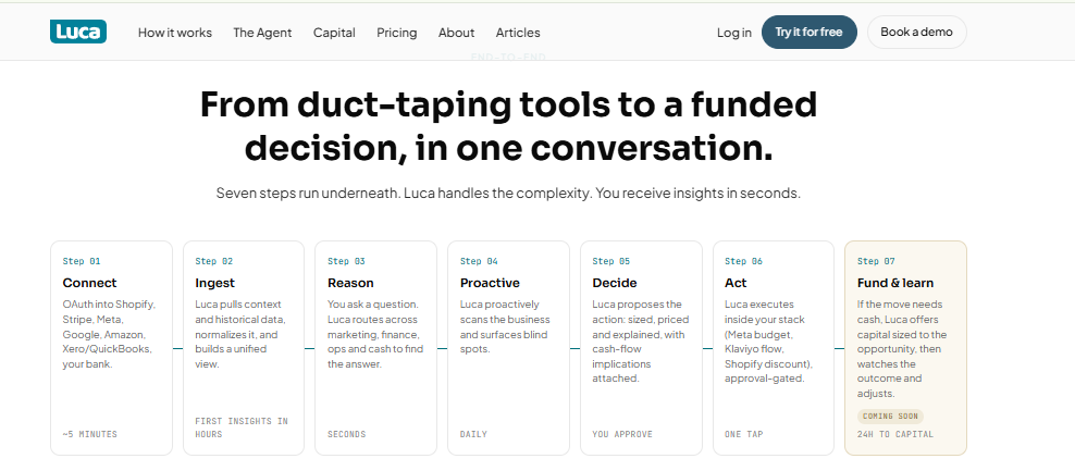
Luca AI connects, ingests, reasons, and acts, turning scattered store data into decisions.
⭐ Why Did We Choose This Tool?
I built Luca AI, so read this section with that in mind. It sits first because of what it does architecturally, not because of who wrote the list. Luca AI is an AI layer over your store's data, not a dashboard with a chat box bolted on. It connects your sources, normalizes them on ingestion, reasons across marketing, product, customer, and profit data together, then tells you which variable moved the number. Most analytics tools added AI. Luca is AI. If you already employ an analyst, buy Tableau instead.
✅ Solutions Offered
Ask questions about your store in plain English, with no SQL and no dashboard building, through conversational analytics.
Root cause analysis that names the influencing components behind a CAC or ROAS swing.
Predictive analytics for reorder timing, sales forecasts, and product-level demand.
Automated weekly and monthly reports with graphs, reasoning, and recommendations to Slack or email.
Continuous anomaly monitoring that pings you when ROAS dips, CAC spikes, or inventory drops below a threshold.
🧠 Explains why a metric moved: Yes, root cause reasoning across sources.
⏰ Time to first useful answer: Same day, since normalization happens on ingestion.
⭐ Verified user rating: Not yet listed on G2, early entrant to this category.
💰 Entry price: €299 per month.
❤️ Best For
Shopify and multichannel stores between $1M and $5M in annual revenue.
Teams with piling data, no data analyst, and no budget for one.
Operators who want recommendations pushed to them, not charts to go find.
📊 Case Study: The 72% Margin That Was Really 8%
What was the problem? A European skincare brand doing roughly $1.8M a year on Shopify treated one SKU as its hero product. The supplier invoice showed a 72% gross margin, so the team kept pushing spend behind it.
How did Luca AI help? Luca AI pulled the fully burdened cost picture into one view, ad spend, discounting, returns, shipping, payment fees, and the support load tied to that SKU. The reasoning surfaced the specific cost lines eating the margin instead of showing a revenue chart.
What was the outcome? True contribution margin on the hero SKU came in around 8%. The team cut spend behind it inside a week, shifted budget to a lower-revenue product with real margin, and set a standing alert on per-SKU contribution margin. 💰 Two years of quiet losses stopped in one afternoon.
💰 Pricing
Starter, €299 / Month. Growth, €499 / Month. Scale, Custom Pricing. Full plan details sit on the Luca AI pricing page.
Luca AI is the only tool on this list that treats the recommendation as the deliverable, which is why it opens the list rather than closing it.
1.2 Triple Whale [toc=1.2 Triple Whale]
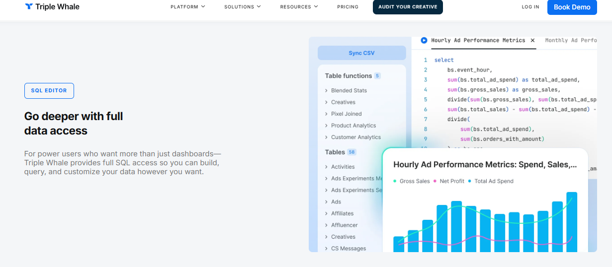
Triple Whale gives power users full SQL access to build custom ad performance and profit queries.
⭐ Why Did We Choose This Tool?
Triple Whale earns its place because it tells the paid-media story better than anything else here. The Triple Pixel plus Moby chat combination gives a media buyer a same-day read on which campaign carried revenue. Where it gets thinner is finance. Attribution numbers can disagree with Shopify and with your email platform, which means someone still reconciles by hand before a board update. ⚠️ Treat it as a marketing storyteller, not a single source of truth, and compare it against the wider set of Triple Whale alternatives before committing.
✅ Solutions Offered
Multi-touch attribution through the first-party Triple Pixel.
Moby AI chat for conversational queries on marketing performance.
Custom dashboards and creative-level performance analytics.
Slack alerts on performance thresholds.
Peer benchmarking against aggregated DTC data for ROAS, CPA, and CPC.
🧠 Explains why a metric moved: Partial, strong on channel, thin on cash and ops.
⏰ Time to first useful answer: Days, once pixel data accumulates.
⭐ Verified user rating: 4.4 out of 5 on G2 across the review corpus.
💰 Entry price: Free tier, then from $219 per month.
❤️ Best For
DTC brands where paid social is the main growth lever.
Teams with a media buyer who owns daily spend decisions.
Stores under roughly $5M GMV, where the GMV-banded price still works.
😊 Reviews
"Triple Whale is very user-friendly and easy to navigate to find the data you need across multiple channels. Relevant channels like emails, ads, organic, etc are already broken down for you and when looking at the specific channel, you have the option to customize the table displaying the data to choose which metrics are most relevant for your needs." Verified User, Ecommerce Marketing Triple Whale G2 Verified Review
"Its very easy to use and works good for a multichannel solution. Sometimes it does not update the numbers correctly and has errors with synchronisation." Verified User, Ecommerce Operator Triple Whale G2 Verified Review
💰 Pricing
Free, from $219 / Month (Foundation) to $749 / Month (Automate), rising with GMV, Enterprise quoted.
Luca AI overlaps Triple Whale on connectors but diverges on output, since it reasons across marketing, profit, and inventory data together rather than resolving the channel question alone. That difference is the same one separating ecommerce analytics platforms from an intelligence layer, and it is worth testing on your own numbers through a conversation with our team.
1.3 Polar Analytics [toc=1.3 Polar Analytics]
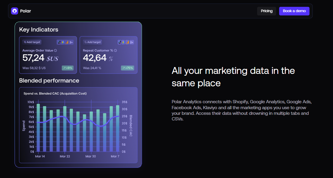
Polar Analytics unifies marketing data to track blended CAC, AOV, and repeat customer rate.
⭐ Why Did We Choose This Tool?
Polar Analytics earns a spot because it gives you a real warehouse without hiring for one. Every plan ships with a dedicated Snowflake database, a first-party pixel, and unlimited users. That means your cohort and LTV stories sit on governed data, not on a spreadsheet export. ⚠️ The trade-off is price and patience. Reviewers report GMV-tiered bills that climb quickly, plus support gaps once onboarding ends.
✅ Solutions Offered
Dedicated Snowflake database included with every plan.
First-party pixel for channel and campaign reporting.
Cohort, retention, and LTV analysis for DTC brands.
AI agents and an MCP connection for conversational queries.
🧠 Explains why a metric moved: Partial, strong reporting, light on recommendations.
⏰ Time to first useful answer: Weeks, since advanced features need learning time.
⭐ Verified user rating: 4 to 5 stars on G2, with critical Trustpilot threads on price and support.
💰 Entry price: From $300 per month, rising with GMV.
❤️ Best For
DTC brands doing $2M or more who want warehouse-grade reporting.
Teams expanding from Shopify into marketplaces and retail.
Operators with someone willing to learn the platform properly.
😊 Reviews
"I believe this is a great product, and solves many problems for brands with more complex reporting. However, from the get go there were some discrepancy in the pricing. The pricing communicated when installing the app via Shopify was completely different from the one provided by sales after the installation (which was much higher)" Maja, Verified Customer Polar Analytics TrustPilot Verified Review
"Shortly after onboarding we were assigned an account manager. About a month later, she was laid off and we were never assigned a new account manager. I have the direct email of a support specialist, but the response time has been less than ideal." Ben S., Director of Commercial Operations Polar Analytics G2 Verified Review
💰 Pricing
From $300 / Month to $720+ / Month, banded by GMV, with add-ons quoted separately. If the bill climbing with revenue worries you, compare it against other ecommerce analytics platforms on a flat plan.
1.4 Glew.io [toc=1.4 Glew.io]
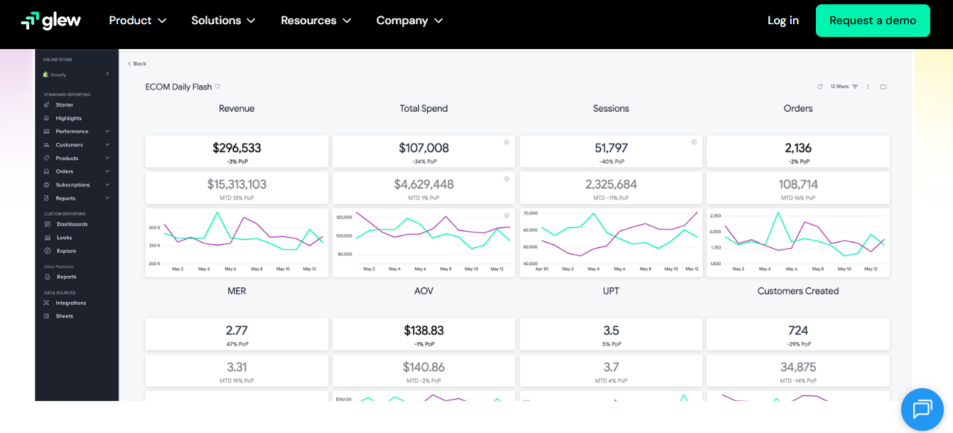
Glew.io reports daily ecommerce KPIs like revenue, MER, and AOV across multiple sales channels.
⭐ Why Did We Choose This Tool?
Glew.io is the cheapest honest entry point on this list. It starts at $79 per month and covers product, customer, and channel reporting across multiple sales channels. For a store under $1M, that beats building the same views in spreadsheets. ❌ Accuracy is the recurring complaint. Reviewers describe data that needed checking and integrations that were hard to add.
✅ Solutions Offered
Multichannel dashboards across Shopify, marketplaces, and retail.
Product-level profitability and inventory reporting.
Segment exports to CSV for further analysis.
Custom Looker-based dashboards on higher plans.
📈 How It Scores on the Core Metrics
🔌 Native ecommerce connectors: Shopify, marketplaces, ad platforms, and email tools.
🧠 Explains why a metric moved: No, reporting only.
⏰ Time to first useful answer: Days, with manual checks recommended.
⭐ Verified user rating: Polarized, from 1.5 to 5 stars in the G2 corpus.
💰 Entry price: $79 per month.
❤️ Best For
Multichannel retailers under $10M in annual revenue.
Stores that need better reporting than Shopify offers, on a small budget.
Teams comfortable spot-checking numbers before a decision.
😊 Reviews
"Data was often not accurate and adding new data sources was hard. The visualization was also subpar." Verified User, Ecommerce Manager Glew.io G2 Verified Review
"Glew reports are easy to segment and export. Data is displayed in easily digestible results with points of reference to previous period and year. For a Shopify-based business, Glew offers more powerful analytical solutions than available to us in Shopify." Verified User, Shopify Merchant Glew.io G2 Verified Review
💰 Pricing
$79 / Month to $649 / Month, banded by annual revenue.
1.5 Tableau [toc=1.5 Tableau]
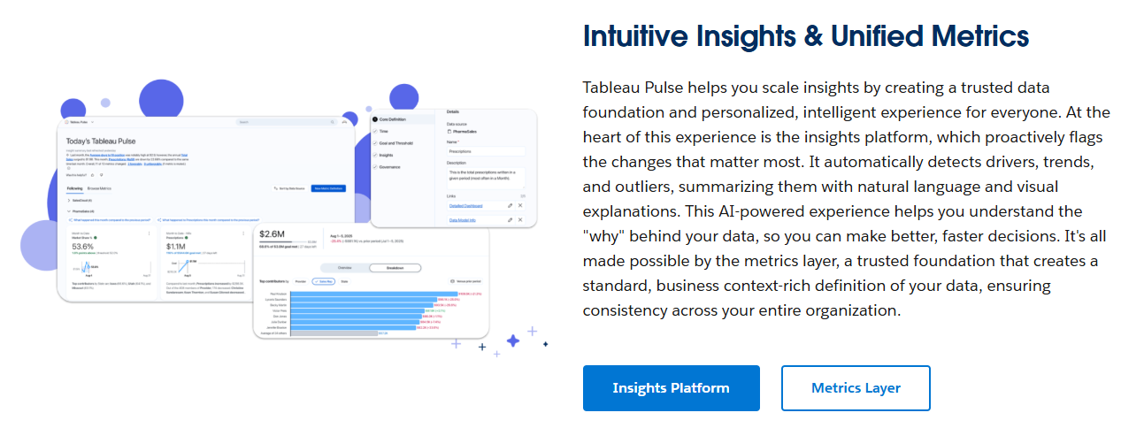
Tableau Pulse flags metric changes and explains drivers using natural language and visual summaries.
⭐ Why Did We Choose This Tool?
Tableau is still the best visual storyteller in software. Story Points let you sequence charts into an argument, which no ecommerce tool matches. It holds 4.4 out of 5 across roughly 3,786 G2 reviews. ❌ The catch is the human requirement. Every new story queues behind someone fluent in Tableau, and licensing stacks up fast per seat.
✅ Solutions Offered
Story Points for sequenced, narrative dashboards.
Deep visual modeling with a large chart library.
Tableau Pulse for metric summaries and alerts.
Broad connectors including Snowflake, BigQuery, and Excel.
Embedded analytics for customer-facing reporting.
📈 How It Scores on the Core Metrics
🔌 Native ecommerce connectors: None specific, Shopify data arrives through a warehouse or extract.
🧠 Explains why a metric moved: No, the analyst does that work.
⏰ Time to first useful answer: Weeks, model building comes first.
⭐ Verified user rating: 4.4 out of 5 across about 3,786 G2 reviews.
💰 Entry price: $15 per user per month for Viewer, $75 for Creator.
❤️ Best For
Companies with a dedicated analyst or data team.
Brands presenting to boards, investors, or retail partners.
Teams with existing warehouse infrastructure to plug into.
😊 Reviews
"Tableau can be resource-intensive with large datasets, and some advanced functionalities have a steep learning curve. Licensing costs can also be a concern for smaller teams." Verified User, Data Analyst Tableau G2 Verified Review
"It has a steep learning curve, where proper skill sets truly matter. I wouldn't recommend it for the uninitiated. It requires a full data brief so you don't get lost down all of the options available." Abe B., Business Intelligence User Tableau Desktop G2 Verified Review
💰 Pricing
$15 / Month (Viewer) to $75 / Month (Creator) per user, Tableau+ bundles quoted. Teams without an analyst usually get further with AI-powered BI tools built for ecommerce.
1.6 Microsoft Power BI [toc=1.6 Microsoft Power BI]
⭐ Why Did We Choose This Tool?
Power BI is the finance director's pick, and for good reason. It models cost lines properly, connects to Excel natively, and prices lower than Tableau per seat. Copilot now writes narrative summaries on higher tiers. ⚠️ Two frictions matter for ecommerce. DAX, the formula language behind Power BI, has a real learning curve, and performance drops on very large datasets.
🔌 Native ecommerce connectors: None specific, ecommerce data needs a connector or warehouse.
🧠 Explains why a metric moved: Partial, Copilot summarizes, it does not diagnose.
⏰ Time to first useful answer: Days for simple reports, weeks for a real model.
⭐ Verified user rating: 4.5 out of 5 on G2 across roughly 1,240 reviews.
💰 Entry price: $14 per user per month for Pro.
❤️ Best For
Finance-led teams already inside Microsoft 365.
Brands that need audited, paginated financial reporting.
Companies with someone willing to learn DAX properly.
😊 Reviews
"Power BI can become slow with very large datasets, and complex DAX formulas have a steep learning curve. Also, advanced customization of visuals and version control for reports could be improved." Verified User, Business Analyst Microsoft Power BI G2 Verified Review
"It may allow you to create a multitude of custom calculations but it is not flexible and the query becomes cumbersome. The outcome of these cannot always be good for the dashboard performance or speed. Power BI has a limit on the size of data that it can ingest." Verified User, Reporting Lead Microsoft Power BI G2 Verified Review
💰 Pricing
$14 / Month (Pro) to $24 / Month (Premium per user) per user, Fabric capacity quoted separately.
1.7 Looker Studio [toc=1.7 Looker Studio]
⭐ Why Did We Choose This Tool?
Looker Studio is free, and free matters when cash sits in inventory. It connects to Google Ads, GA4, and Sheets in minutes. For a store under roughly $50K a month, it is genuinely enough. ❌ Above that, the cracks show. Reviewers report slow loads, sync problems, and settings that reset while editing.
✅ Solutions Offered
Free dashboards with shareable links.
Native Google Ads, GA4, and Sheets connectors.
Custom filters and calculated fields.
Scheduled email delivery of reports.
Community connectors for third-party sources.
📈 How It Scores on the Core Metrics
🔌 Native ecommerce connectors: Google sources only, Shopify needs a paid connector.
🧠 Explains why a metric moved: No, charts only.
⏰ Time to first useful answer: Hours for a basic dashboard.
⭐ Verified user rating: Polarized on G2, strong critics alongside satisfied free users.
💰 Entry price: Free, $9 per user per month for Pro.
❤️ Best For
Stores under roughly $50K in monthly revenue.
Teams living inside Google Ads and GA4.
Anyone who needs a shareable report today with no budget.
😊 Reviews
"It seems to have the potential of being useful. This potential isn't easily realized, but it's there." Verified User, Marketing Analyst Looker Studio G2 Verified Review
💰 Pricing
Free, then $9 / Month per user (Looker Studio Pro). Merchants outgrowing the free tier usually move to a purpose-built Shopify reporting dashboard.
1.8 Domo [toc=1.8 Domo]
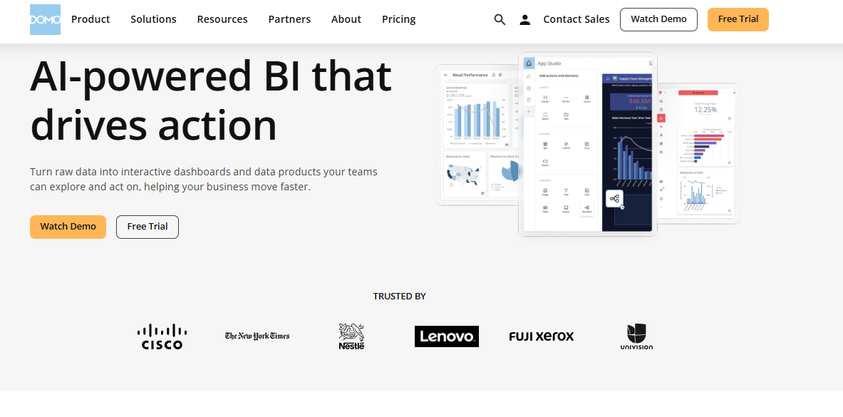
Domo builds enterprise dashboards and data products for teams with dedicated analytics resources.
⭐ Why Did We Choose This Tool?
Domo belongs here because it does storytelling at enterprise scale. Cards, data apps, and governed pipelines let large teams publish one version of the truth. It holds 4.3 out of 5 across 1,084 G2 reviews. ❌ It is the wrong shape for a lean DTC brand. Cost, setup effort, and required technical expertise are the three most cited complaints.
✅ Solutions Offered
Storytelling cards and data apps for published narratives.
Governed data pipelines with enterprise access controls.
AI agents for summaries and alerts.
Broad connector library across business systems.
Mobile delivery of executive dashboards.
📈 How It Scores on the Core Metrics
🔌 Native ecommerce connectors: Available, though built for enterprise systems first.
🧠 Explains why a metric moved: Partial, and it needs configuration to do so.
⏰ Time to first useful answer: Months, warehouse setup comes first.
⭐ Verified user rating: 4.3 out of 5 across 1,084 G2 reviews.
💰 Entry price: Custom, consumption-based.
❤️ Best For
Enterprises with an in-house data team.
Multi-brand groups needing governed reporting.
Organizations with budget for consulting support.
😊 Reviews
"Domo is a powerful platform, but it has a steep learning curve and can struggle with large datasets. More flexibility in pricing and clearer documentation would make it even better." Verified User, Data Operations Domo G2 Verified Review
"The least helpful part is really the price. I'm stressed trying to make sure we're getting the best bang for our buck." Verified User, Analytics Manager Domo G2 Verified Review
💰 Pricing
Custom, consumption-based, quoted per instance. For a lean team, the same job usually lands cheaper inside Shopify business intelligence built for commerce data.
1.9 Powerdrill Bloom [toc=1.9 Powerdrill Bloom]
⭐ Why Did We Choose This Tool?
Powerdrill Bloom is the fastest way to turn one dataset into a written story. Upload a CSV, ask a question in plain English, and it returns charts plus narrative. Paid plans start at $16.58 per month, which is close to free. ❌ It does not connect to your store. Nothing is normalized, so the numbers are only as good as the file you uploaded.
✅ Solutions Offered
Upload-and-ask analysis on CSVs, spreadsheets, and PDFs.
Auto-generated AI reports with narrative and charts.
🧠 Explains why a metric moved: Partial, within the uploaded dataset only.
⏰ Time to first useful answer: Minutes.
⭐ Verified user rating: Limited verified review volume on major platforms.
💰 Entry price: Free, then $16.58 per month for Pro.
❤️ Best For
One-off analyses on an exported dataset.
Small teams testing AI narrative before buying a platform.
Founders preparing a quick investor or supplier summary.
💰 Pricing
Free, then $16.58 / Month (Pro) to $165.83 / Month (Premium). Upload-based tools skip the ecommerce data integration work that makes an answer trustworthy.
1.10 Flourish [toc=1.10 Flourish]
⭐ Why Did We Choose This Tool?
Flourish is on the list for one job, presentation. Its scrollytelling templates turn a data point into something a retail buyer or investor remembers. Newsrooms use it, which tells you the quality is real. ❌ It is not an analytics tool. You bring finished numbers to Flourish, it does not find them for you.
✅ Solutions Offered
Scrollytelling templates for narrative sequences.
Animated and interactive chart types.
Embeddable story pages for sites and decks.
Template library with brand customization.
Free public tier for individual creators.
📈 How It Scores on the Core Metrics
🔌 Native ecommerce connectors: None, data is pasted or uploaded.
🧠 Explains why a metric moved: No, presentation layer only.
⏰ Time to first useful answer: Under an hour for a template story.
⭐ Verified user rating: Limited verified review volume on major platforms.
💰 Entry price: Free public tier, paid plans quoted.
❤️ Best For
Investor updates, PR stories, and board presentations.
Marketing teams publishing data-led content.
Anyone who already knows the answer and needs it to land.
💰 Pricing
Free, with paid individual and team plans quoted on the pricing page. Treat it as the last mile after your ecommerce data visualization numbers are already reconciled.
Luca AI sits at the top of this list because of a structural difference, not a feature count. Nine of these tools hand you a chart and leave the reasoning with you. Luca AI reasons across Shopify, ad, email, and accounting data together, then tells you which variable moved the number and what to do about it. If you already employ an analyst, Tableau or Power BI remains the better buy. If you do not, see how operators put Luca AI to work before your next tool renewal.
Q2. How Were These Data Storytelling Tools Scored? [toc=2. How We Scored]
Each tool was scored out of 100 across five weighted criteria: Ecommerce Data Fit 25%, Explanation Depth or the ability to answer why a metric moved 25%, Setup and Usability 20%, Verified User Reviews 15%, and Pricing Transparency 15%. Scores of 0 to 20 earn one star, 21 to 40 two, 41 to 60 three, 61 to 80 four, and 81 to 100 five.
📊 The Rubric, and What Each Criterion Measures
Scoring Rubric for Data Storytelling Tools
Criterion
Weight
What it measures
Ecommerce Data Fit
25%
Native connectors for Shopify, ad platforms, email, accounting, and 3PL
Explanation Depth
25%
Whether the tool answers why a number moved, not just what it is
Setup and Usability
20%
Time to a useful answer without an analyst
Verified User Reviews
15%
G2, Trustpilot, and Reddit evidence, positive and negative
Pricing Transparency
15%
Published pricing, and whether the real bill matches the quote
Nothing was scored from a vendor homepage. Every rating traces to a review, a pricing page, or an operator thread. Where a tool had thin verified review volume, I said so instead of guessing. The same evidence standard applies across our wider work on ecommerce reporting.
🧠 Why Explanation Depth Carries a Full Quarter
Store owners do not lack numbers. They lack causes. One founder surveying Shopify merchants summed up the pattern exactly.
"I've been chatting with Shopify store owners and have seen a recurring issue: dashboards display figures but don't clarify why changes happen or what steps to take" Founder, r/buildinpublic Reddit Thread
That complaint is the whole reason this criterion exists. A tool that shows a CAC spike and a tool that names the campaign, audience, and creative behind it are not the same product. Luca AI scans connected data continuously and pushes an alert when ROAS dips, CAC spikes, or inventory crosses a threshold, which is a different behavior from waiting to be opened. That behavior is the core of ecommerce monitoring tools worth paying for.
💰 Why Pricing Transparency Made the List
Published pricing is a trust signal, not a convenience. Reviewers on GMV-banded tools describe quoted prices that did not match the app-store price. That gap costs real cash at renewal, so it earns its 15%. Our own plans stay published on the Luca AI pricing page for the same reason.
❌ What Was Deliberately Excluded
Four things carried zero weight in this rubric.
Chart aesthetics, because pretty output does not change a decision.
Template counts, because nobody wins on library size.
Analyst awards and quadrant placements, since they measure enterprise fit.
Any capability claimed only on a vendor page with no review or doc behind it.
I also excluded attribution accuracy as a scoring line. It matters enormously, but it belongs to a different tool category and would have skewed every score toward pixel products.
⚠️ Where This Rubric Could Be Wrong
My read is that Explanation Depth deserves its 25%, though I hold that loosely. If you already employ an analyst, that weight should probably drop to 10% and Setup should climb. Rerun the math with your own weights before you buy anything. The rubric is published precisely so you can disagree with it.
Luca AI earns five stars here, carried by Explanation Depth and Ecommerce Data Fit, since root-cause reasoning and anomaly detection are the product rather than a module added later. On Setup and Usability it scores well for the same structural reason, because normalization happens on ingestion.
Q3. What Is a Data Storytelling Tool, and Why Do Ecommerce Dashboards Fail at It? [toc=3. Definition and Dashboard Gap]
A data storytelling tool combines charts, narrative, and context so the reader understands what changed, why it changed, and what to do next. Ecommerce dashboards fail because they report what happened inside one source, leaving you to reconcile Shopify, ad platform, and accounting numbers by hand before any story exists.
🧭 Words First, Charts as Reinforcement
The best analysts I know explain the finding in plain sentences before they open a charting tool. If the sentence works, the chart becomes proof. If the sentence does not work, no visualization saves it.
That order is backwards in most tools. They start with the canvas and hope the story appears. A dashboard full of impressive charts with no sentence attached is a maintenance job, not an insight, which is the trap most ecommerce analytics dashboard builds fall into.
📉 The Question Your Dashboard Cannot Answer
Here is the test I use. Ask which product and channel combination drives repeat purchases in your store. Then time how long it takes to answer.
"The dashboard can feel cumbersome, basic metrics like sales and visitors are fine, but when I need deeper insights (for example, which product/channel combination drives repeat purchases)" Store Owner, r/ShopifyWebsites Reddit Thread
That question spans three systems. Orders live in Shopify, spend lives in Meta and Google, and lifecycle data lives in Klaviyo. Every dashboard answers one slice, so the operator becomes the join function.
🔍 What the Reconciliation Actually Costs
I have watched founders spend three hours every Sunday on this. They export, paste, rebuild the same pivot, and reach an answer that is already stale. That is not an analytics problem; it is an unpaid second job.
The cost compounds because the answer arrives after the decision window. Ad budget for Monday gets set on Friday instinct instead of Sunday data. Ask Luca AI the same cross-source question and the join happens before you type it, which is the actual difference between a reporting layer and an intelligence layer built on real ecommerce data integration.
✅ The One Test That Sorts These Tools
Use this rule when you demo anything on this list. If the tool's output is a chart, the story is still your job. If the output is a sentence with a cause and a recommended action, it is doing the work you are paying for.
Apply the test to the free options too. Looker Studio will happily show a revenue dip. It will never tell you the dip came from one SKU going out of stock in your best region, which is exactly the gap conversational analytics closes.
⚠️ Where I Might Be Overstating This
Dashboards are not useless, and I could be pushing too hard here. A daily glance at sales, sessions, and spend is genuinely useful for pattern recognition. My position is narrower than it sounds. The dashboard is fine as a speedometer; it just cannot tell you which turn to take, and most stores are buying it hoping for the second thing.
Luca AI inverts the default output, returning the reasoned answer with the chart attached rather than a canvas you assemble. That is why operators use it to end the Sunday triangulation habit instead of formalizing it into another dashboard.
Q4. Luca AI Review: What Does an AI Layer Over Your Data Do That a Dashboard Cannot? [toc=4. Luca AI Reviewed]
Luca AI is an AI layer over your ecommerce data. It connects Shopify, Meta, Google, Klaviyo, accounting, 3PL, and support sources, normalizes them on ingestion, then extracts the relevant slice for a situation, finds root cause and influencing components, forecasts from history, and pushes customized reports to Slack or email on a schedule.
🔌 What It Actually Is, Structurally
Think of it as the reasoning layer that normally requires a warehouse, a modeling tool, and a junior analyst. Luca AI collapses those three into one surface you query in plain English. No SQL, no dashboard building, no ticket queue.
The category framing matters for your evaluation. This is not an attribution pixel, and it does not replace one. If your core question is which ad drove which order, buy a pixel product instead, then read our take on Triple Whale alternatives for that job.
⏰ Why Normalizing on Ingestion Changes the Timeline
Most data projects die in cleanup. Your Shopify fiscal calendar says one thing, your ERP says another, and retail week 554 in one system is week 332 in the next. Someone has to reconcile that before a single question gets answered.
Luca AI normalizes and standardizes data as it arrives, so the cleanup year never starts. Plug in, ask, act. That is the single biggest reason time to first useful answer measures in days rather than quarters, and why we treat ecommerce data management as a backend job, not yours.
🧠 The Analytical Range
Ask Luca AI to do the work a junior ecommerce analyst would do, across six domains.
Root cause analysis on a CAC, ROAS, or margin swing.
Influencing components, meaning which upstream variables moved the outcome.
Predictive work including sales forecasts and reorder timing.
Cohort and retention analysis without building a cohort dashboard.
Product-level profit analysis down to the SKU.
Operational patterns like support ticket spikes and vendor performance.
It also flags where you are already well optimized. That matters more than it sounds, because it stops you burning attention on a channel that is fine.
📩 Reports and Alerts That Arrive Without You Asking
Set the task once, in a sentence. Ask for a weekly CAC report with graphs, reasoning, and recommendations across Meta and Google spend, and it lands in Slack every Monday. That is automated data reporting doing the follow-up for you.
The monitoring runs continuously against your historical pattern, not a static threshold. Luca AI pings you when a metric breaks its own trend, which catches the slow drift a fixed alert misses. One operator on Reddit got frustrated enough with native analytics to build his own weekly AI report, which tells you how badly this gap is felt.
❌ Who Should Not Buy This
Three buyers should walk away, and I would rather say it here than in a sales call.
Enterprises with an existing data team. They need Tableau or Domo plus a warehouse, not a reasoning layer.
Stores below roughly $1M in annual revenue. There is not enough data yet to reason against.
Anyone shopping specifically for attribution. That is a different product category.
Luca AI is built for the operator between $1M and $5M who needs the reasoning a data hire would provide, at a fraction of that salary. The honest boundary is the enterprise buyer, who already has the analyst and does not need us. If you sit inside that range, see how operators actually use it before your next renewal.
Q5. AI-Native, BI Players or Ecommerce-Specific: Which Bucket Fits Your Stack? [toc=5. Three Buckets Compared]
Ecommerce-specific tools like Triple Whale, Polar Analytics, and Glew.io win on connector fit and commerce-shaped metrics. BI players like Tableau, Power BI, Looker Studio, and Domo win on modeling depth but assume you have an analyst. AI-native tools like Powerdrill Bloom and Flourish generate narrative fast but model nothing, so they belong downstream of a reconciled dataset.
🔌 Connector Fit Across All Ten Tools
Connector Fit Across All Ten Data Storytelling Tools
Tool
Shopify
Ad platforms
Klaviyo
Accounting and 3PL
Luca AI
Native
Native
Native
Native
Triple Whale
Native
Native
Native
Limited
Polar Analytics
Native
Native
Native
Partial
Glew.io
Native
Native
Native
Partial
Tableau
Via warehouse
Via warehouse
Via warehouse
Via warehouse
Power BI
Via connector
Via connector
Via connector
Native for Xero and QuickBooks
Looker Studio
Paid connector
Google native
Paid connector
No
Domo
Available
Available
Available
Available
Powerdrill Bloom
File upload
File upload
File upload
File upload
Flourish
None
None
None
None
🐳 The Ecommerce Bucket, and Its Real Edge
Peer benchmarks are the edge nobody talks about. A 2.1 ROAS means nothing on its own. It means something once you know what brands at your AOV tier are running, which Triple Whale draws from aggregated real-time data across more than 20,000 customers.
The shared weakness is finance. These tools see marketing clearly and cash flow poorly, which is why operators pair them with an ecommerce cash flow forecasting tool.
"Some data we still notice discrepancies between platforms, for example, tracking ads, and differences in the reported metrics like revenue." Verified User, Ecommerce Marketing Triple Whale G2 Verified Review
📐 The BI Bucket, Compared Honestly
Tableau vs Power BI vs Luca AI for Data Storytelling
Criterion
Tableau
Power BI
Luca AI
G2 rating
4.4 out of 5
4.5 out of 5
Not yet listed
Storytelling mechanism
Story Points
Copilot narratives
Plain-English reasoning
Analyst required
Yes
Yes for DAX
No
Entry price per month
$15 per user
$14 per user
€299 flat
DAX, the formula language behind Power BI, is where most ecommerce teams stall. Reviewers name it directly, and it is the main reason merchants shortlist AI-powered BI tools for ecommerce instead.
"Power BI can become slow with very large datasets, and complex DAX formulas have a steep learning curve." Verified User, Business Analyst Microsoft Power BI G2 Verified Review
💰 The Free and Enterprise Extremes
Looker Studio is free and genuinely useful under roughly $50K a month. Above that, the sync issues and connector limits start costing you decisions, and most teams graduate to purpose-built Shopify reporting apps.
Domo sits at the other end, with consumption-based pricing and a 4.3 out of 5 rating across 1,084 G2 reviews. Reviewers flag cost and learning curve as the two barriers.
⏰ The AI-Native Bucket: Speed Is Real, Modeling Is Not
The speed gain is not marketing. Manipulation work that would take two weeks by hand now returns in about 90 seconds. That is worth real money on a one-off analysis.
The limit is equally real. These tools model nothing about your business, so garbage in produces confident garbage out. Ask Luca AI the same question and the join across sources happens before the narrative gets written.
⚠️ Keep a Human on the Final Read
One premium bike brand published a homepage image showing a $20,000 bike with the rear derailleur on the front wheel. AI generated it, and nobody checked it. Do not let the AI be the QA on anything a customer sees.
Luca AI overlaps the ecommerce bucket on connectors but diverges on output, since it reasons across marketing, profit, and inventory data to name the lever that moved a metric. That is a different job from surfacing another tile to monitor.
Q6. What Do Data Storytelling Tools Really Cost Once You Add the Hidden Line Items? [toc=6. True Cost Breakdown]
Sticker price is the smallest line. Power BI Pro moved from $10 to $14 per user per month with Copilot gated to higher tiers, Tableau licensing draws the most frequent cost complaint on G2, and both assume analyst hours. Add the weekly export-and-reconcile labor your team already absorbs and the real figure often triples.
💸 The Three Cost Lines Nobody Puts in the Table
Hidden Cost Lines in a Data Storytelling Stack
Cost line
What it looks like
Annual impact
License
Per-seat or GMV-banded fee
$948 to $8,640
Learning curve
DAX or Tableau training, plus rework
40 to 120 hours
Reconciliation labor
Weekly export, paste, pivot
100 to 150 hours
Reviewers name the gated-tier problem directly. Advanced AI features sit above the entry plan, so the price you compared is rarely the price you pay.
🧮 The Cost Per Answered Question
Here is the math I run with founders. Three hours of reconciliation per week, at a loaded rate of $45 an hour, is $7,020 a year. Add a $2,000 license and you are at $9,020.
Now divide by the number of decisions that money changed. Most stores answer four or five real questions a month, which puts cost per answered question near $170. That number is the one worth negotiating, not the monthly fee, and it belongs in how you track ecommerce unit economics.
⚠️ Gross Margin Hides the Same Way
Gross margin only tells you what it costs to make the thing. It says nothing about what it costs to sell the thing. The costs between the supplier invoice and actual profit are where stores bleed quietly, which is the whole point of contribution margin versus gross margin.
Tooling behaves identically. One practitioner traced 42% of all support tickets to a single product, which allocated to $1.45 per unit in hidden cost. That line never appears on a dashboard unless something joins support data to SKU data.
✅ Where Free Actually Works
Three free options are honest choices, with clear ceilings.
Looker Studio: free forever, breaks on Shopify connectors and sync reliability.
Tableau Public: free, but your data becomes publicly visible.
Flourish: free public tier, presentation only, no analysis.
Reviewers on free tiers are candid about the trade-off.
"It seems to have the potential of being useful. This potential isn't easily realized, but it's there." Verified User, Marketing Analyst Looker Studio G2 Verified Review
📉 Why This Is a Profit Decision, Not a Software Decision
Ecommerce net profit fell from 17.7% to 10.6% over a decade, across roughly 300 surveyed stores in the eCommerceFuel Trends Report. At 10.6%, a $9,000 tooling stack needs to protect about $85,000 in revenue just to break even, which is why we treat this as a question about ecommerce profit margins.
That math is why I push back on GMV-banded pricing. Your bill scales with revenue while your margin does not, and reviewers report quoted prices arriving higher than the app-store price.
Luca AI removes the largest hidden line from this calculation, the data-cleanup phase, by normalizing and standardizing sources on ingestion rather than after the invoice is signed. Flat pricing at €299 also means the bill does not climb every time you have a good quarter.
Q7. How Do You Pick One and Ship a Decision-Grade Story by Monday? [toc=7. Choose and Implement]
Match the tool to your stage, then test it against three stories: AI-referred traffic, fully burdened contribution margin per SKU, and peer-relative performance. Under $50K monthly revenue, Looker Studio plus Shopify reports is enough. Between $50K and $1M with no analyst, Luca AI carries the most weight because it reasons across sources. Above $1M with a data hire, pair a BI tool with a commerce layer.
🏁 Pick By Stage, Not By Feature List
Which Data Storytelling Tool Fits Your Revenue Stage
Your stage
Buy this
The one trial question
Under $50K per month
Looker Studio, free
Can I see channel revenue without an export?
$50K to $1M per month, no analyst
An AI reasoning layer
Why did CAC move last week?
Above $1M with an analyst
BI tool plus commerce layer
Can finance and marketing agree on one number?
🔎 Story One: AI-Referred Traffic
This is the story almost nobody can tell yet. Shopify's Q1 2026 data shows AI-referred visitors converting at nearly 50% higher rates than organic search, with AI-referred orders up close to 13x year over year.
You can filter this today. Open Shopify Analytics and segment by Referrer Channel to isolate AI answer engines. If a tool cannot break out that segment, it is already behind your traffic, and your ecommerce conversion tracking needs the update first.
💰 Story Two: Fully Burdened Contribution Margin
A founder once slid an invoice across the table and called a product her best seller at 72% gross margin. Twenty minutes later, after we costed every line, actual contribution margin came in at 8%. She had scaled a money pit for two years.
That is the story your tool must produce on demand. Ask Luca AI to allocate ad spend, discounts, returns, shipping, fees, and support load down to the SKU, then rank products by what actually clears. That exercise is the practical form of customer profitability analysis.
📊 Story Three: Peer-Relative Performance
Your numbers need an outside reference. DTC customer acquisition cost now runs $5 to $15 on owned channels versus up to $120 for mega-influencer campaigns, with Meta CPMs up 30% since 2023.
Without that context, a rising CAC looks like failure. With it, you may simply be paying market rate, which is a distinction worth building into your core ecommerce KPIs.
⏰ The Five-Step Weekly Workflow
Write the decision you need to make, in one sentence, before opening any tool.
Pull only the metrics that change that decision. Ignore everything else.
State the answer in plain English, with the cause named.
Attach one chart as reinforcement, not as the answer.
Set an alert on that metric so next week the tool tells you first.
Steps four and five are where most operators quit. Luca AI ships the scheduled report with reasoning and pings you when a metric breaks its own historical pattern, which closes the loop without a calendar reminder.
⚠️ Keep the Human Gate
Automate the analysis, not the sign-off. Every operator I trust on this says the same thing: a human reviews everything before it goes out, for a long while yet.
The failure mode is not a wrong chart. It is a confident wrong chart that nobody questioned before a budget moved.
🔮 What I Am Still Sitting With
Poor inventory accuracy costs retailers over $1 trillion a year in revenue distortion. My read is that inventory, not marketing, becomes the main data story by 2027, though I hold that loosely, and it is why ecommerce inventory management keeps pulling ahead of channel reporting.
Luca AI already crosses into operational forecasting, including support ticket spikes and vendor performance, which is where I think this category moves next. If you are testing tools this month, I would genuinely like to hear which question broke them, so tell us what you are building.
FAQ's
What is a data storytelling tool, and how is it different from a dashboard?
A data storytelling tool combines charts, narrative, and business context so the reader understands what changed, why it changed, and what to do next. A dashboard stops at the first part.
The practical difference shows up the moment a question spans systems. Orders sit in Shopify, spend sits in Meta and Google, and lifecycle data sits in Klaviyo. A dashboard answers one slice, so the operator becomes the join function between them.
Dashboard output: a chart showing revenue dipped 14% last week.
Storytelling output: revenue dipped because one SKU went out of stock in your best region on Tuesday.
Test to apply: if the output is a chart, the story is still your unpaid job.
We built our approach to ecommerce business intelligence around that second output, because a chart without a cause attached is a maintenance task rather than an insight. Luca AI returns the reasoned sentence first and attaches the chart as reinforcement, which is the opposite of how most reporting tools are built.
One caveat worth stating plainly. Dashboards are genuinely useful as a daily speedometer for sales, sessions, and spend. They simply cannot tell you which turn to take, and most stores buy them hoping for exactly that.
Which data storytelling tool is best for a Shopify store without a data analyst?
For a Shopify store with no analyst on payroll, the answer depends almost entirely on your revenue stage rather than the feature list.
Under 50,000 dollars per month: Looker Studio plus native Shopify reports is genuinely enough, and it is free.
50,000 dollars to 1 million per month: an AI reasoning layer carries the most weight, because nobody on your team has time to build models.
Above 1 million per month with a data hire: pair Tableau or Power BI with a commerce layer.
Luca AI sits in that middle band deliberately, since it connects Shopify, Meta, Google, Klaviyo, accounting, and 3PL sources, normalizes them on ingestion, and answers questions in plain English with no SQL and no dashboard building. We priced it flat at 299 euros per month so the bill does not climb every time you have a good quarter.
Run one question in every trial. Ask why CAC moved last week. If the tool shows you a CAC chart instead of naming the campaign, audience, or creative behind the move, it has failed the only test that matters at this stage. Our guide to the best Shopify analytics apps walks through the same comparison in more depth.
Are there free data storytelling tools that actually work for ecommerce?
Yes, three free options are honest choices, and each has a clear ceiling worth knowing before you commit a quarter to it.
Looker Studio: free forever, strong on Google Ads and GA4, but Shopify needs a paid connector and reviewers report sync reliability problems.
Tableau Public: free, with the significant catch that your data becomes publicly visible.
Flourish: free public tier, excellent for scrollytelling and investor decks, but presentation only with no analysis underneath.
Free works well below roughly 50,000 dollars in monthly revenue. Above that, the hidden cost shows up as labor rather than licence fees. Three hours of weekly reconciliation at a 45 dollar loaded rate is 7,020 dollars a year, which is more than most paid tools cost outright.
That calculation is the one we push founders to run before choosing free. Luca AI removes the largest hidden line, the data cleanup phase, by normalizing and standardizing sources as they arrive rather than after an invoice is signed. If you are still weighing the free path, our breakdown of ecommerce reporting shows where the ceiling usually hits.
One honest note. If your store is early and your data volume is thin, free is the correct answer and paid tooling will not help yet.
Tableau or Power BI for data storytelling, and do ecommerce teams actually need them?
Both are excellent, and both assume something most ecommerce teams do not have, which is a person fluent in the tool.
Tableau: 4.4 out of 5 on G2, Story Points for sequencing charts into an argument, deepest visual control, and the most frequent cost complaints in its review corpus.
Power BI: 4.5 out of 5 on G2, easier setup, native Excel integration, Copilot narratives on higher tiers, and a real DAX learning curve.
Shared gap: neither ships native Shopify, Meta, or Klaviyo connectors, so commerce data arrives through a warehouse or a paid connector.
Our read is that these tools are the right buy above roughly 1 million dollars in monthly revenue with a data hire in place, and the wrong buy below it. The licence is rarely the expensive part. The analyst hours or agency retainer required to turn a model into a story is the line nobody puts in the comparison table.
Luca AI exists because that layer is the cost most lean DTC teams cannot justify, so the reasoning happens inside the product instead of inside a hire. If you want the fuller comparison, we covered it in our review of AI-powered BI tools for ecommerce.
What should a data storytelling tool be able to tell me in 2026 that it could not in 2024?
Three stories are genuinely new, and most tools on the market cannot yet produce any of them on demand.
AI-referred traffic: Shopify's Q1 2026 data shows AI-referred visitors converting at nearly 50% higher rates than organic search, with AI-referred orders up close to 13 times year over year. You can already isolate this by segmenting Referrer Channel in Shopify Analytics.
Fully burdened contribution margin per SKU: gross margin only says what it costs to make the thing. Ad spend, discounts, returns, shipping, fees, and support load are where stores bleed quietly.
Peer-relative performance: a 2.1 ROAS means nothing until you know what brands at your AOV tier are running.
The margin story is the one we see reverse decisions fastest. One founder called a product her best seller at 72% gross margin, and true contribution margin came in at 8% once every line was costed. Two years of quiet losses ended in an afternoon.
Luca AI reasons across marketing, profit, inventory, and support data together so those three stories come from one connected dataset rather than three separate tabs. Our piece on contribution margin versus gross margin shows the calculation line by line.
Enjoyed the read? Join our team for a quick 15-minute chat — no pitch, just a real conversation on how we’re rethinking Ecommerce with AI - Luca
Loading Schedule...
Your AI Co-Founder is here.
Here’s why:
Shopify, Meta, Xero - one brain.
"Should I scale?" Answered with real data.
Growth capital. No applications. One click.
Thank you! Your submission has been received! Please book a time slot for the Meeting
Oops! Something went wrong while submitting the form.